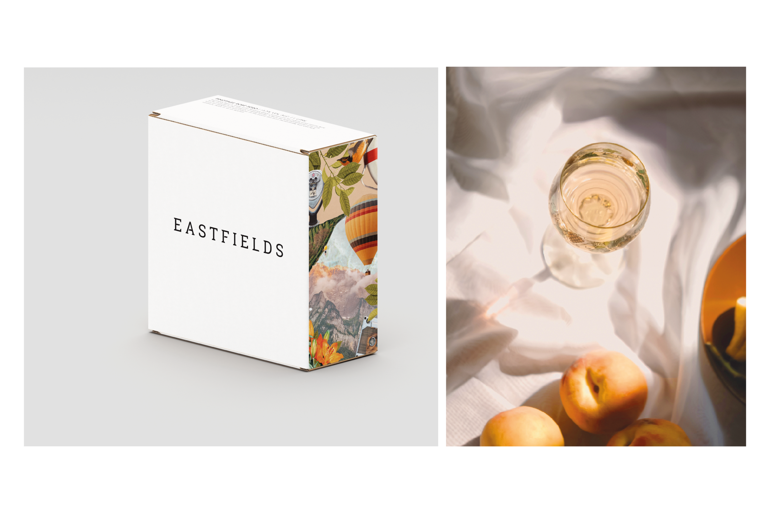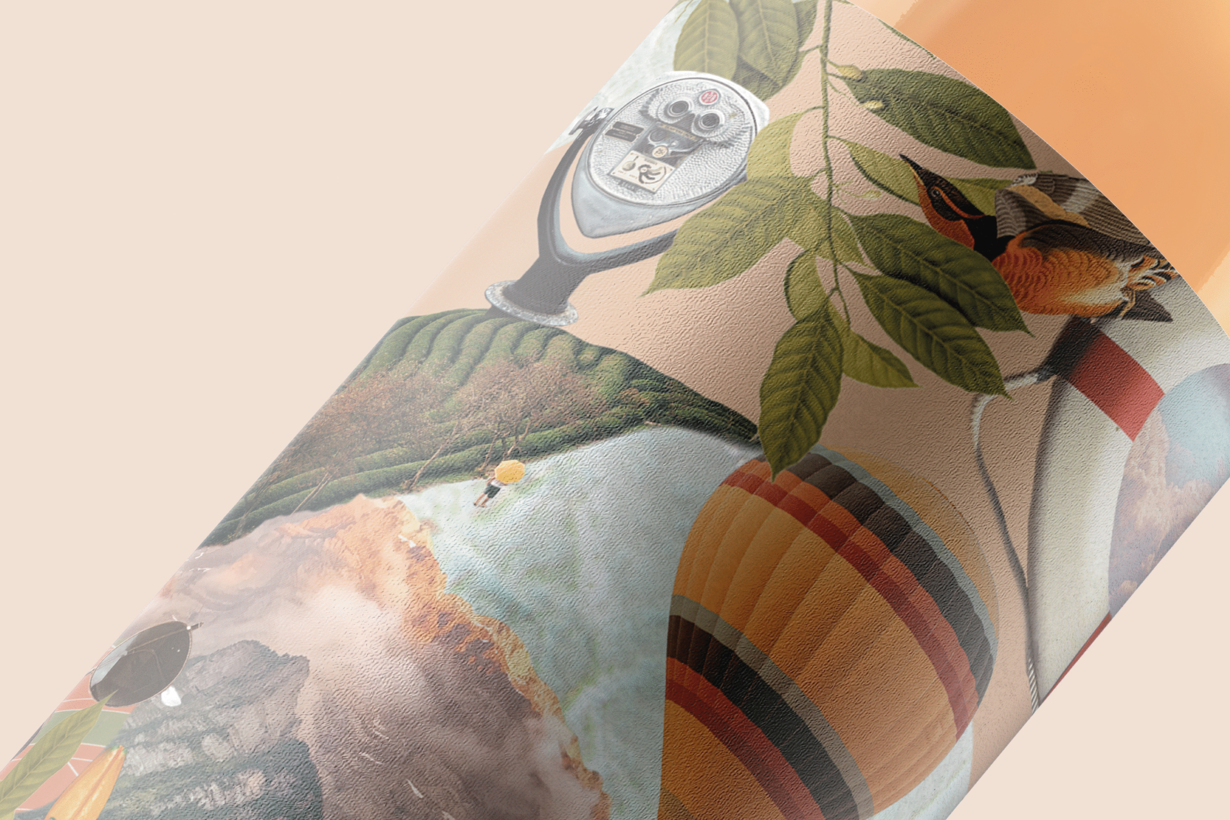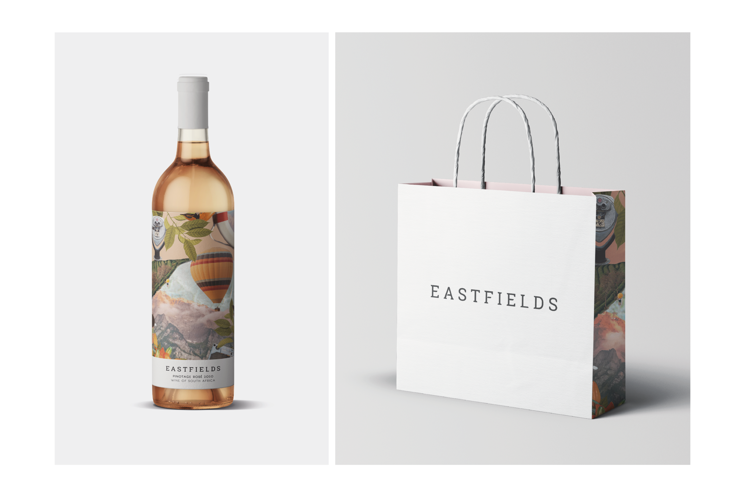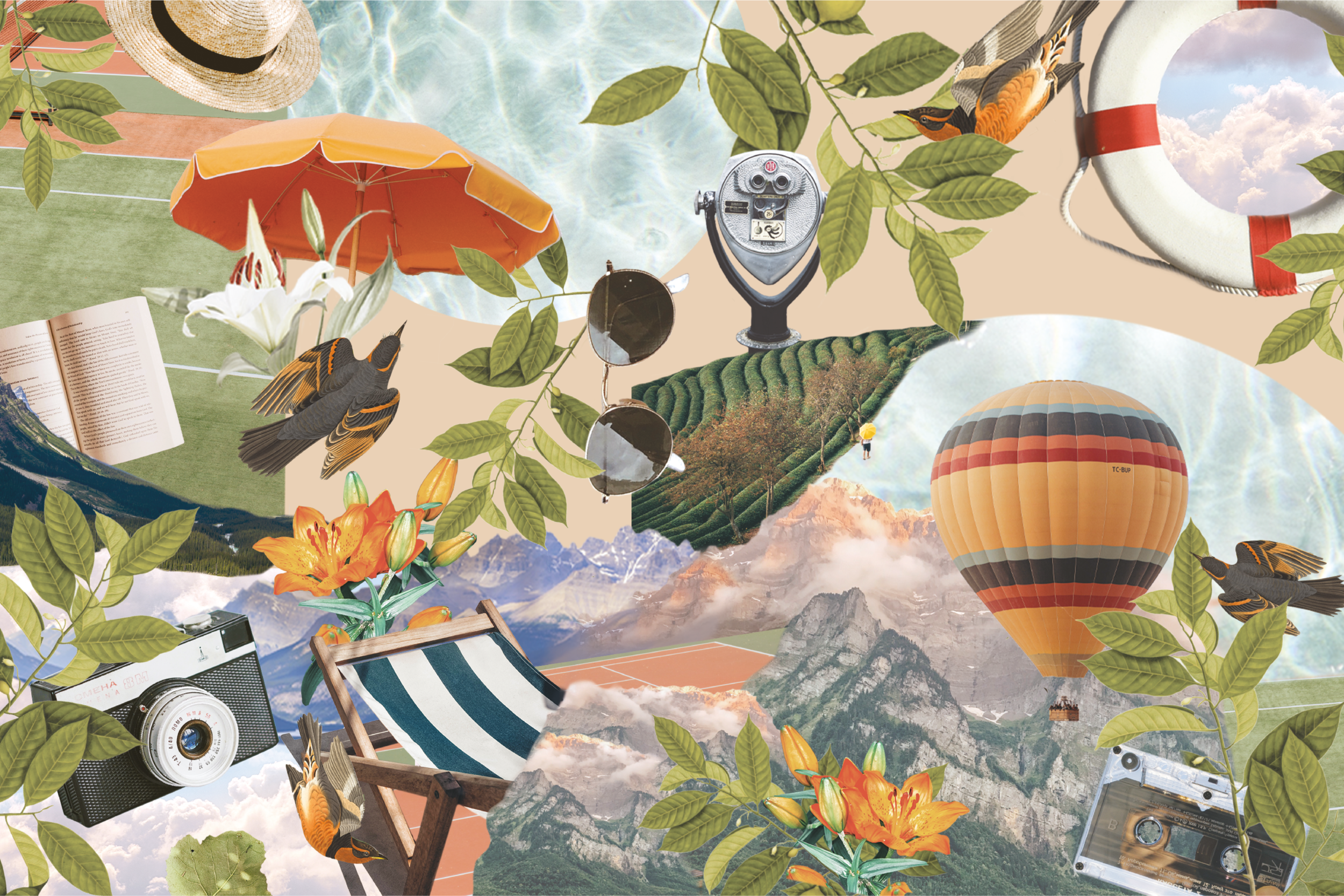

As a product that should be enjoyed in Summer, the design of the Eastfields Rosé design celebrates a warm, Finnish-inspired dreamscape.
From the collage tint matching the liquid colour, to the size of the label in proportion to the bottle, every detail of the design aims to evoke an imagination running wild with possibilities of where Eastfields should be enjoyed and dreams of carefree days.
The collage is finished off with a warming tint that enhances the colour of the liquid and the label wraps around the sides of the bottle, in order to cover most of the front facing view of the product.
The capsule is clean and creates a nice balance with the bottom strip of the label being the same colour.
SERVICES:
Logo Design | Packaging Design | Project Management | Production Management