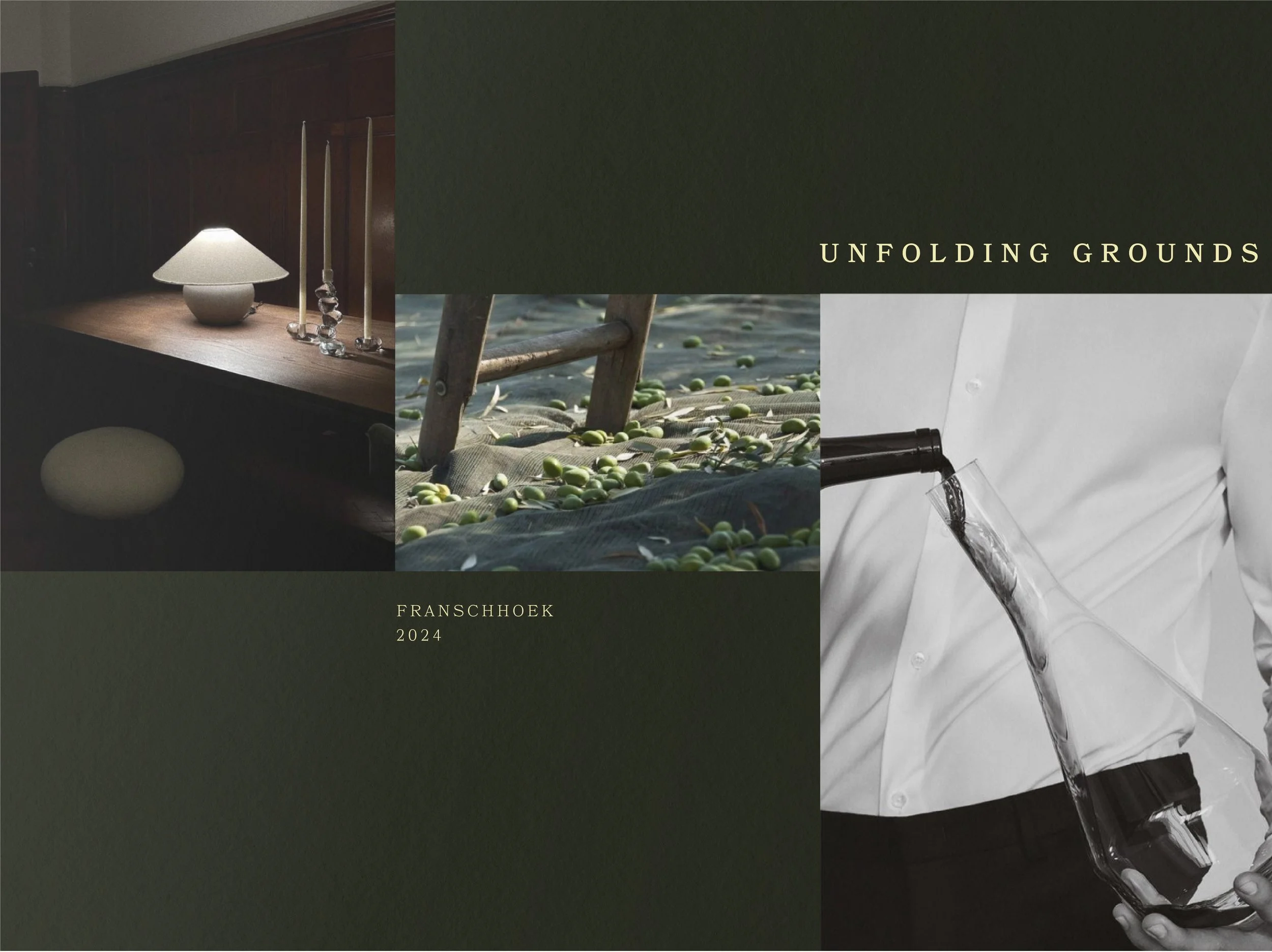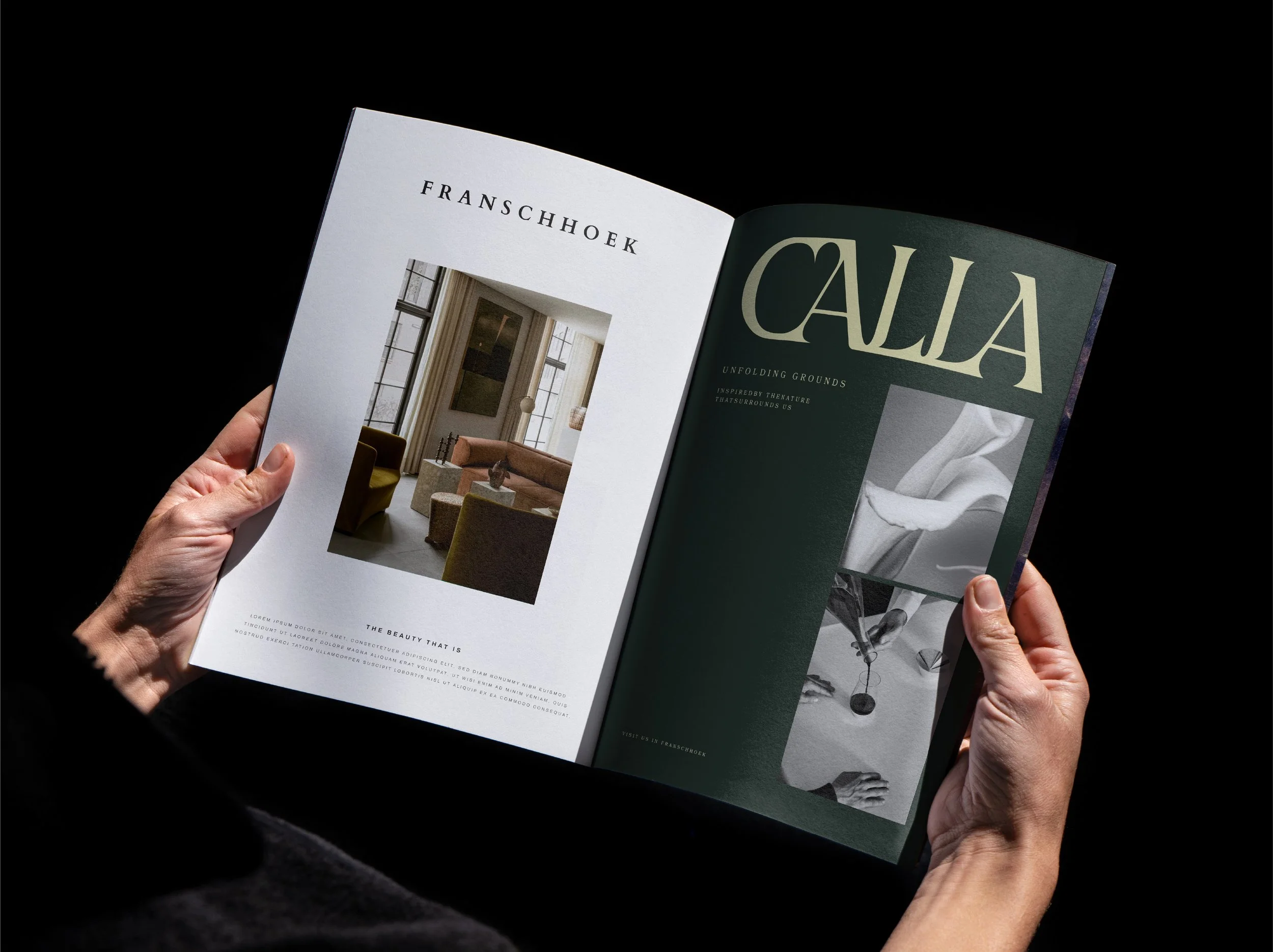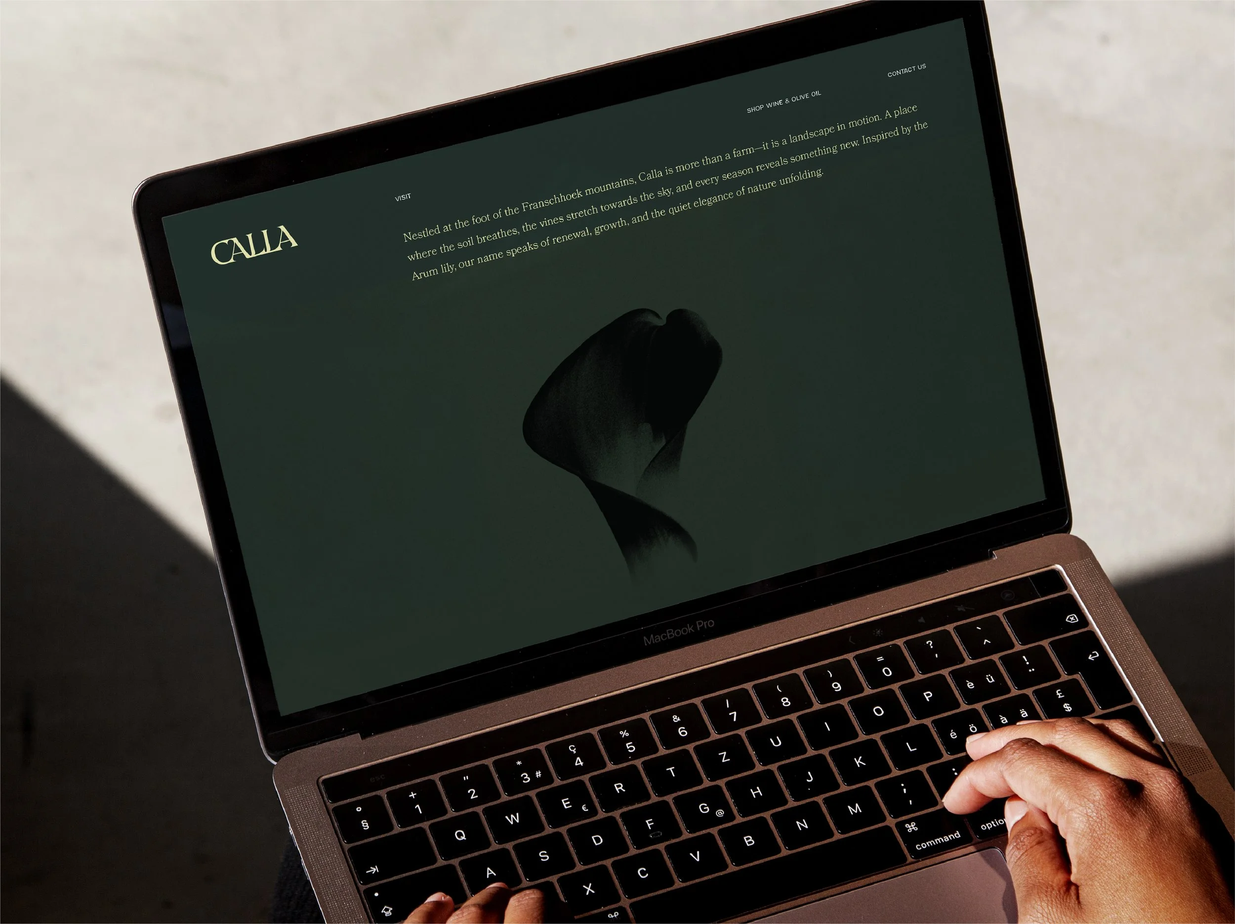
Calla is a wine and olive farm rooted in the quiet strength of the earth - where nature and time collaborate to produce something lasting. Nestled at the foot of the Franschhoek mountains, the farm's branding is an expression of refined simplicity: a place where every season reveals something new. Inspired by the lily, Calla speaks to renewal, growth, and elegance unfolding over time.
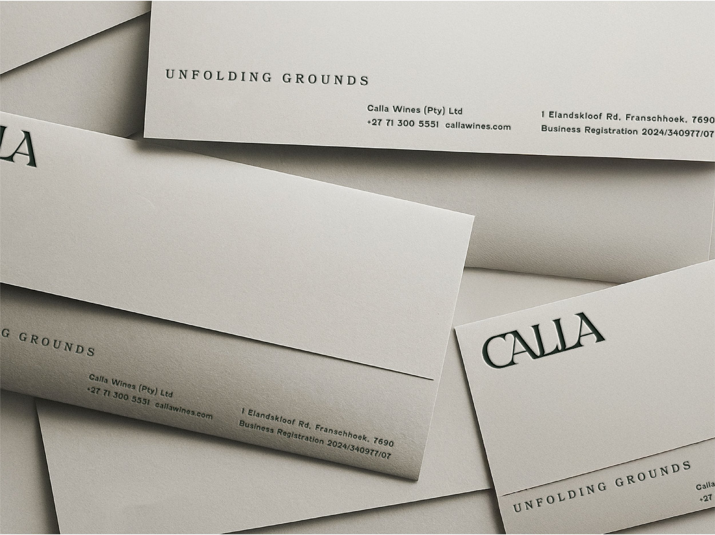
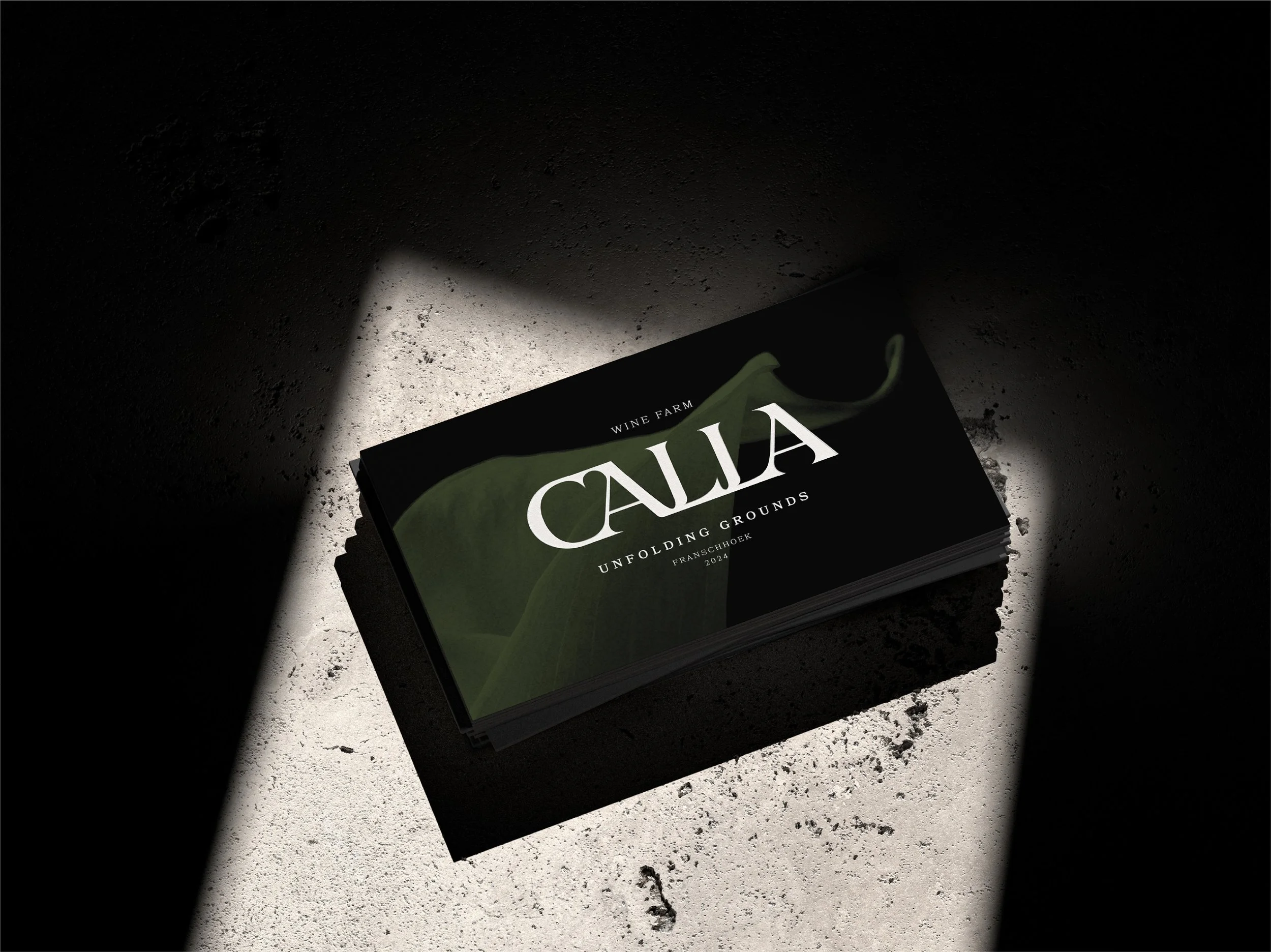
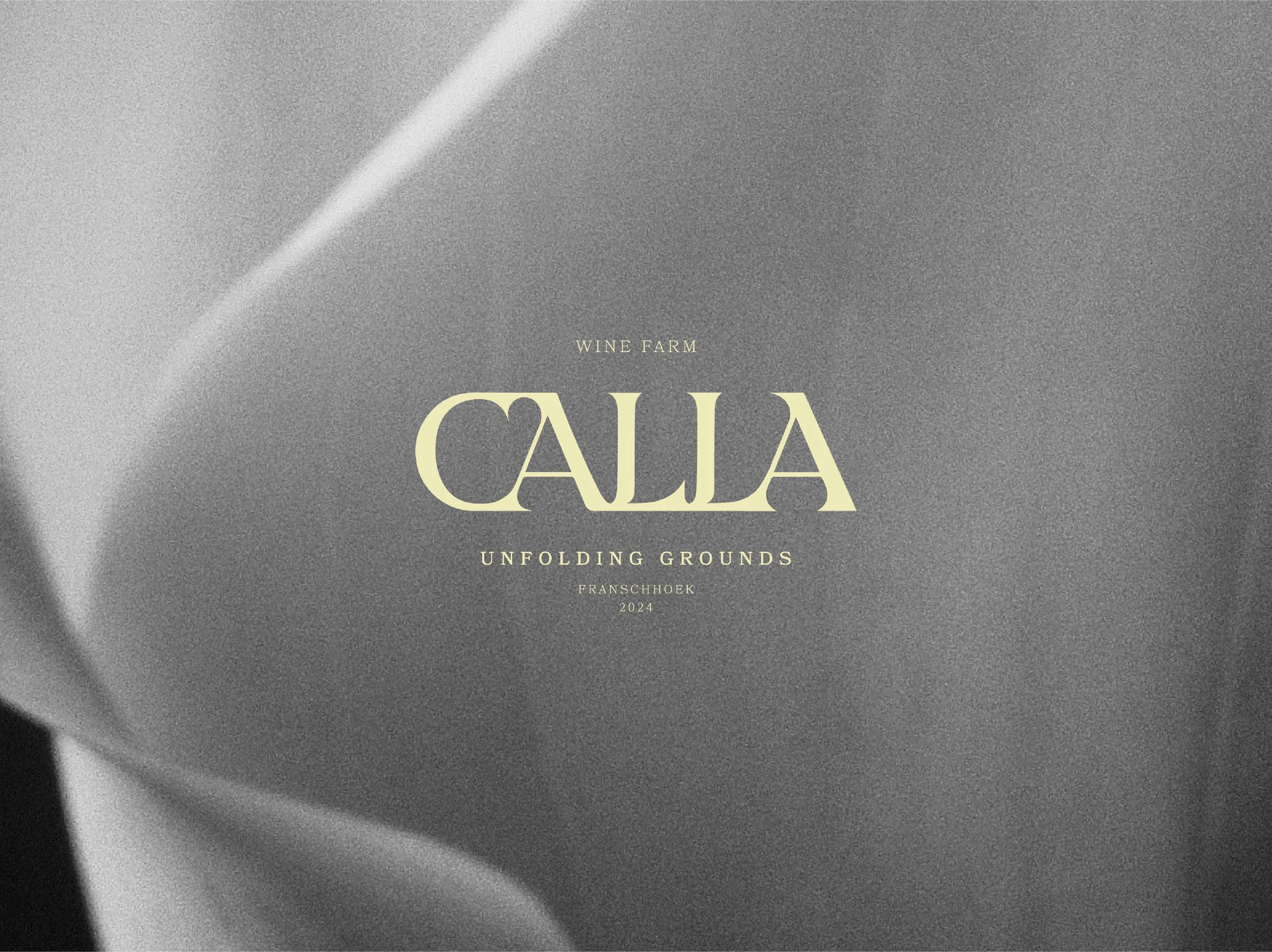
We partnered with Calla to develop a brand identity, crafting the positioning and visual language to feel intimate, nature-led, and quietly sophisticated. At the heart of the system is a typographic wordmark paired with the tagline Unfolding Grounds - designed to feel timeless, grounded, and premium.
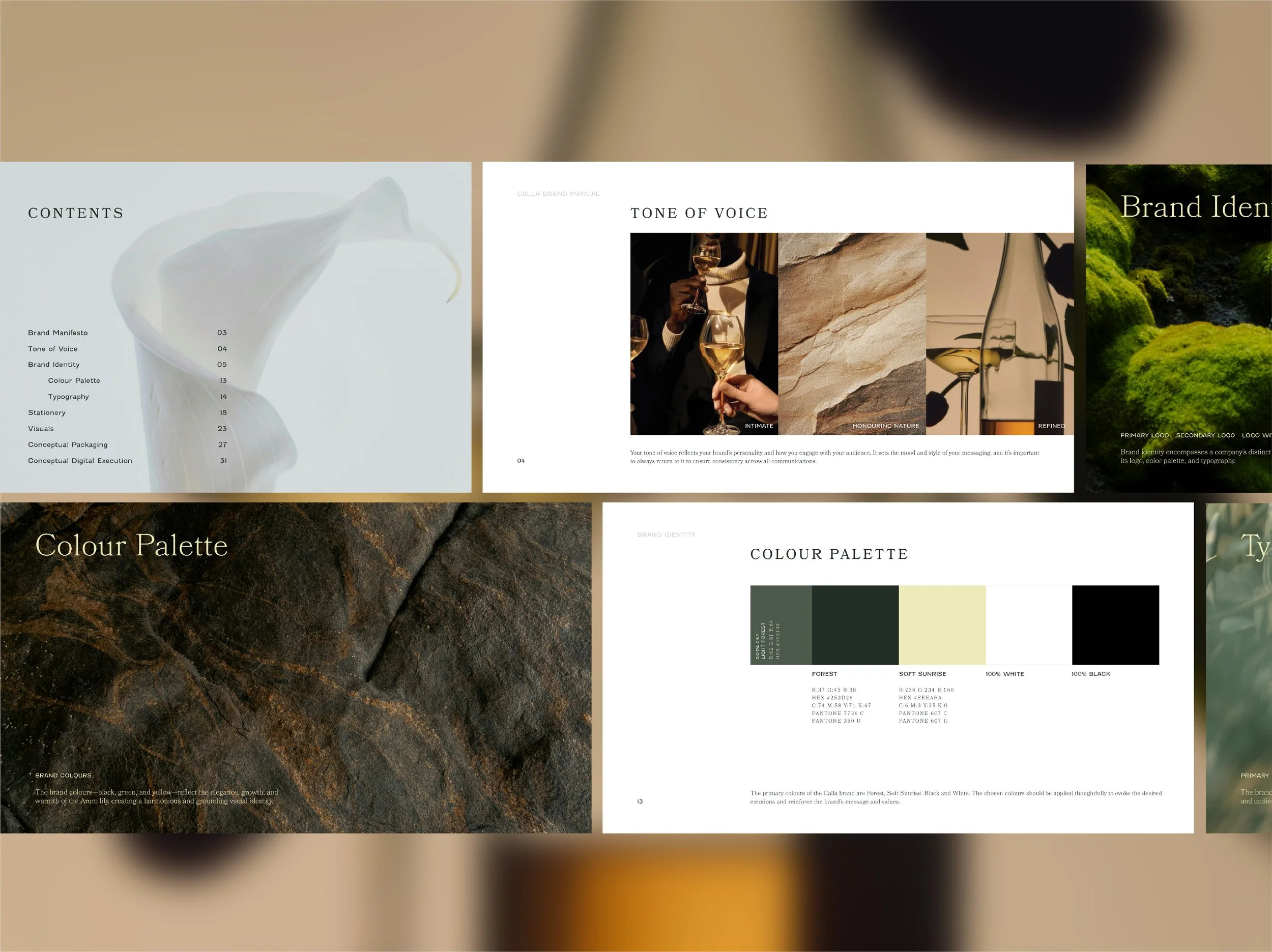
A palette of forest greens, soft sunrise warmth, and stark black and white draws directly from the landscape, while reinforcing the balance between tradition and modern craftsmanship.
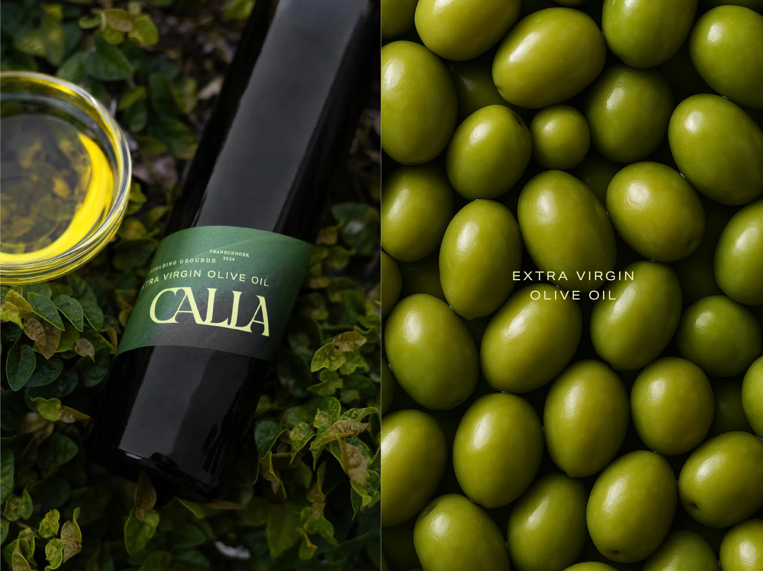
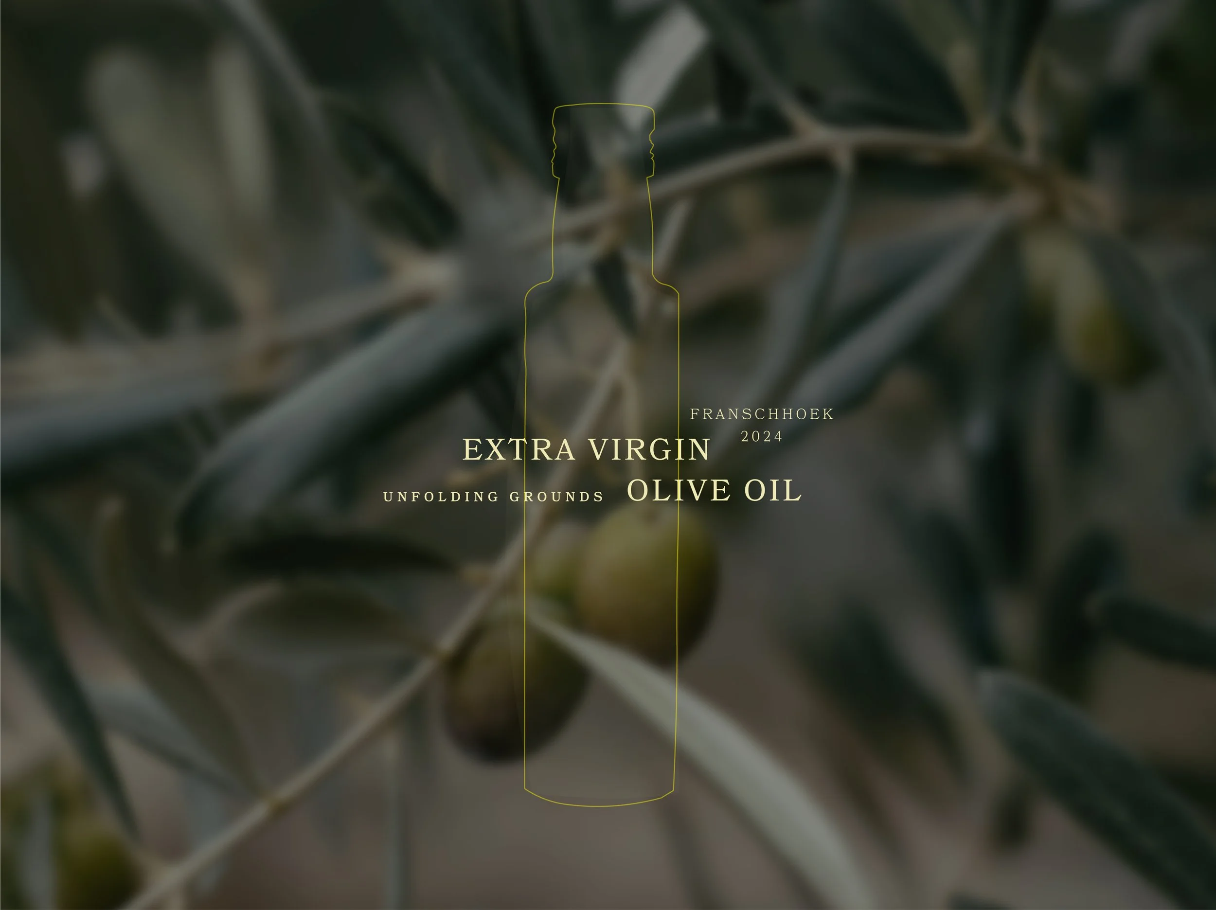
The project extended across a full brand manual, stationery suite, and conceptual packaging direction for their products. Uncoated papers, premium finishes, and subtle structural references to lily petals create an elevated product experience that remains deeply connected to the land. This starting point later evolved into the launch of the Olive Oil.
A digital design direction was also developed for web and social, ensuring the brand translates seamlessly across every touchpoint with warmth, restraint, and quiet elegance.
SERVICES:
Brand Identity Design | Packaging Design | Brand Manual Design