
Buya means to return, to come/go back.
This definition spoke to the owners because of their vision for the winemaking being focused on minimal interference. They also resonated deeply with the figurative side of the definition - returning home, to love and basics.
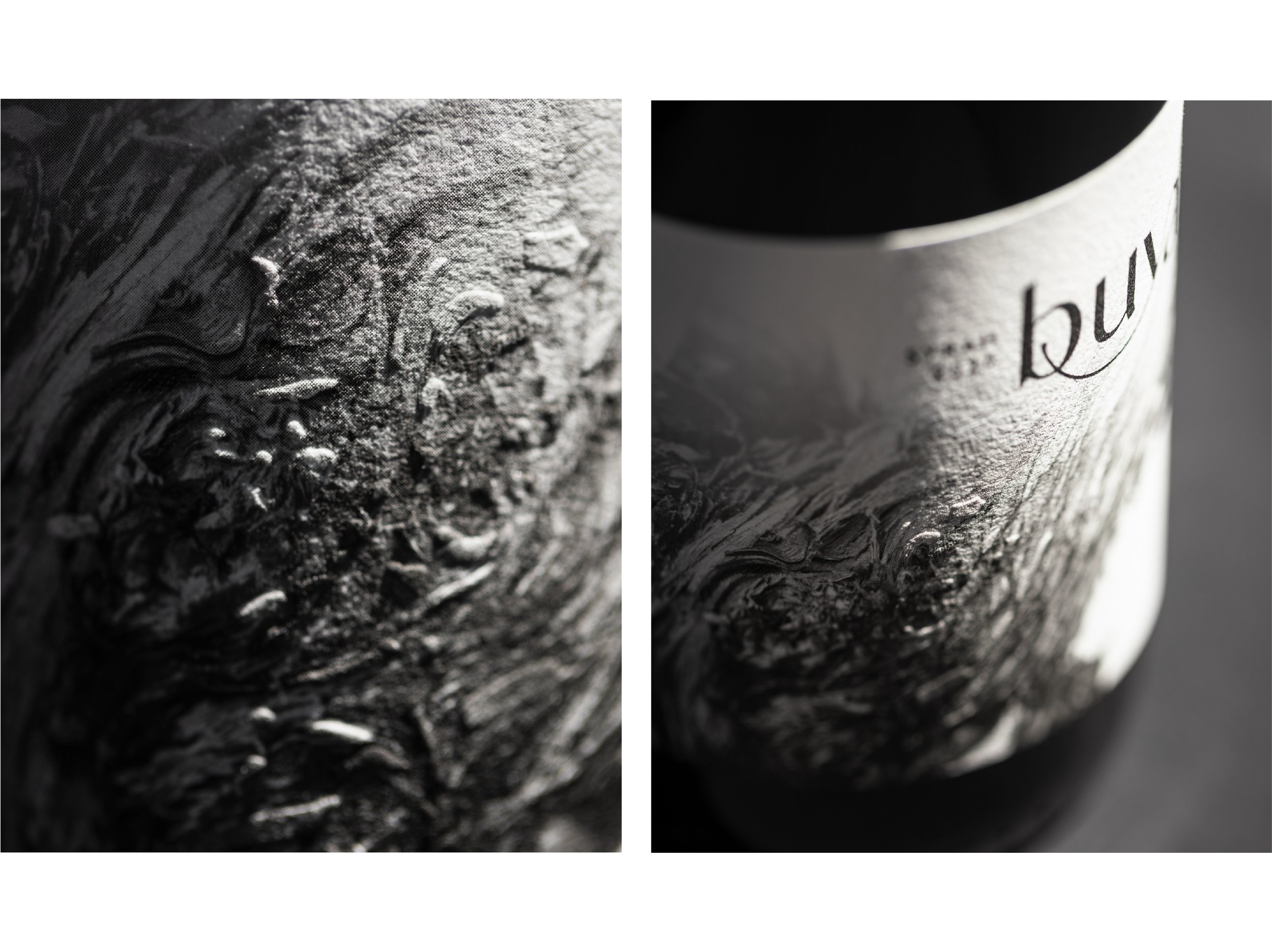
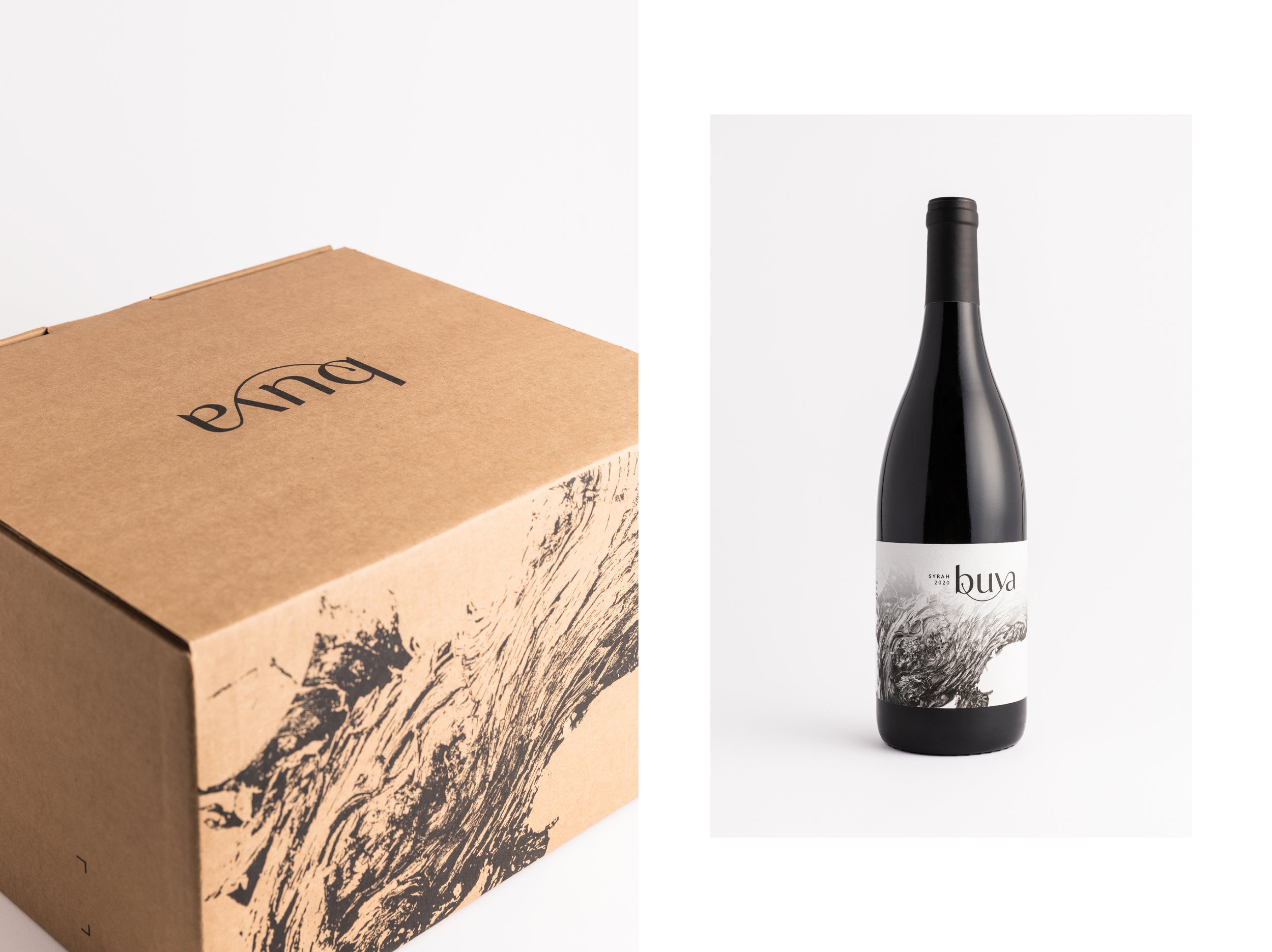
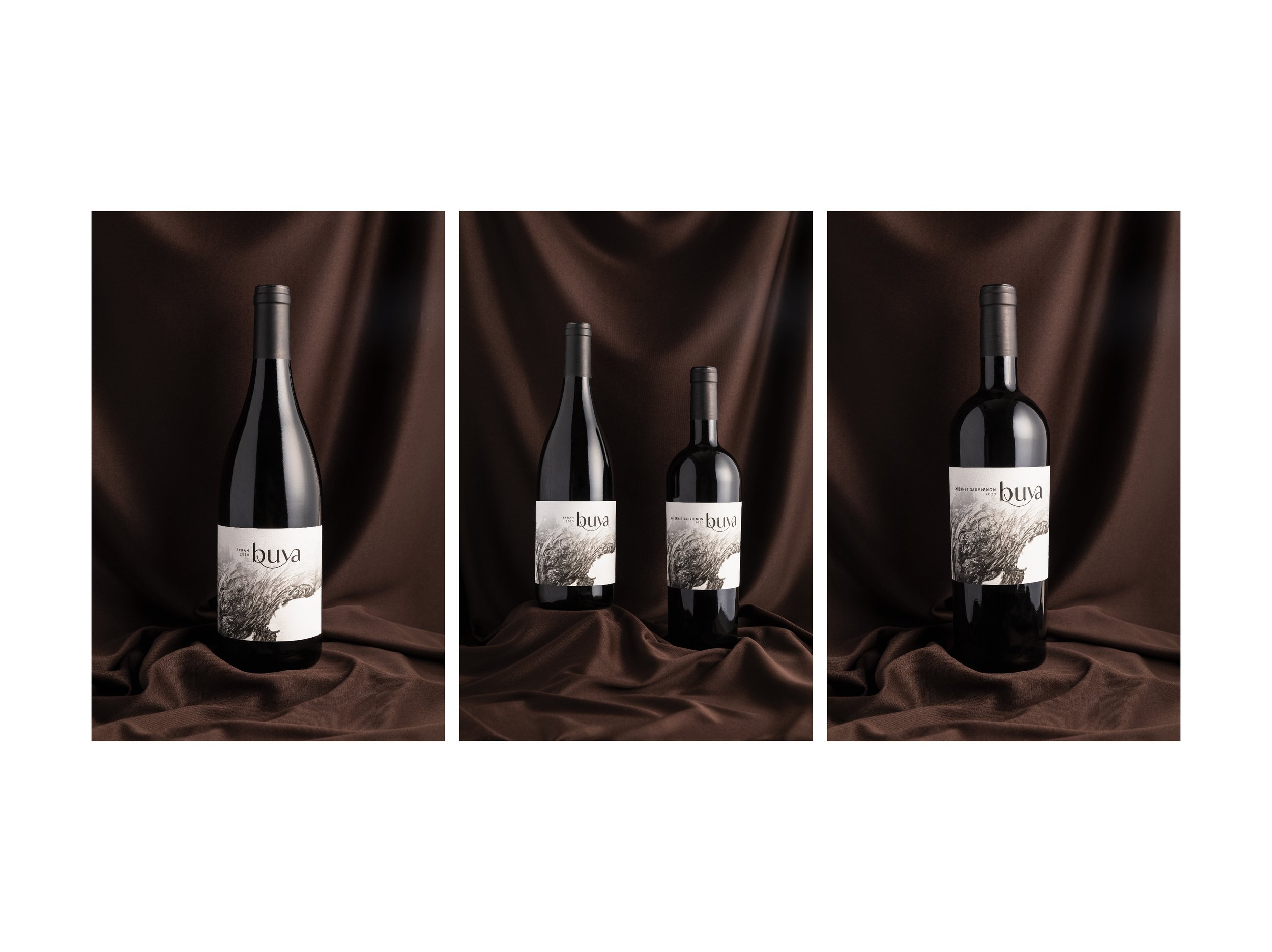
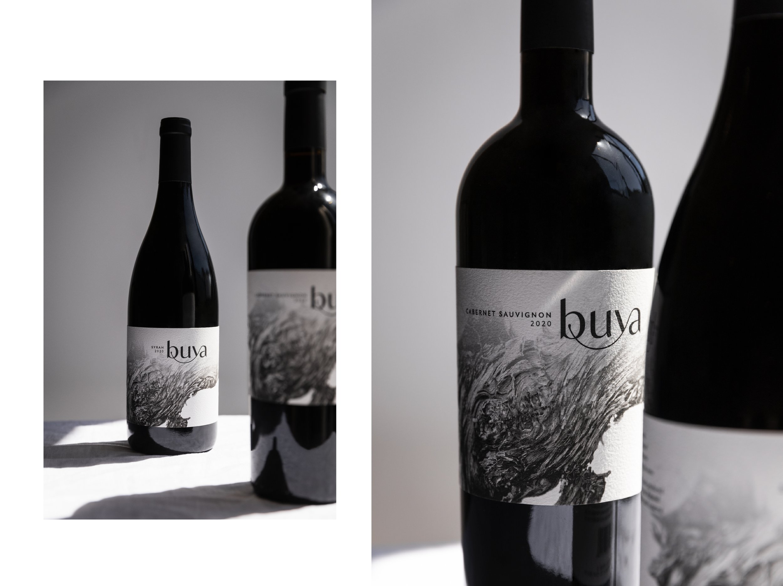
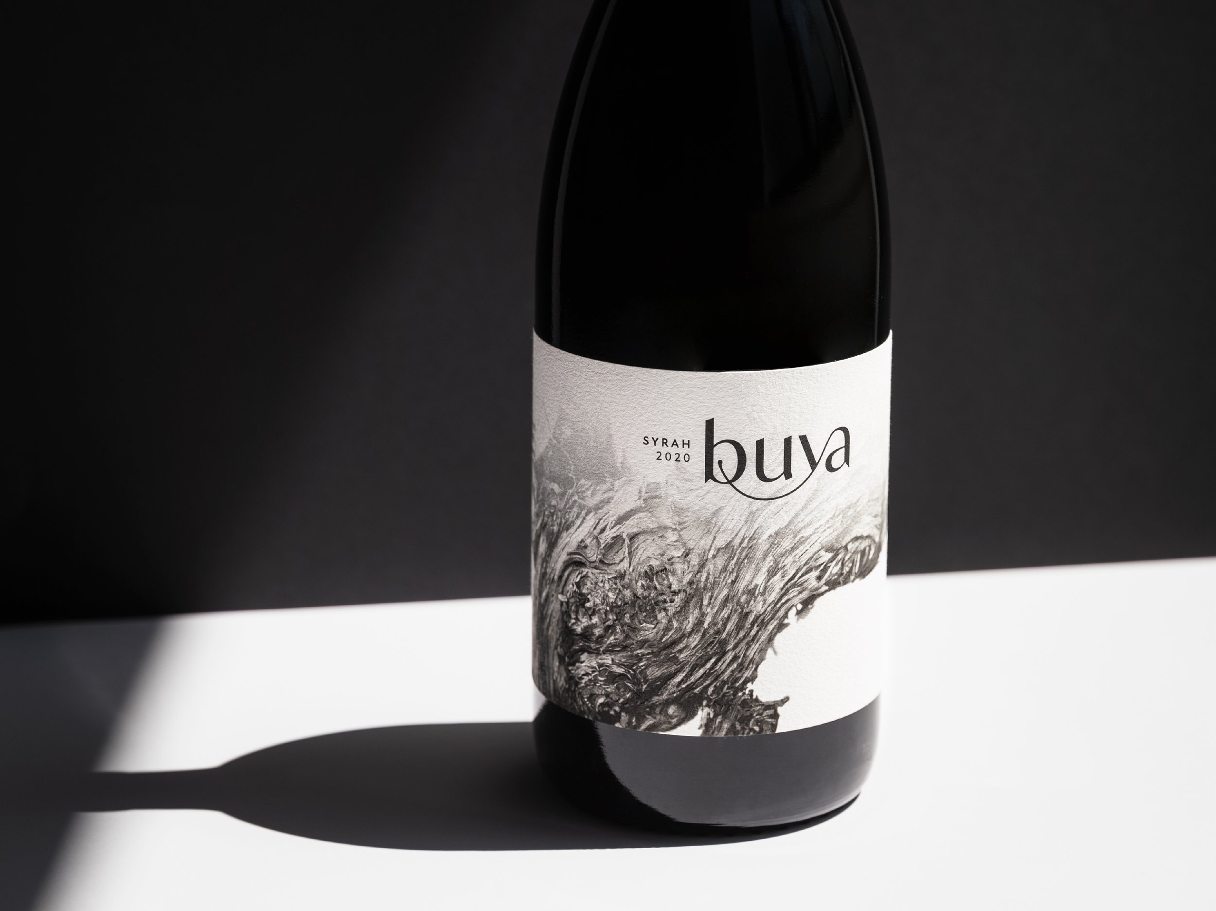
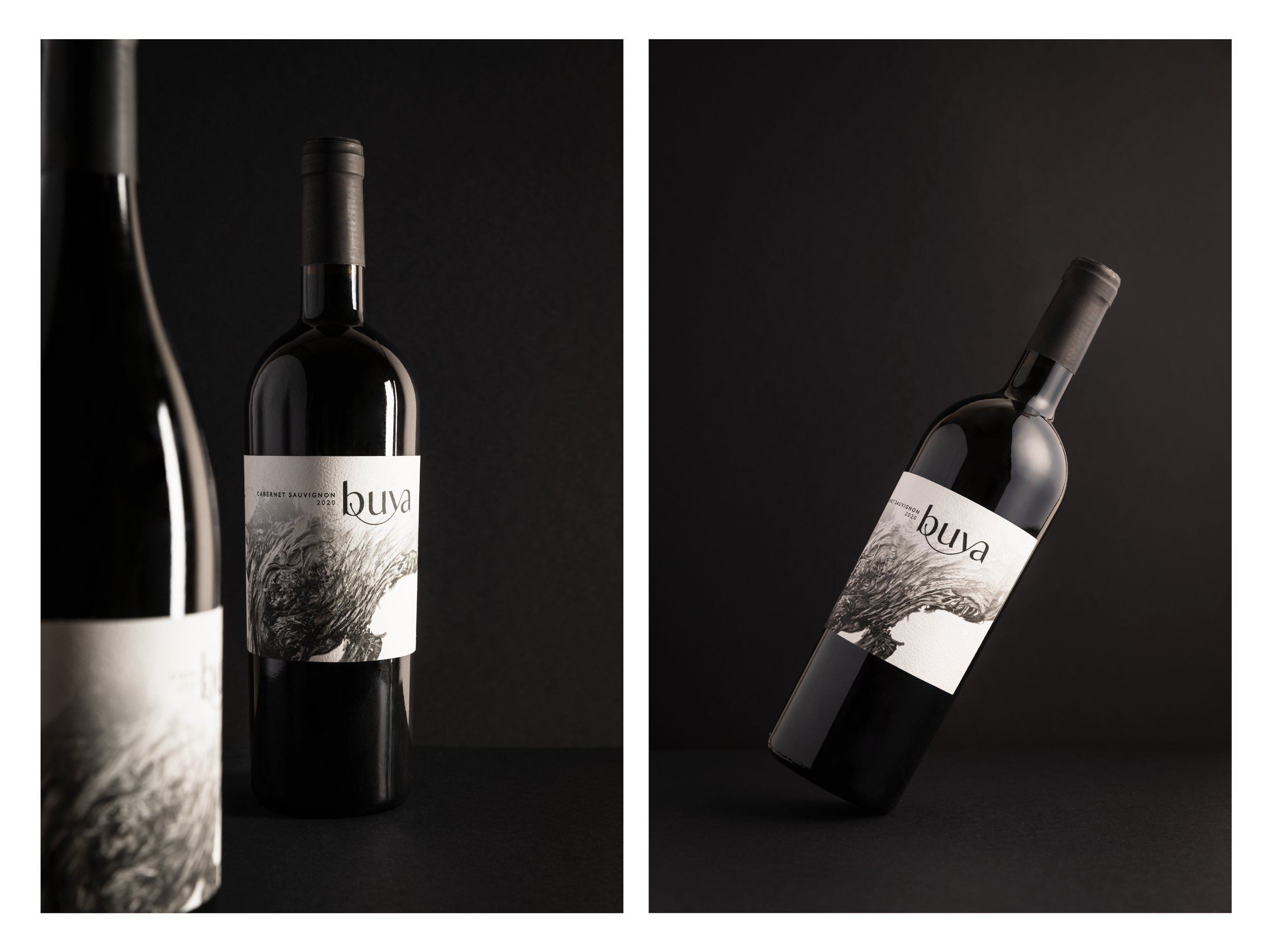
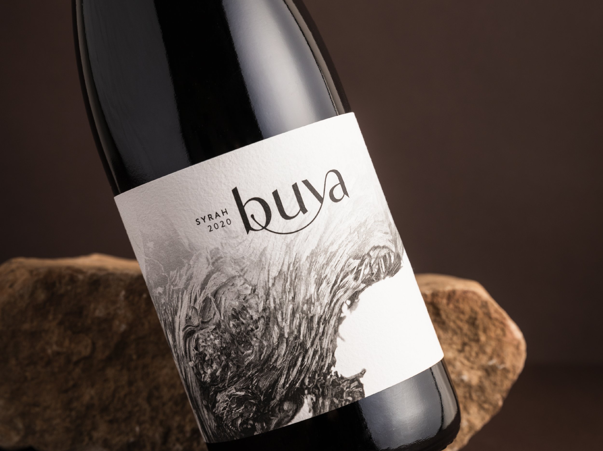
We therefore came up with the concept of traces to inform the label design. This concept focused on the road to getting back or returning. It looked at the journey and the traces that get left behind and created in the process.
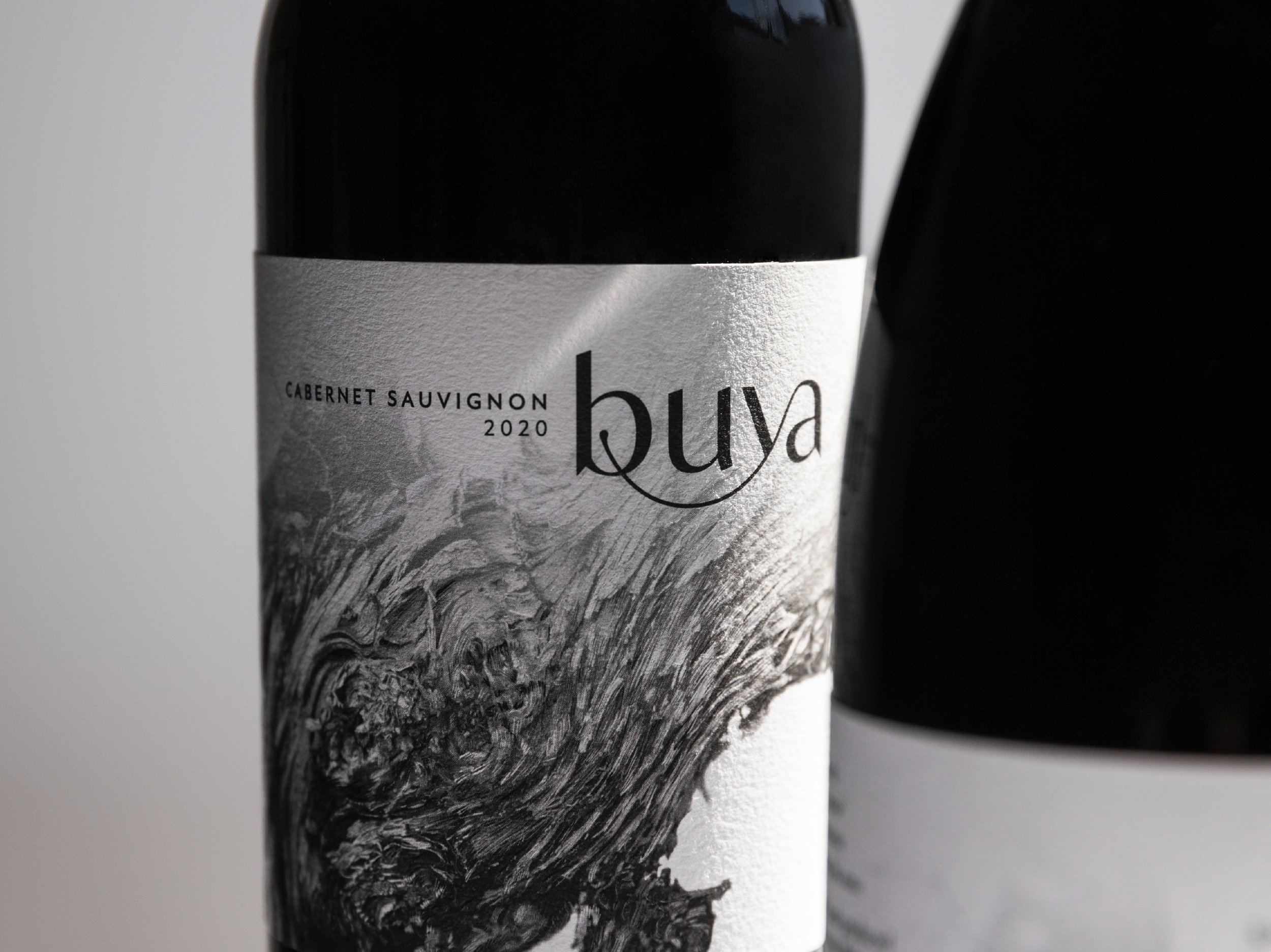
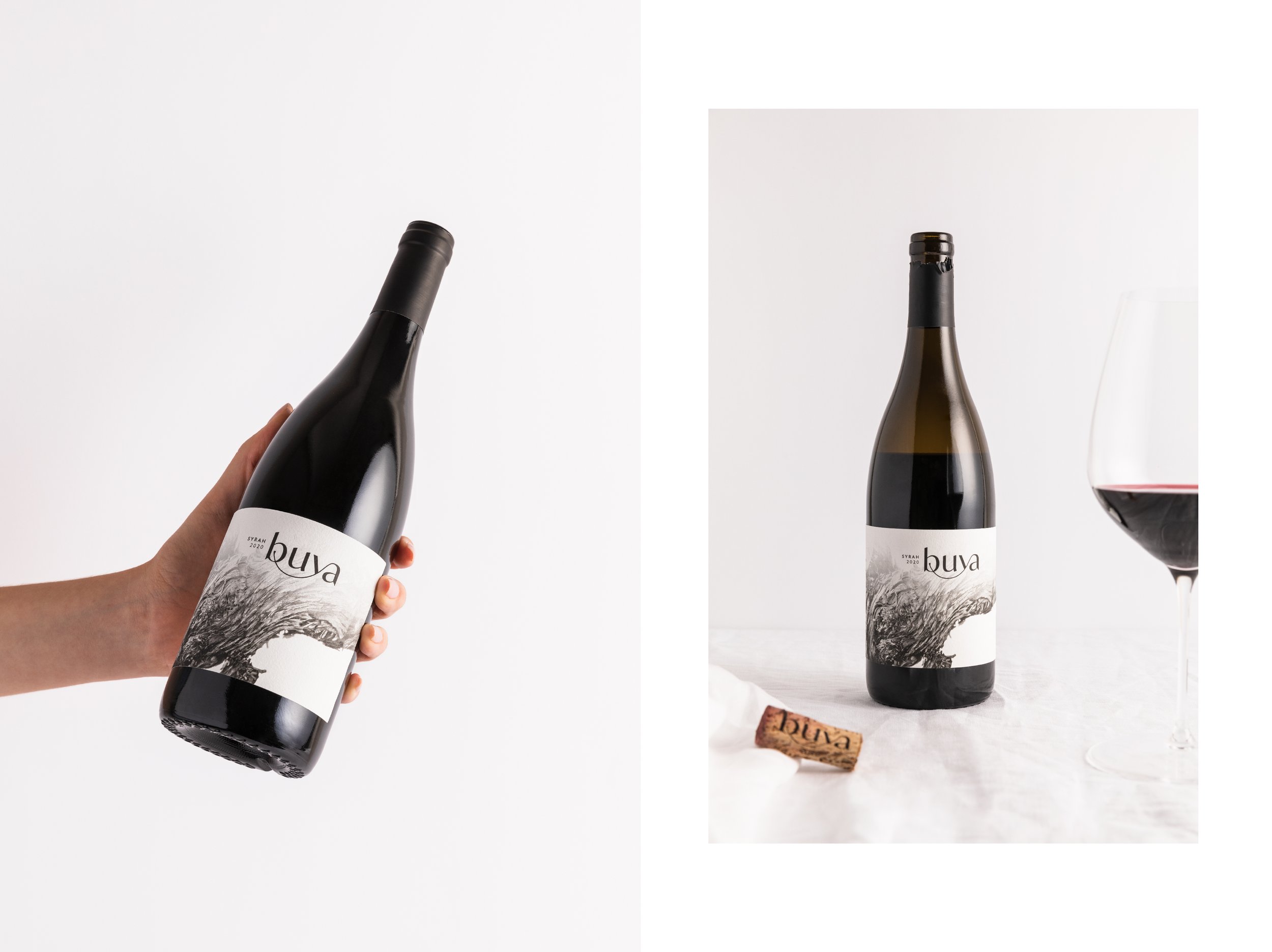
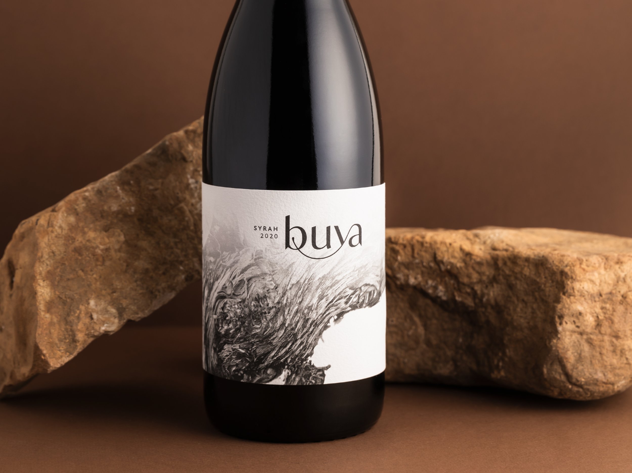
By doing this, it celebrated the outcome of having returned and marvelling in the process and appreciation of the journey. From a design execution perspective, we made use of texture on the label to symbolise the left behind traces and how they shape the destination. These textures were pulled from a vine bark illustration that was applied in a way where the close-up detail almost becomes more artistic than literal.
The design uses a monochromatic colour palette, which makes the techniques and elements that are left on the design, stand out more prominently.
The creative vision for the label was for it to be more intriguing than striking, as this concept is based on something inconspicuous, yet felt or experienced. The outcome is elements of reminiscence, with a timeless quality.
SERVICES:
Label Design | Production Management | Photography : Rebecca Richarson | Project Management