
Idun is the goddess of eternal life and fertility - which inspired us to create a wine brand where every bottle tells a simple, universal story of ethereal journeys and fulfilled dreams.
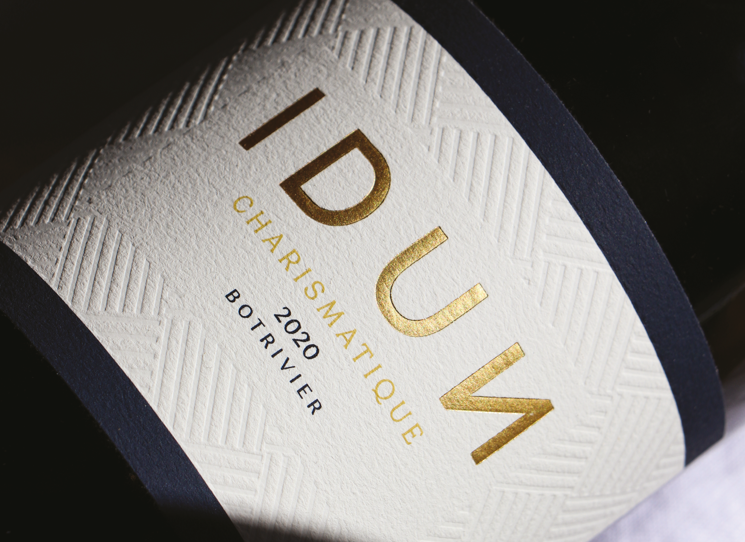
IDUN POETIQUE RANGE
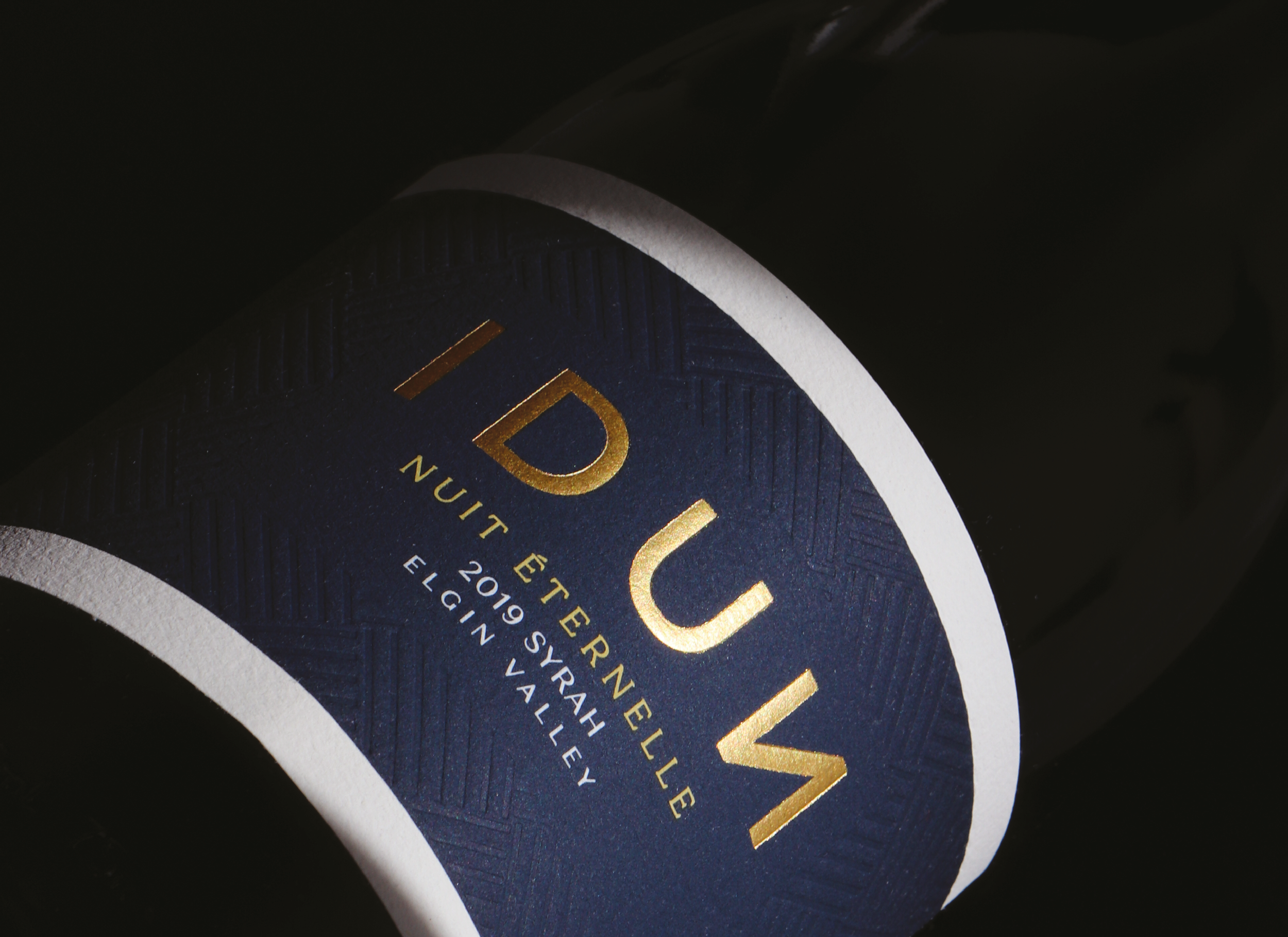
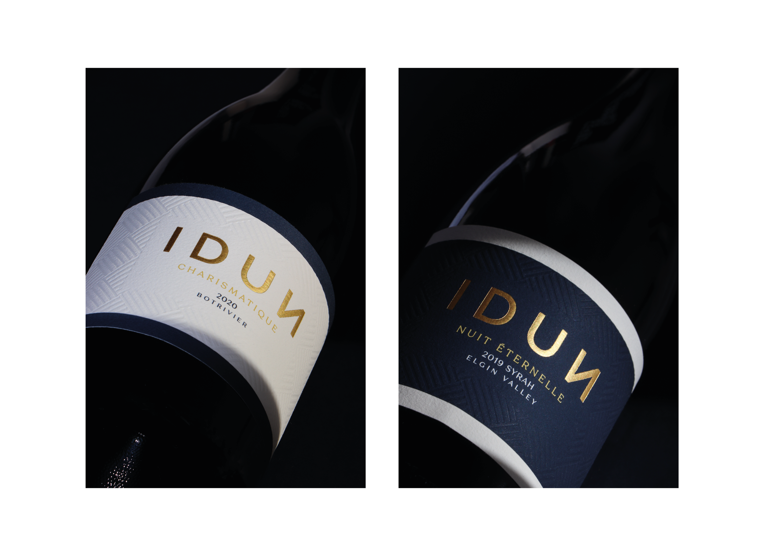
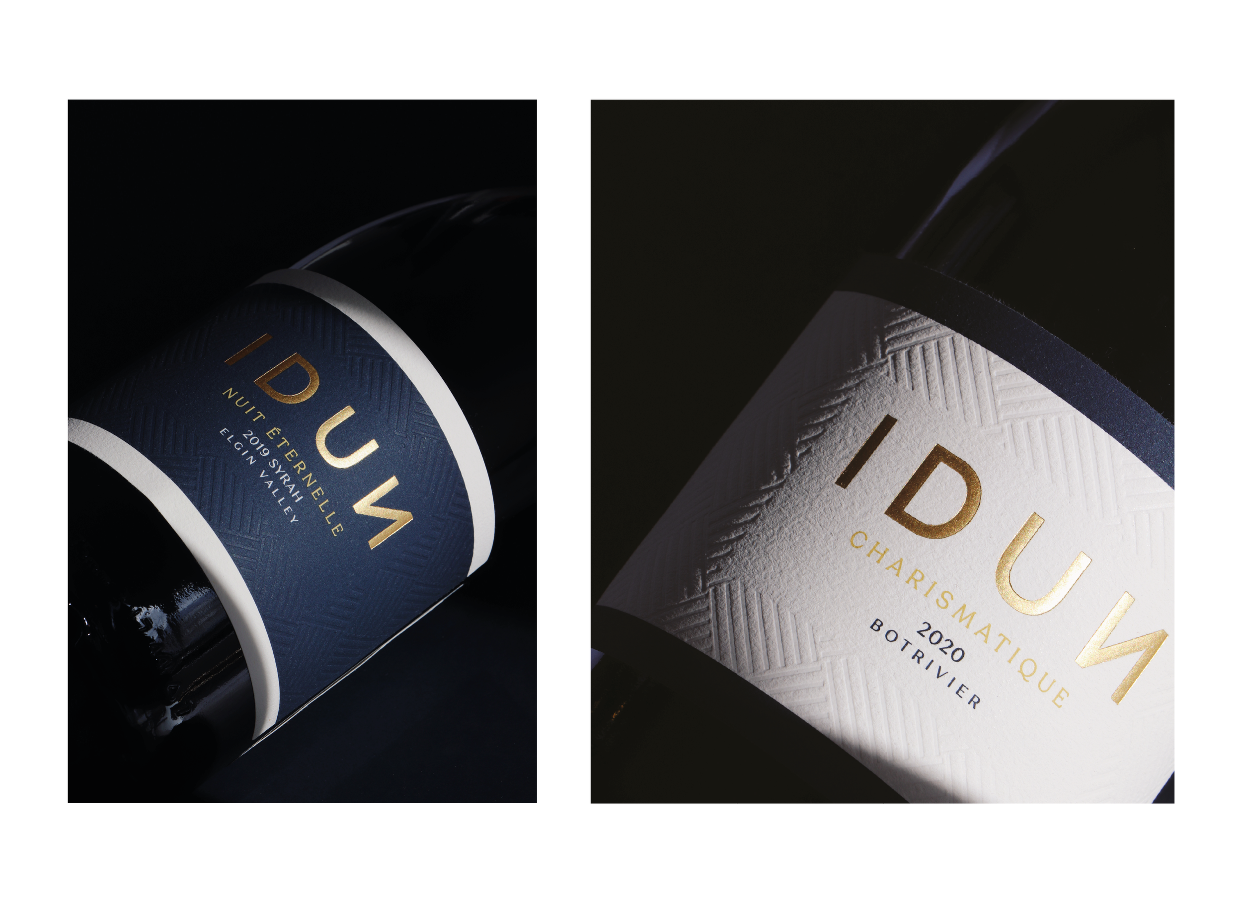
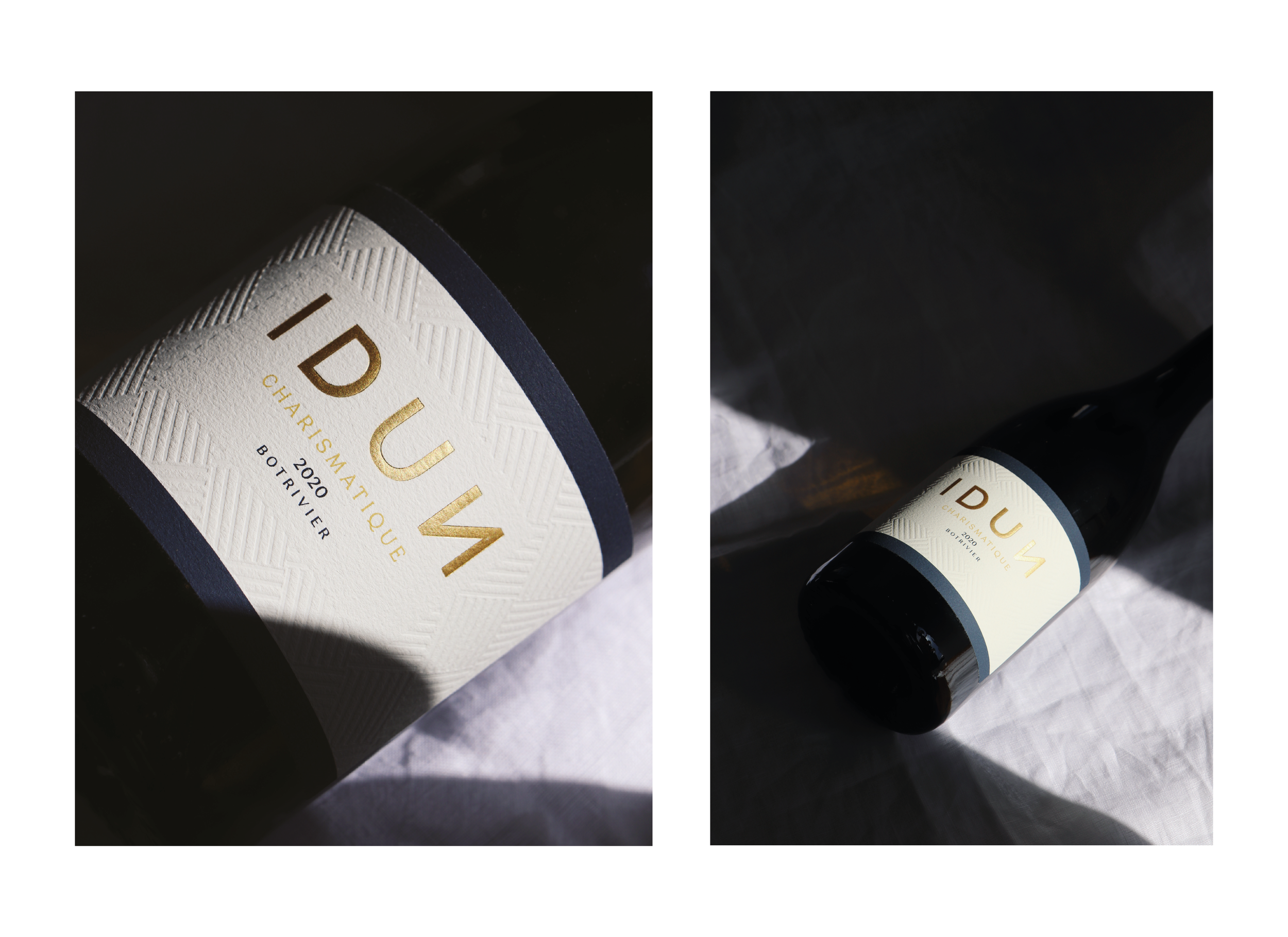
As an update of the old label designs, we kept the elements that are unique to the expression of this story - the regal colour palette and the bold, modern brand identity. These elements compliment the Norse mythology origin, as it is Scandinavian (clean) and pantheon (religious).
To frame the label, contrasting bold lines were added at the top and the bottom. The strip of colour that fills the space between these lines, is used as the indicator between wine of Origin Elgin and Wine of Origin Botrivier.
Every small detail has been considered, from the shorter capsule to the blind debossed pattern that holds the information.
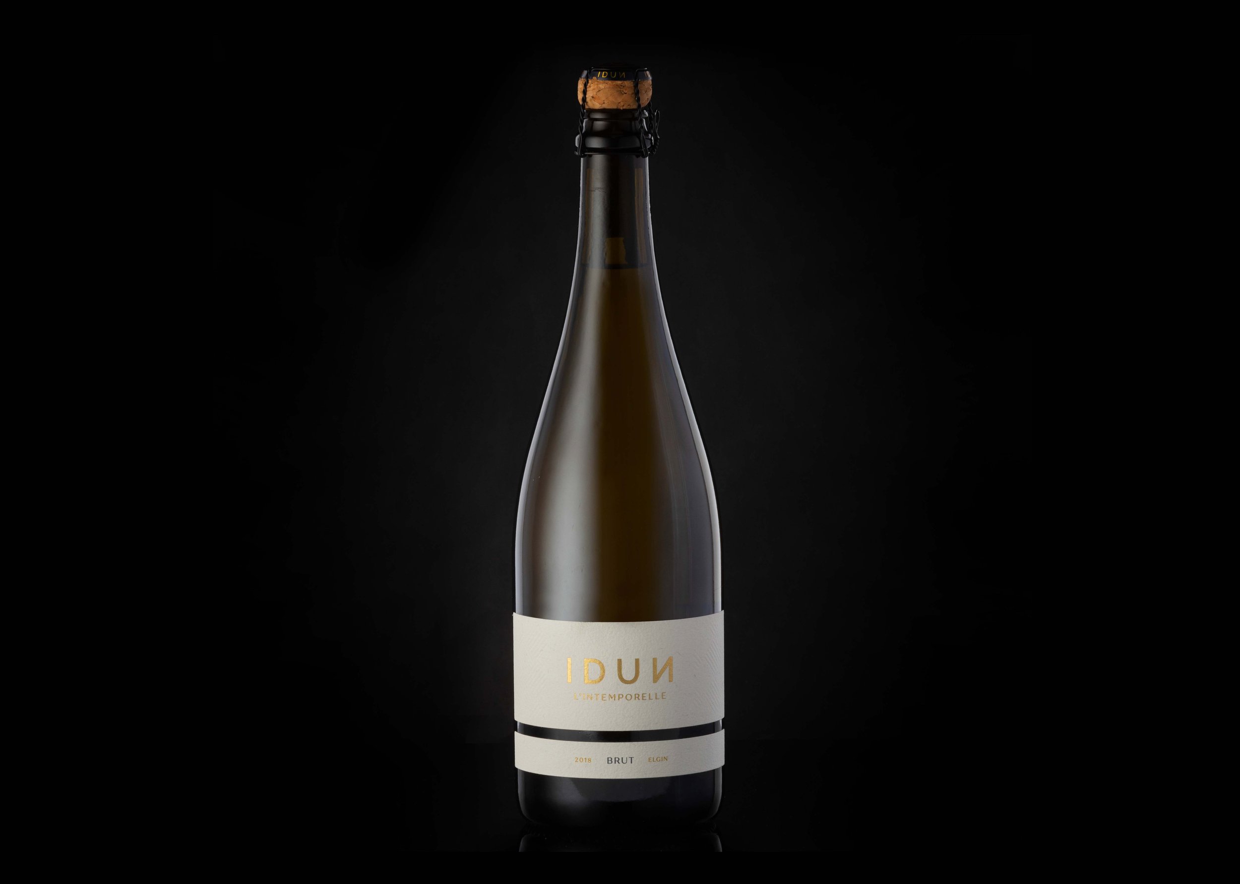
IDUN MCC
The definition of the french word l’intemporelle is timeless.
This modern, yet classic MCC has nowhere to hide. It doesn’t seek to stand out with embellishments, but rather is brave in its simplicity of leaving only what is necessary.
The primarily white and gold colour palette references celebrations, modernity and elegance. The wirehood is exposed, placing all of the emphasis on the label.
The use of 2 labels creates a feeling of the addition of a line, to link back to the other Idun ranges, without having to add colour.
SERVICES:
Logo Design Update | Packaging Design | Label Design | Photography | Project Management | Production Management