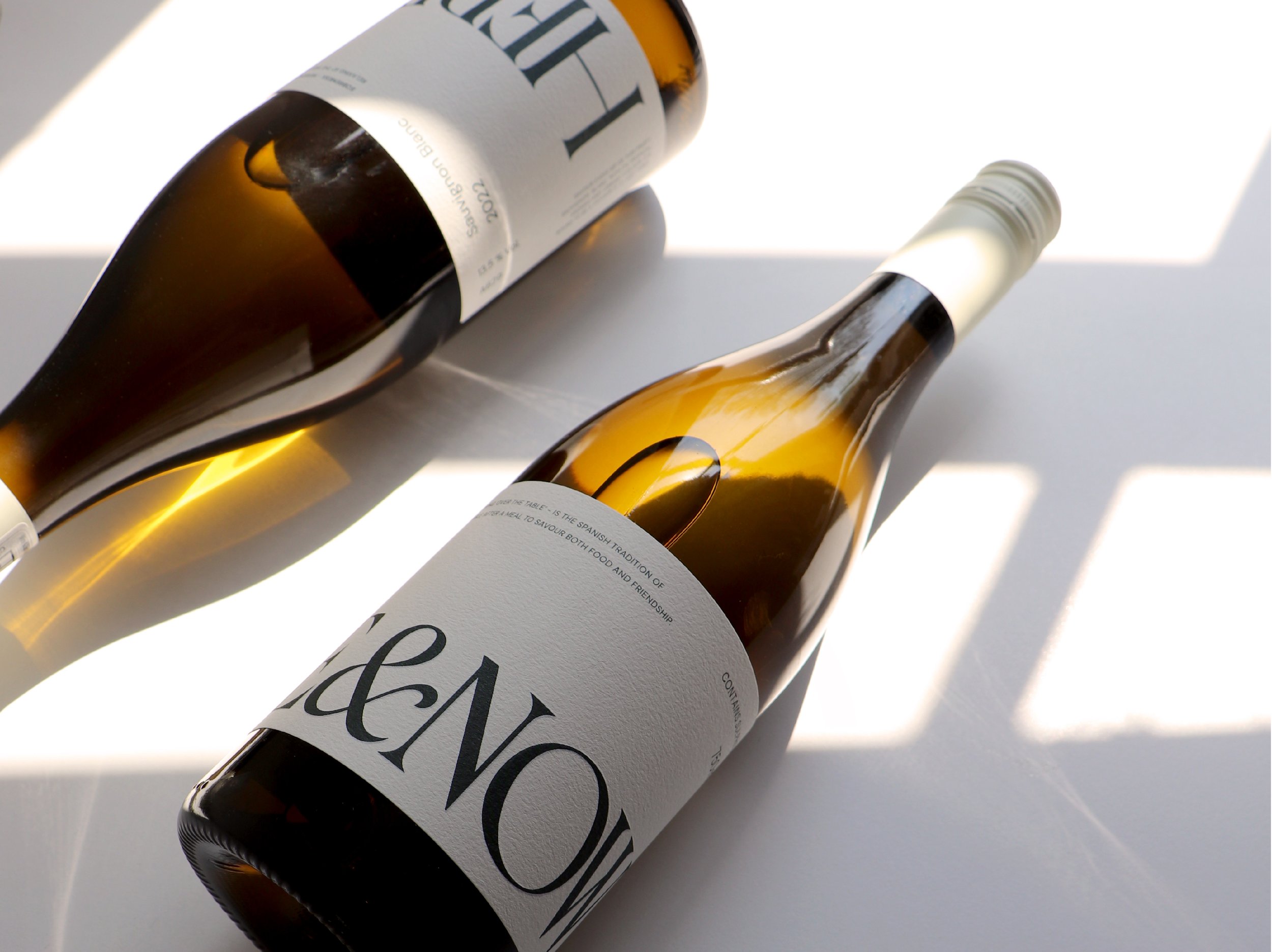
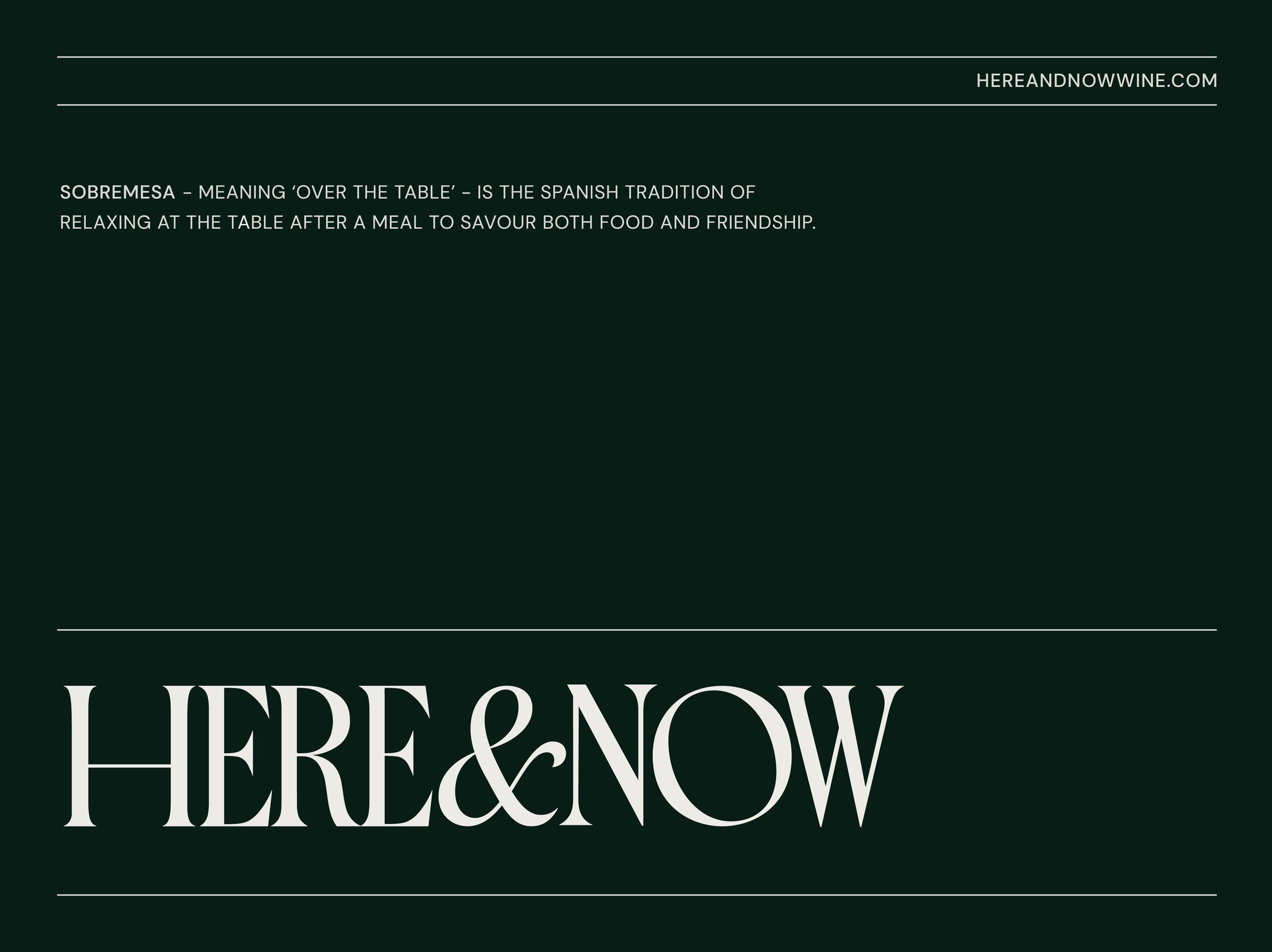
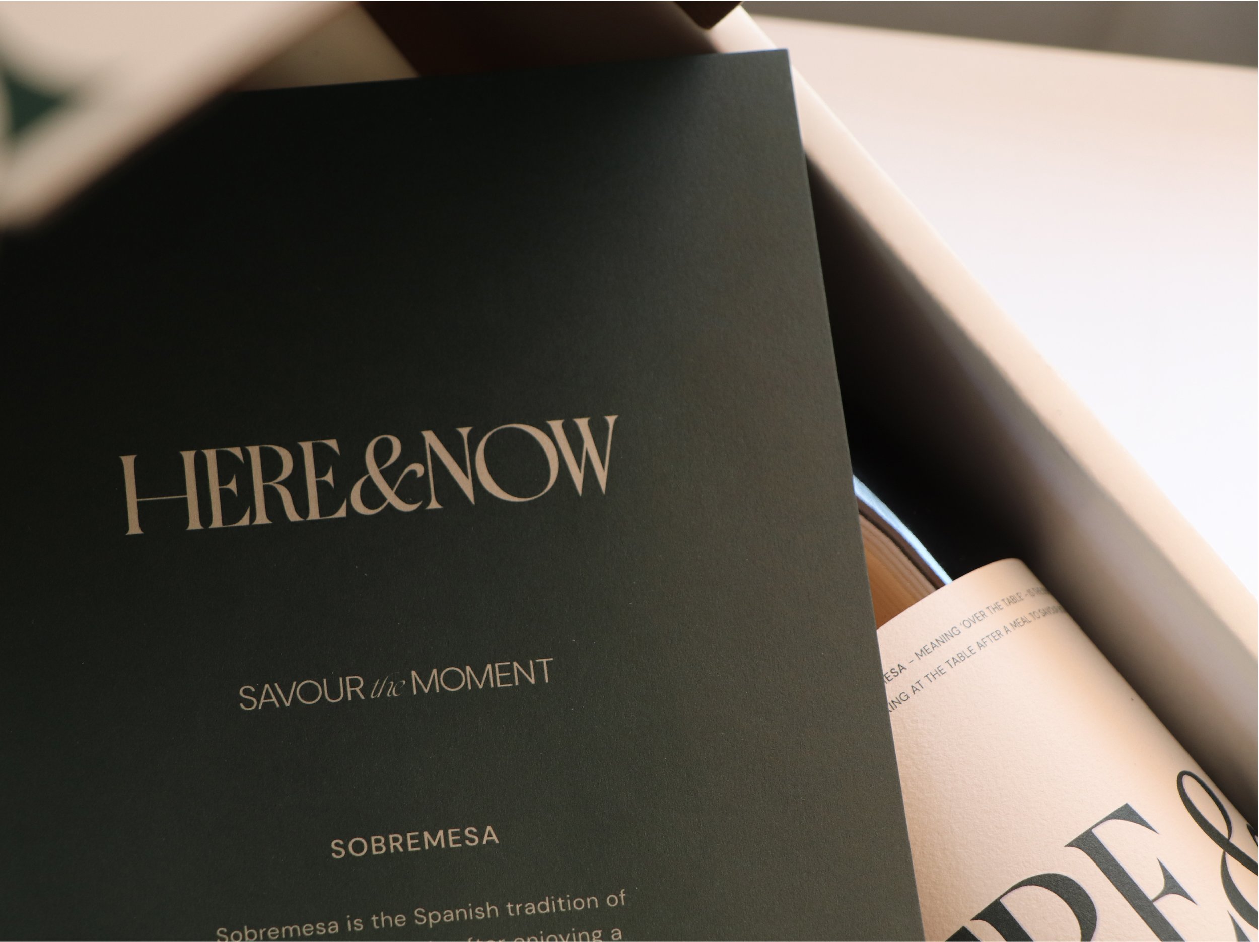
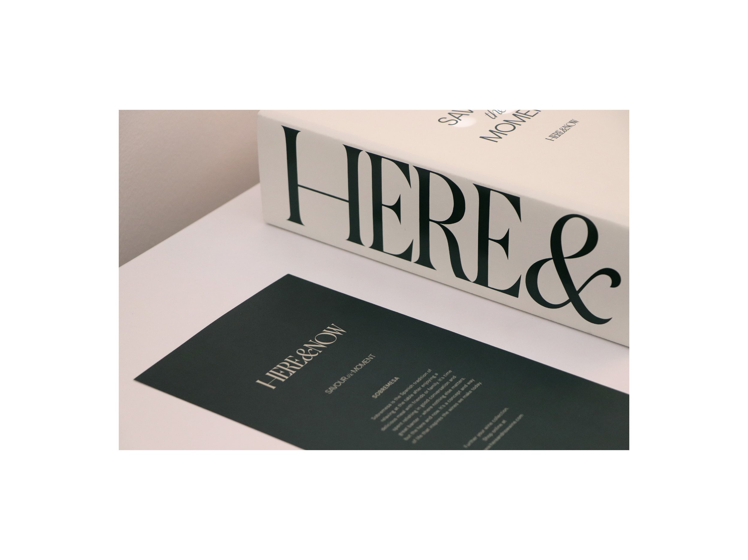
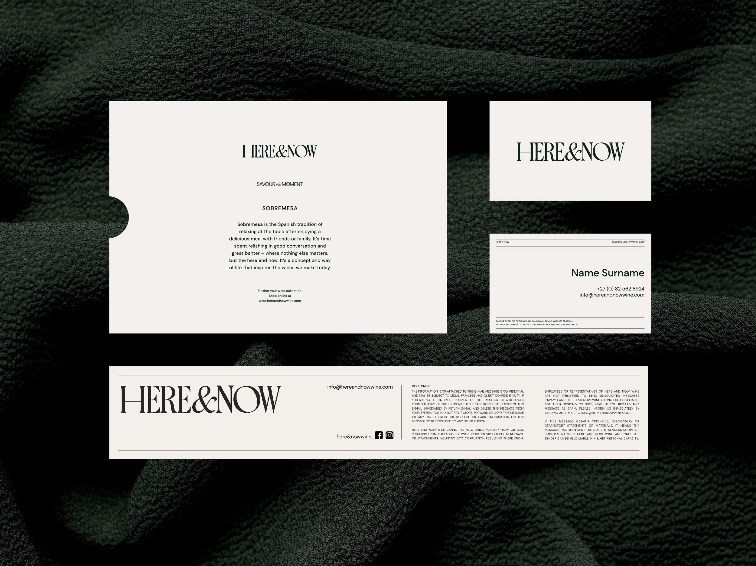
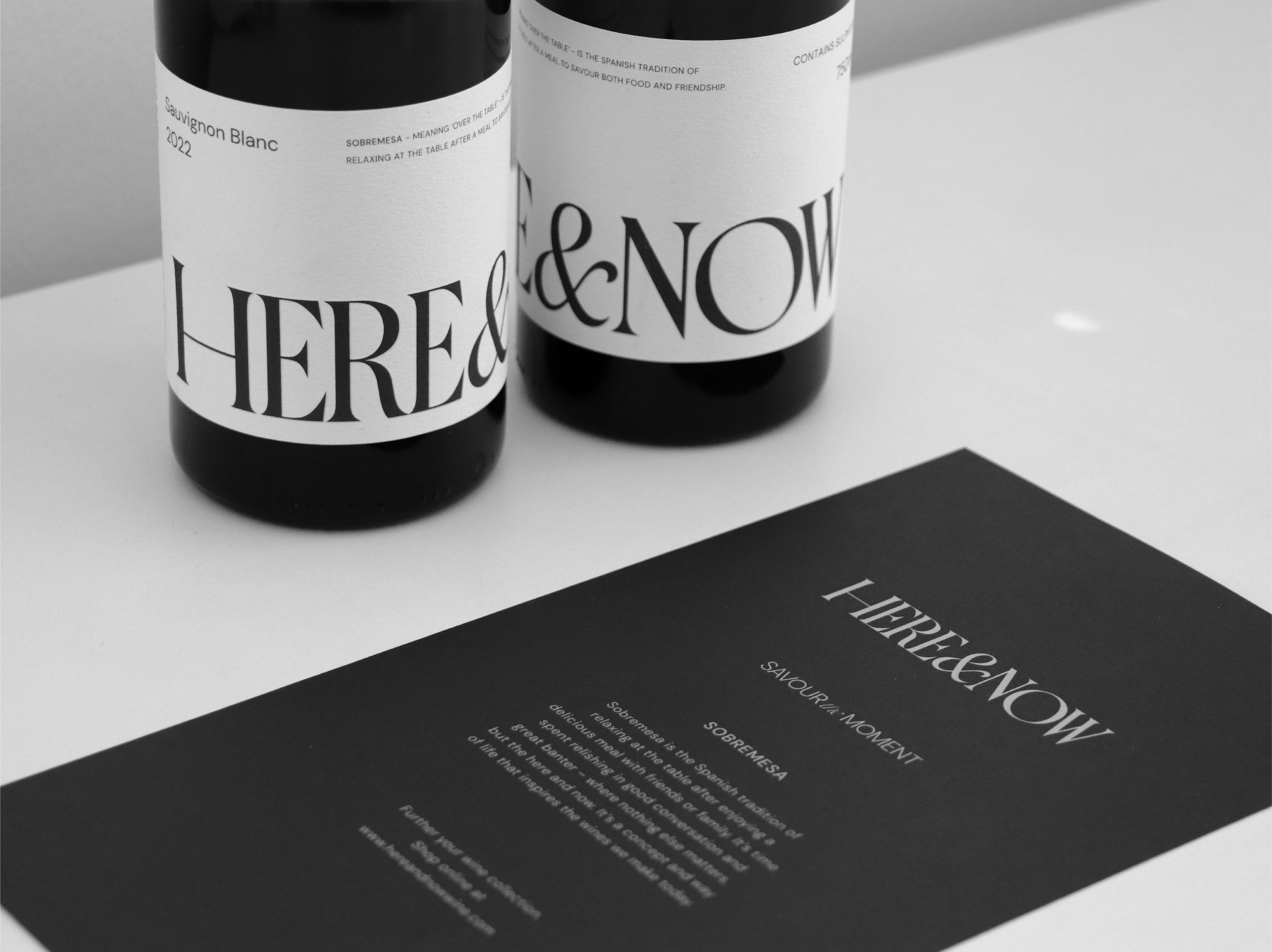
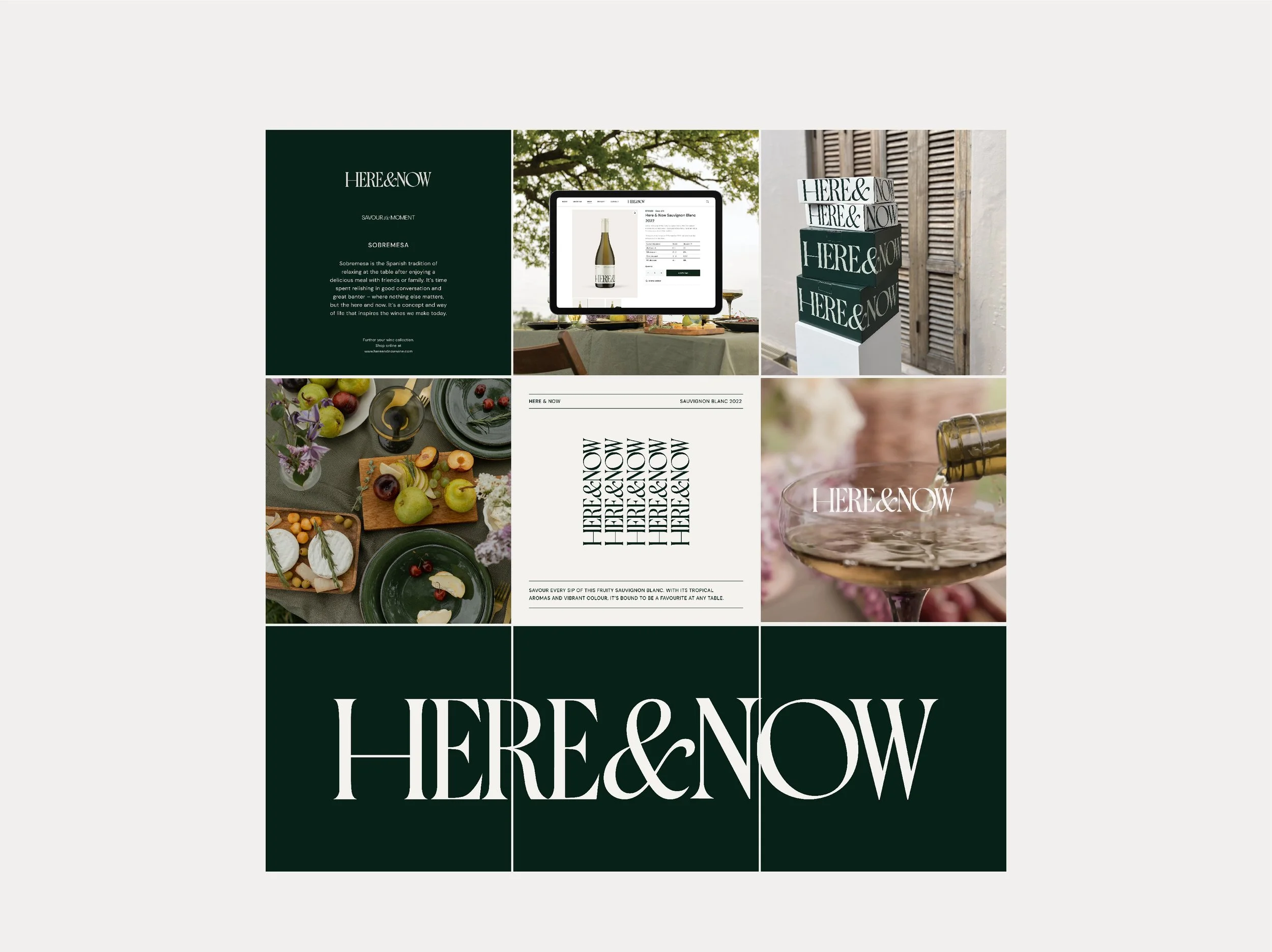
Sobremesa is the Spanish word for “over the table”, meaning the time spent around the table after lunch or dinner, talking to the people you shared the meal with; time to digest and savour both food and friendship”.
This wine celebrates being in that moment, in the Here & Now.
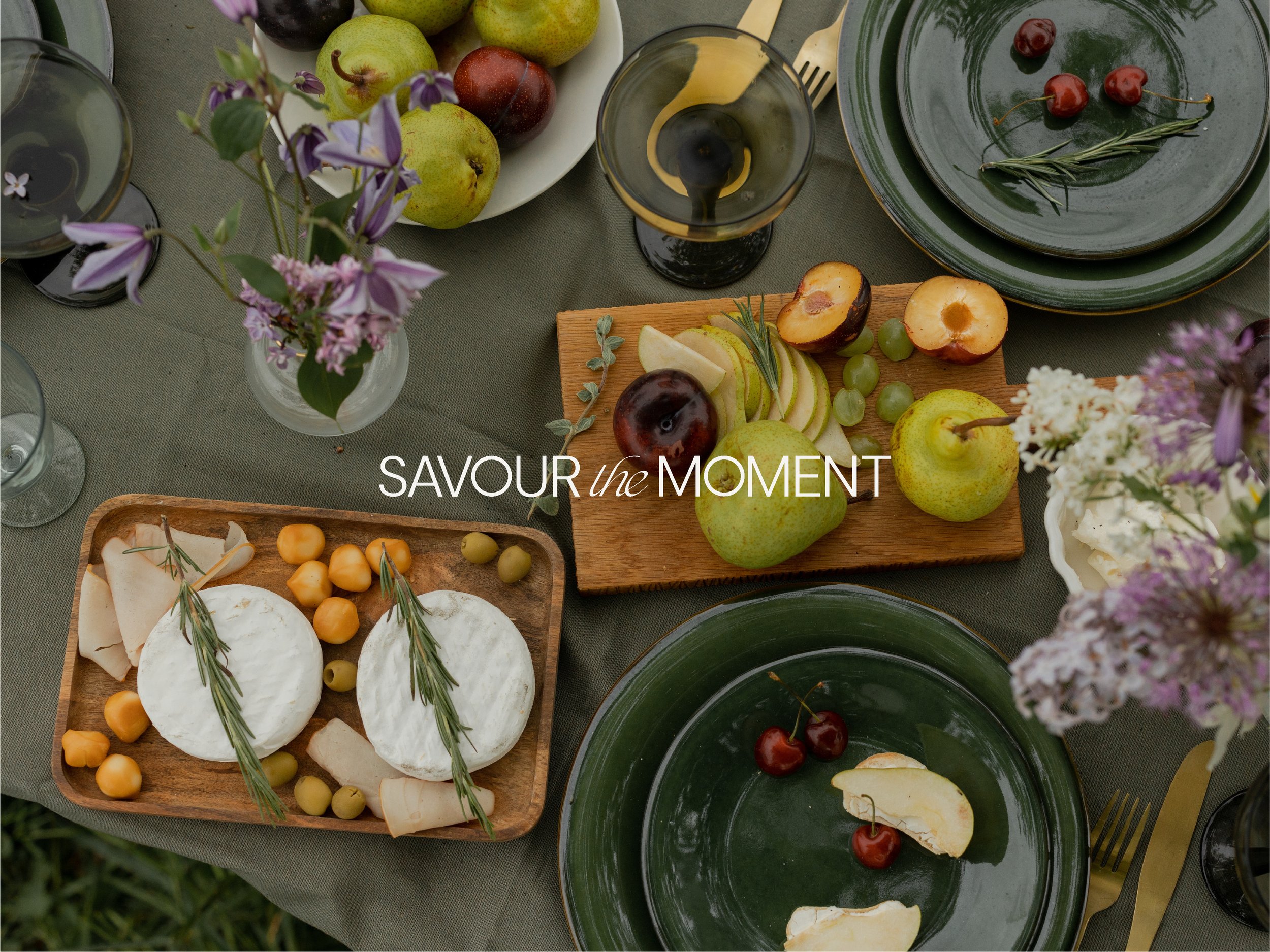
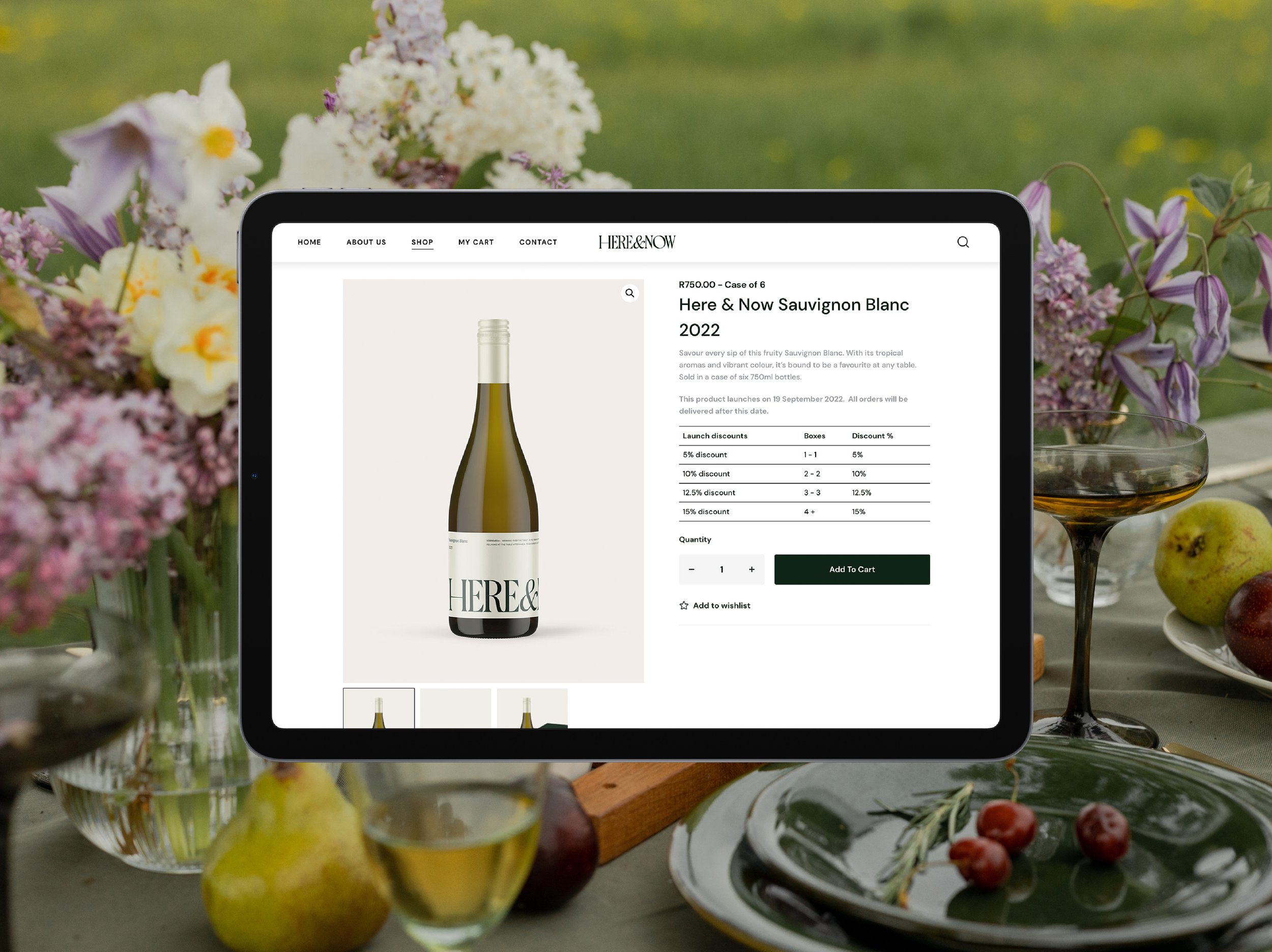
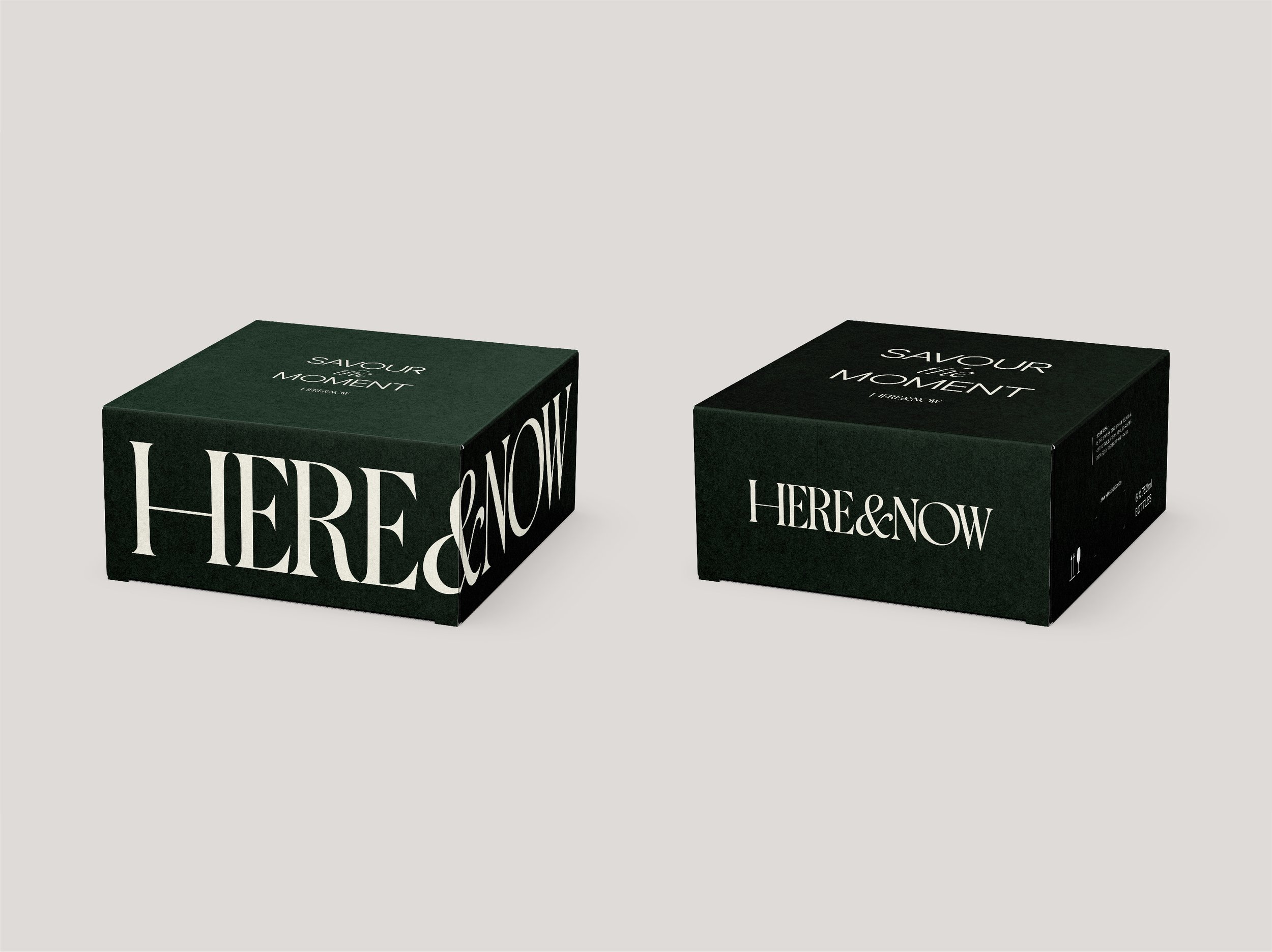
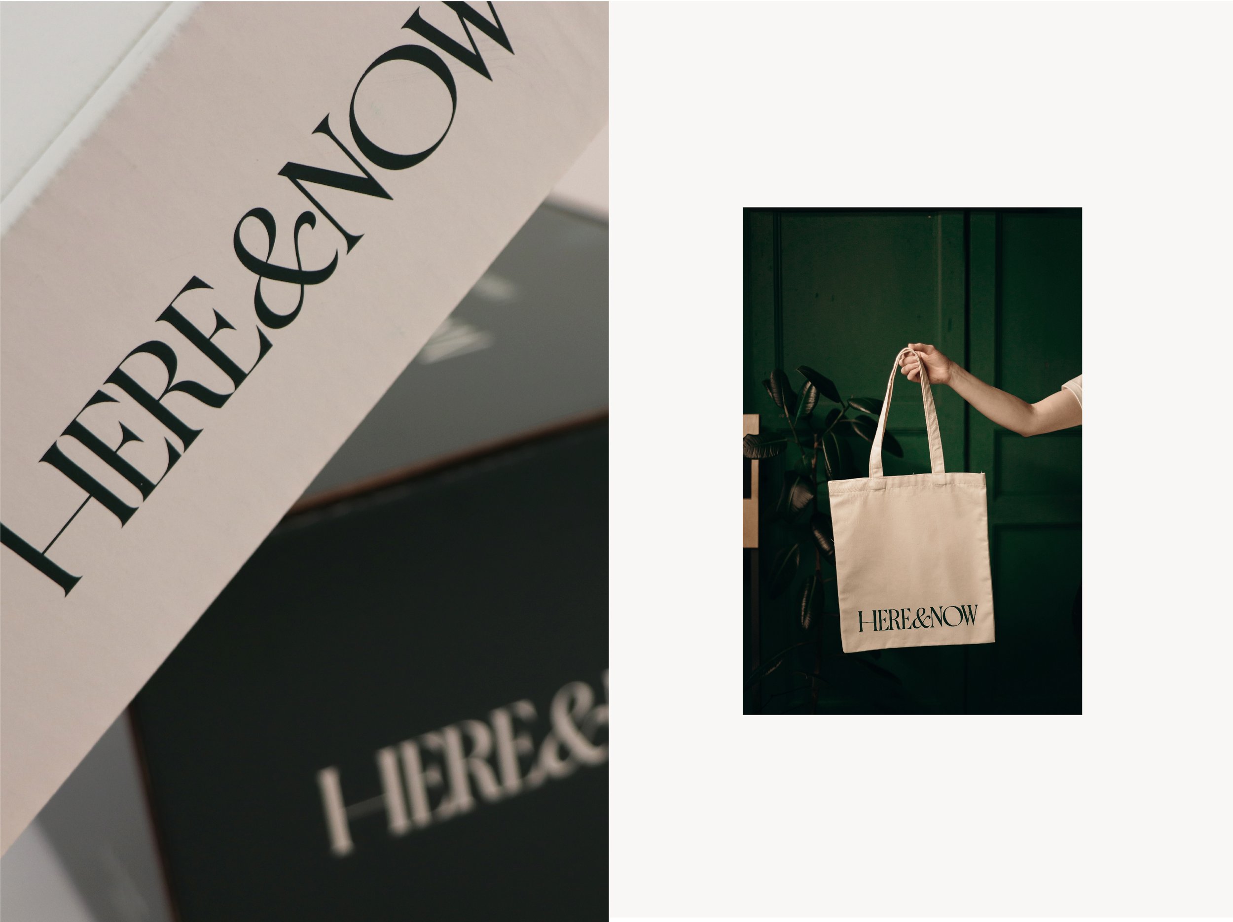
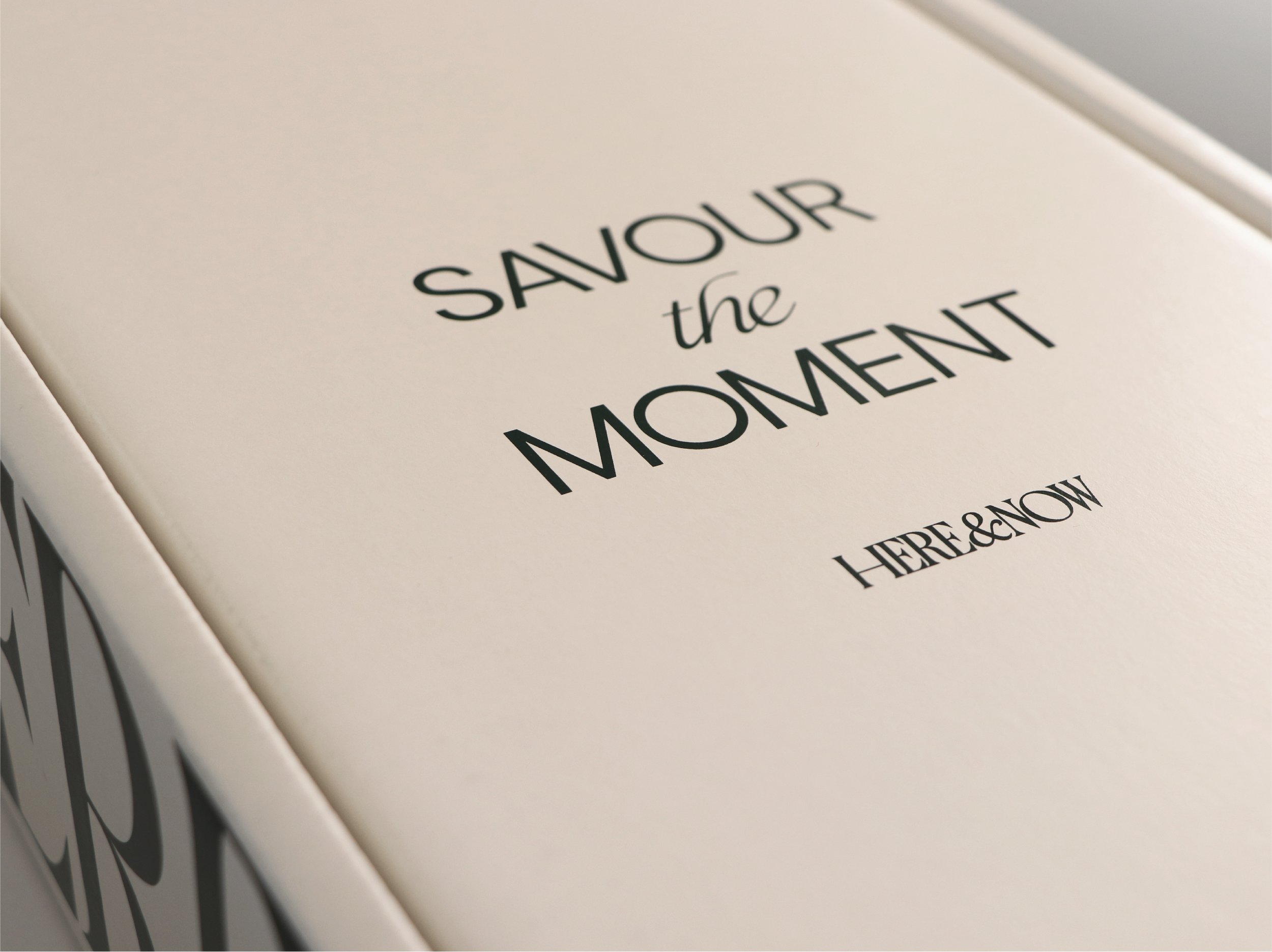
The design mimics a table setting, with the moment being in the centre, making it something everyone can feel. It makes use of a duo-tone colour palette, a light cream contrasted by a dark, lively green. This colour base transcends varietals and bottle shapes, giving the brand the legs to extend past the first product, a fresh Sauvignon Blanc from the Franschhoek valley.
The typography is bold, classy and playful at the same time – showcasing all of the different types of personalities around a table.
It’s the type of wine you gift, enjoy, open immediately and savour the conversation more than the winemaking intricacies. It is the beginning of a good time, real and natural relationships and the perfect addition to your dinner table.
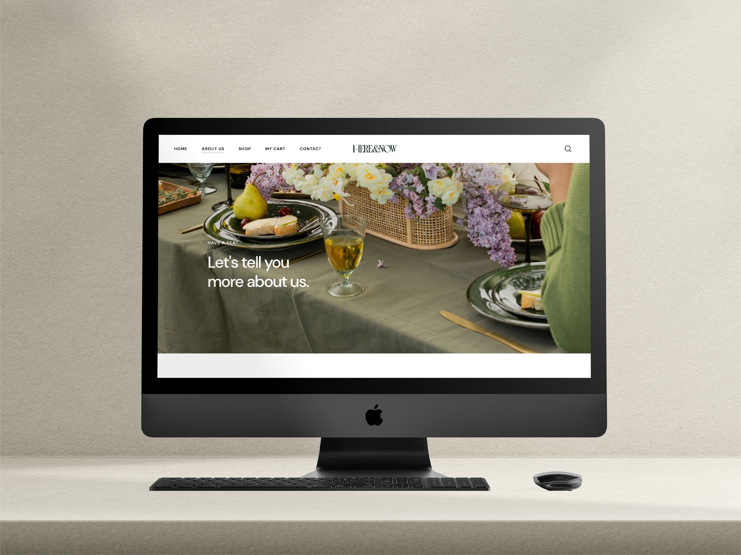
SERVICES:
Brand Identity Design | Stationery Design | Website Design | Project Management