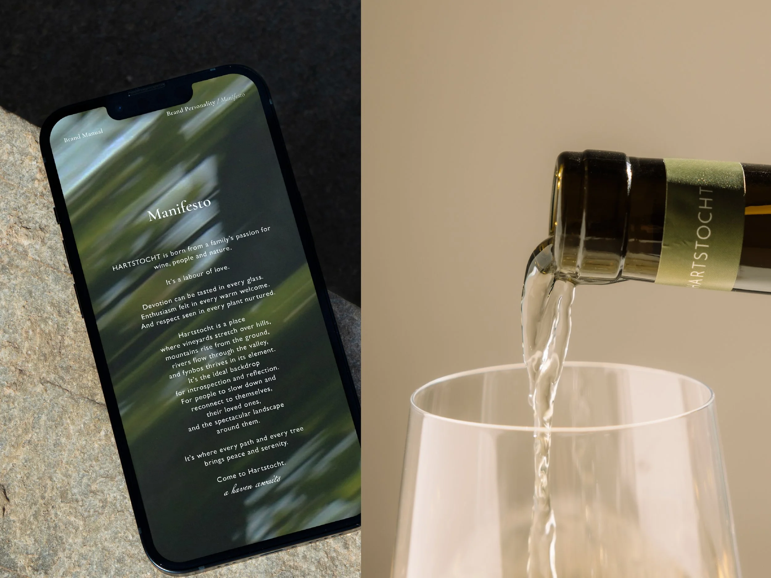
"When I started searching for a name, I thought about our love for nature, passion for wine and people, and bringing the three together."
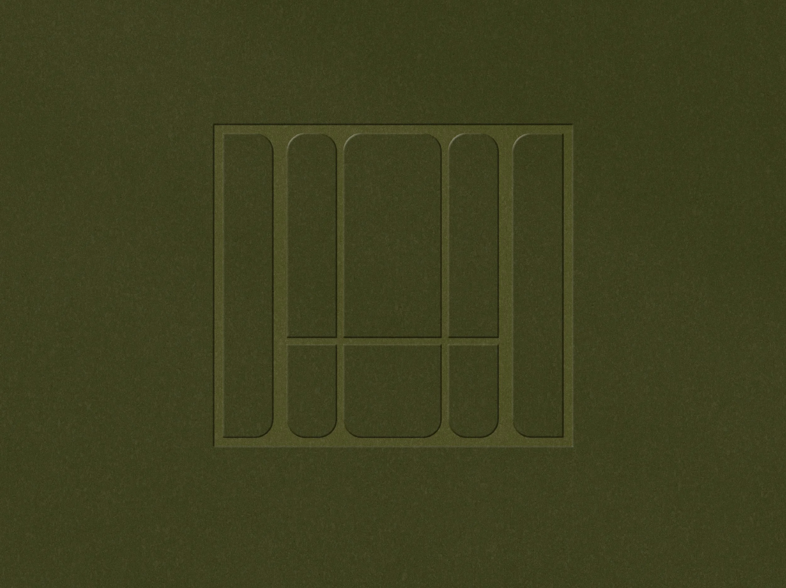
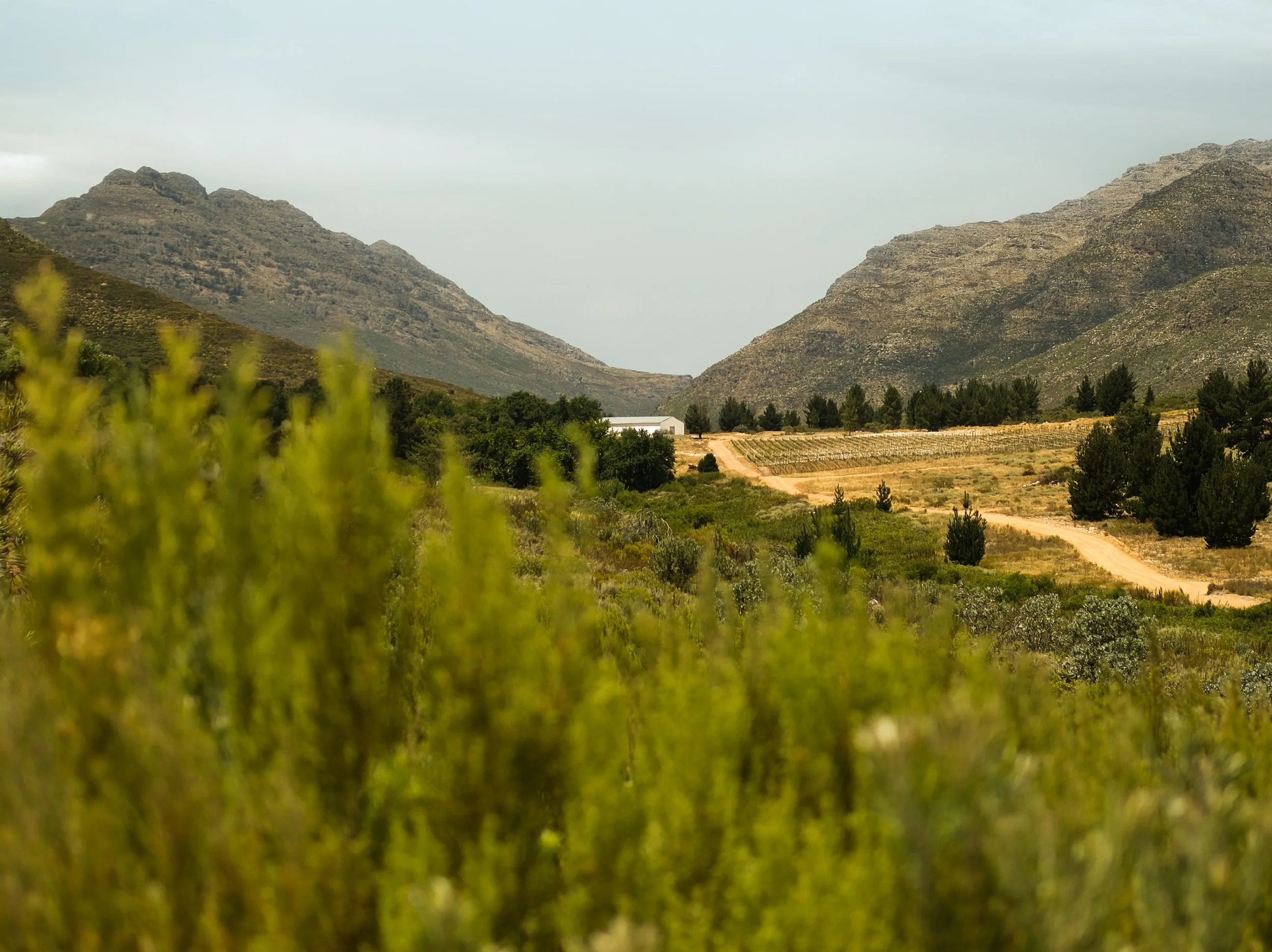
Tucked between the mountains of Citrusdal, Hartstocht is a wine estate in the making; a place that will one day welcome guests for tastings, events and weddings. Its name, Dutch for passion, is a nod to one of the founding partners, and that spirit became the heart of our approach as we partnered with the family to create a brand identity for this future oasis.
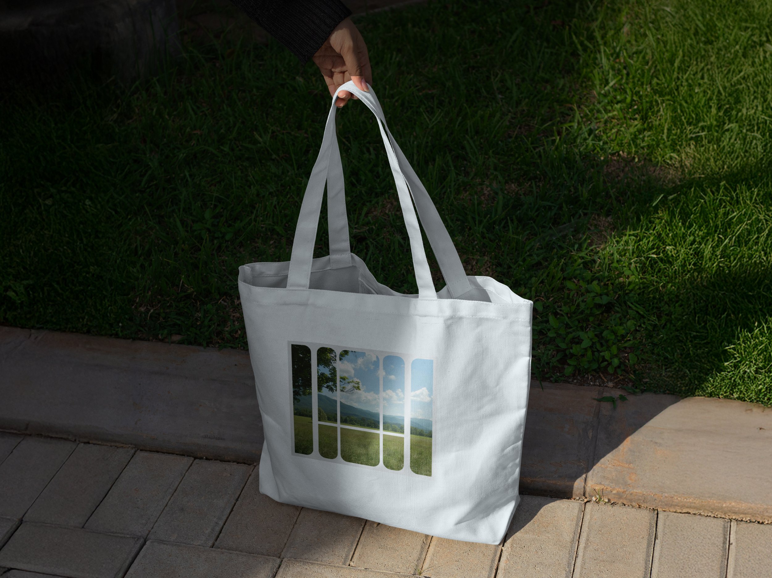
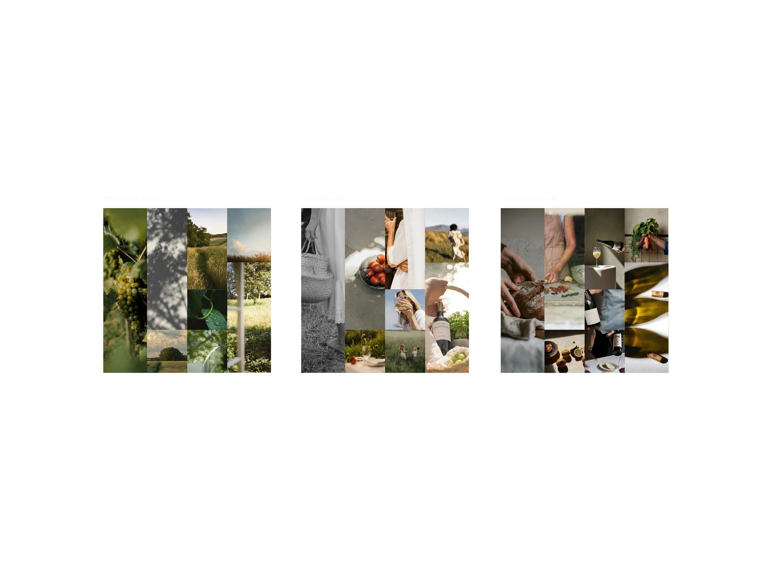
We drew inspiration from the feeling of arriving in the valley: the mountains rising on either side, and that first deep breath of fresh air.
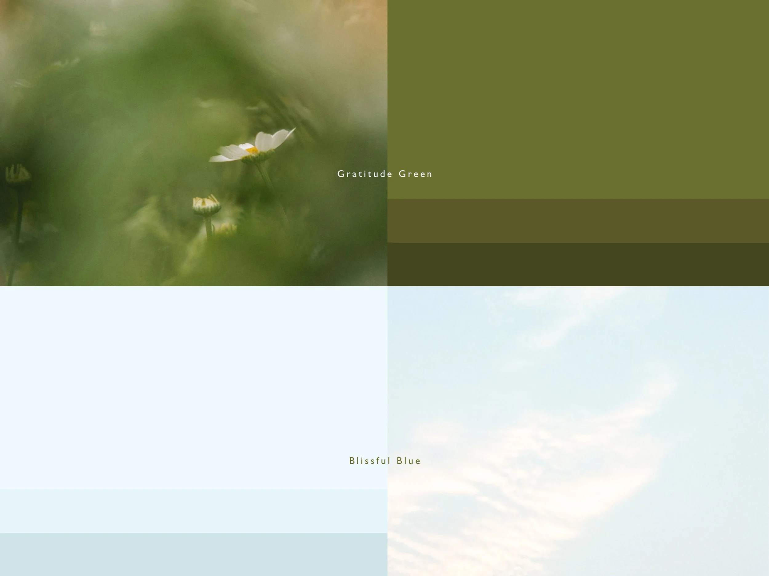
The colour palette comes straight from the land. It draws on the fresh springs running through the ground, the green of the surrounding flora and the open blue of the sky overhead.
The typography moves from a confident sans serif wordmark into the softer, flowing serif of the supporting fonts, so the identity reads almost like poetry.
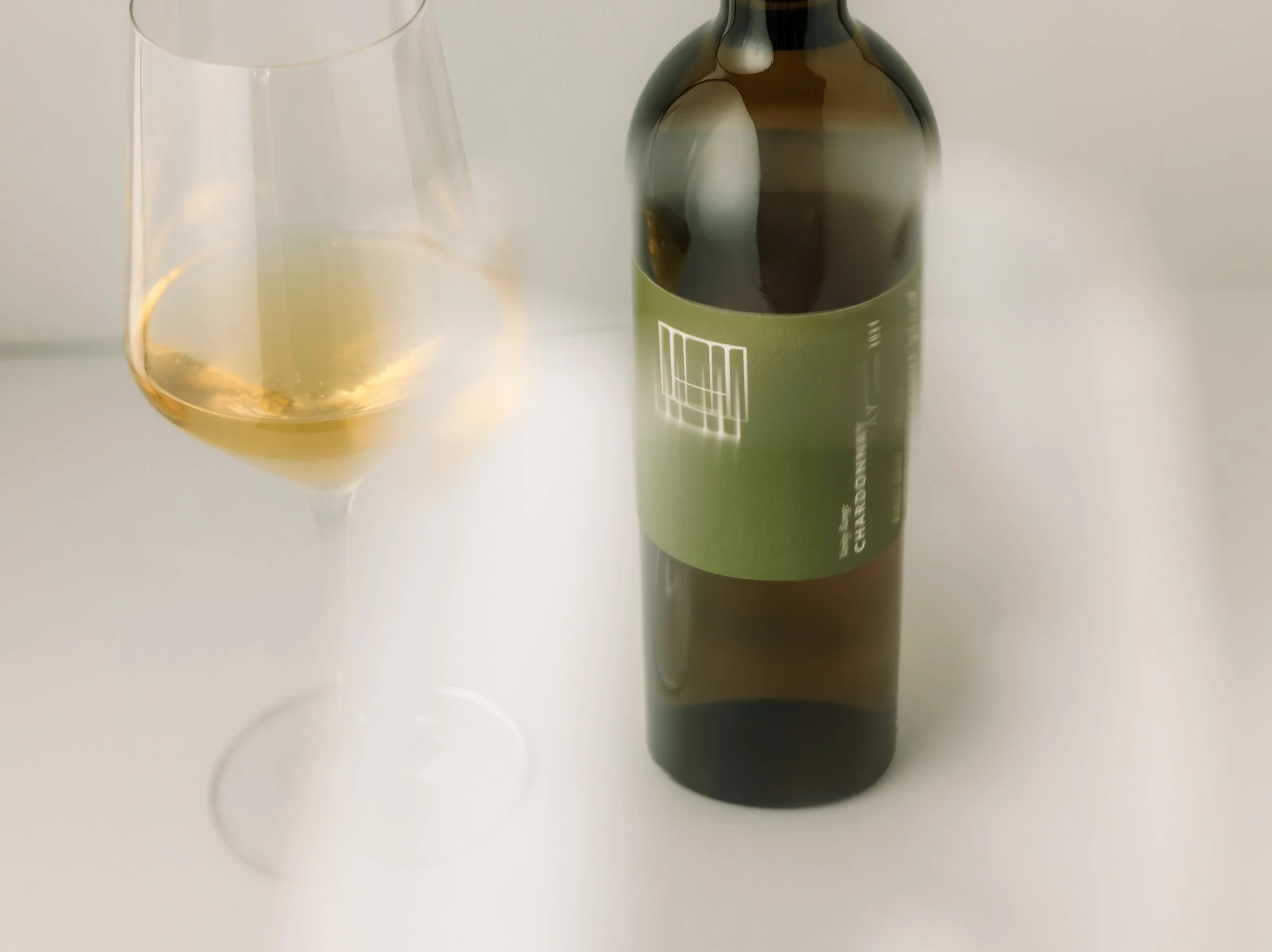
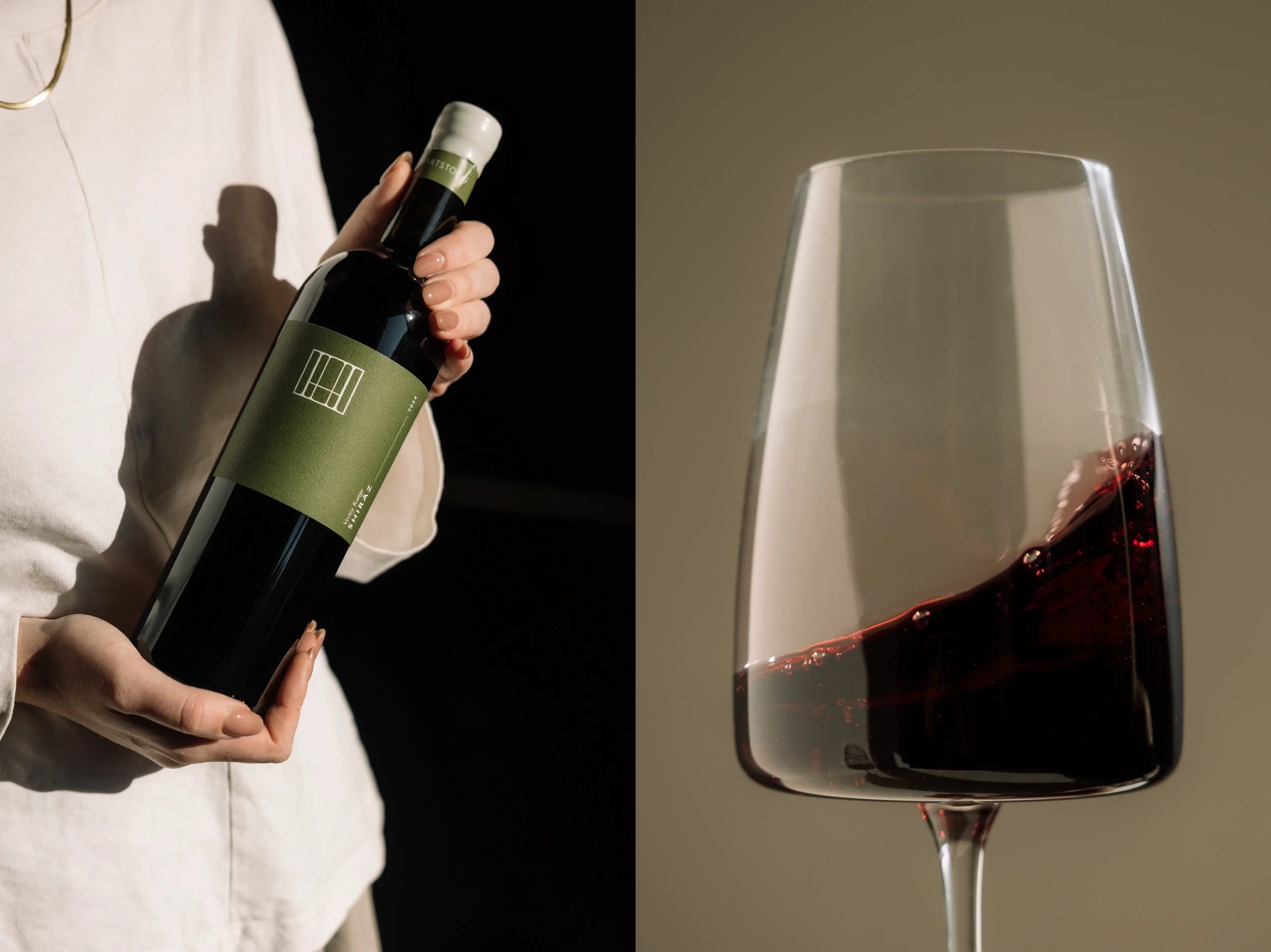
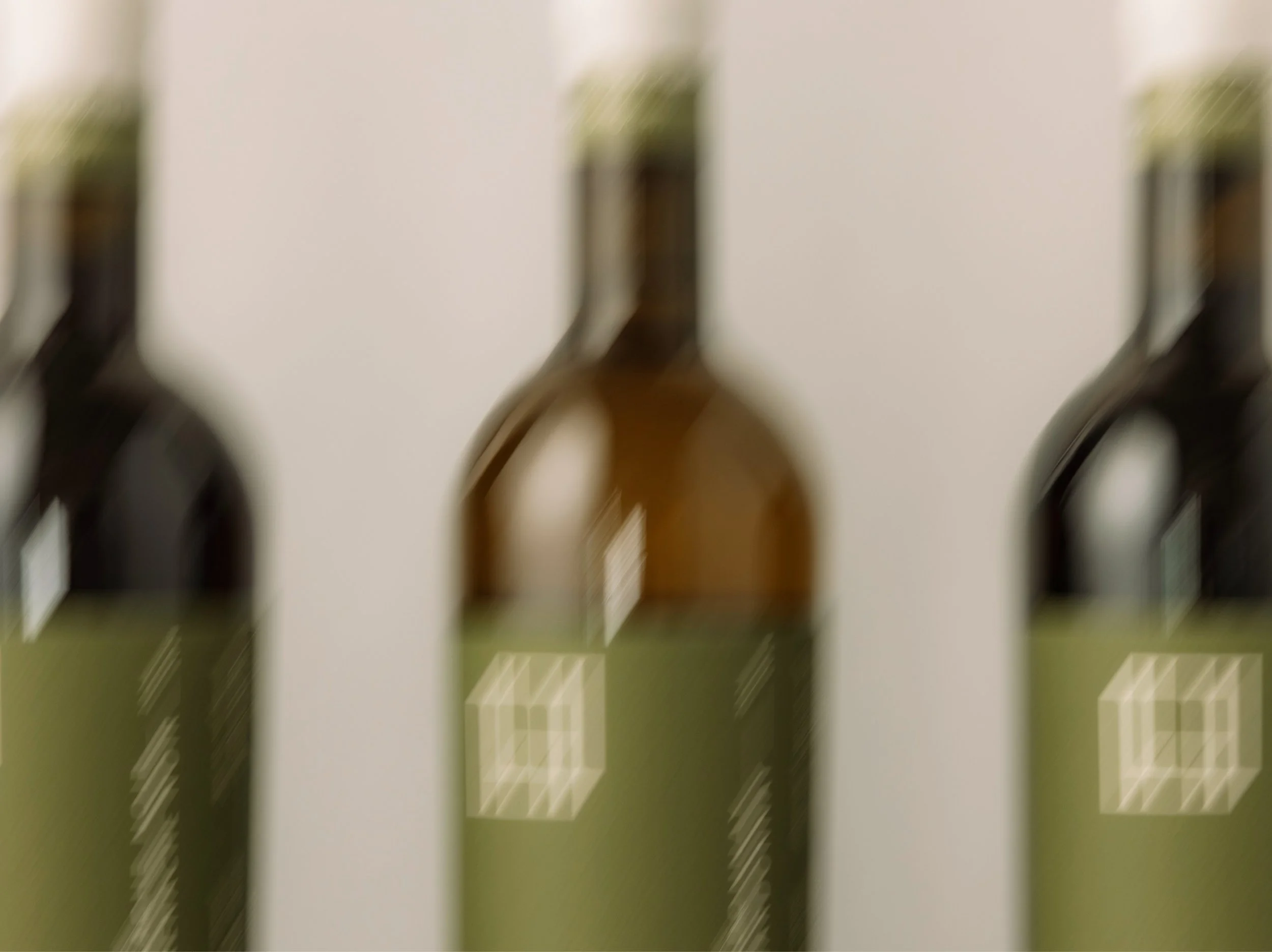
The first release carries these colours boldly onto the bottle, celebrating a maiden vintage. While this wine isn't yet from the estate itself, as the young vines are still settling into their new home, it marks the beginning of the Hartstocht story.
The family's passion runs through every part of the brand, and the vision continues to grow as we build it together, one step closer to the dream of the estate.
SERVICES:
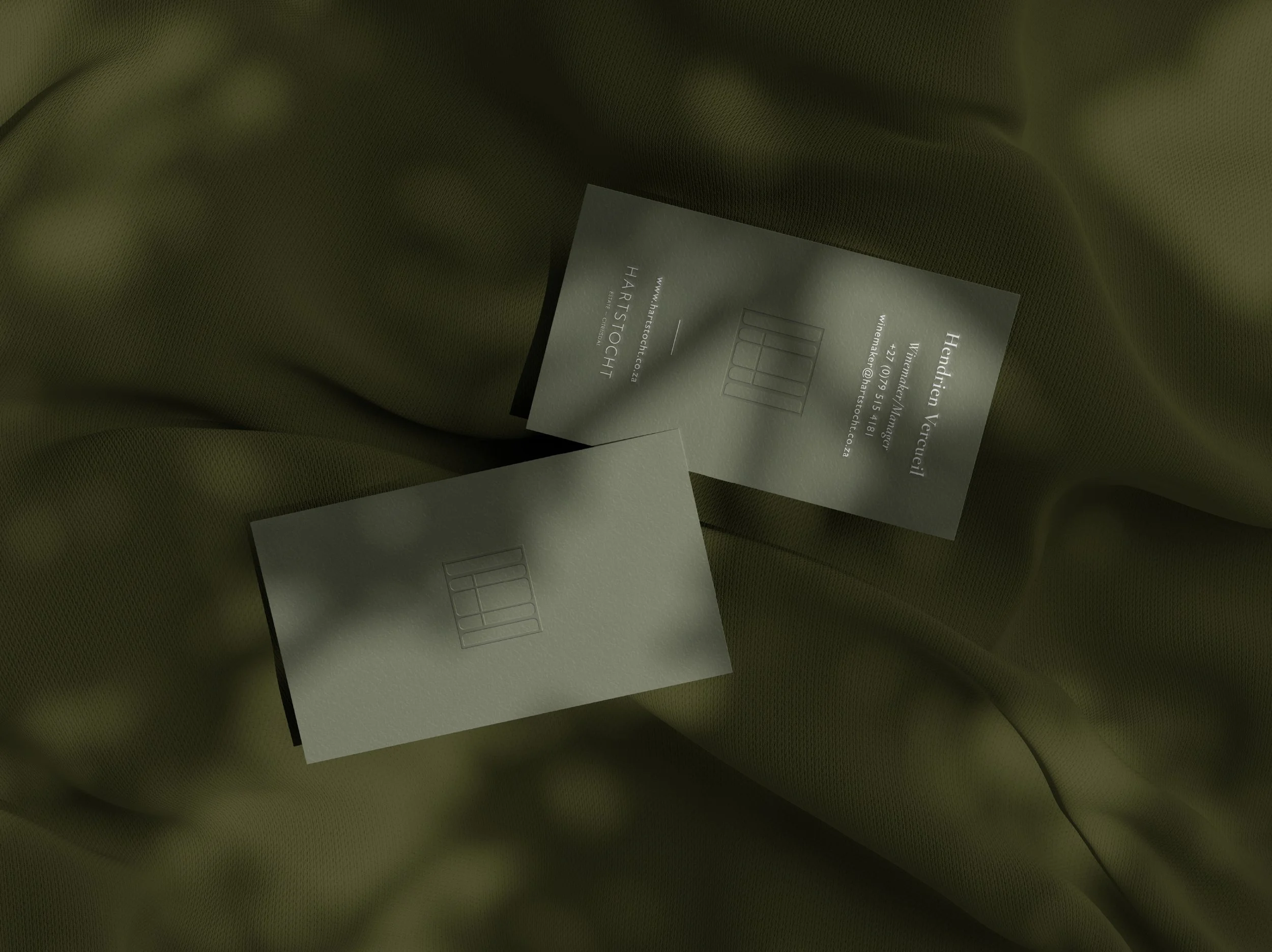
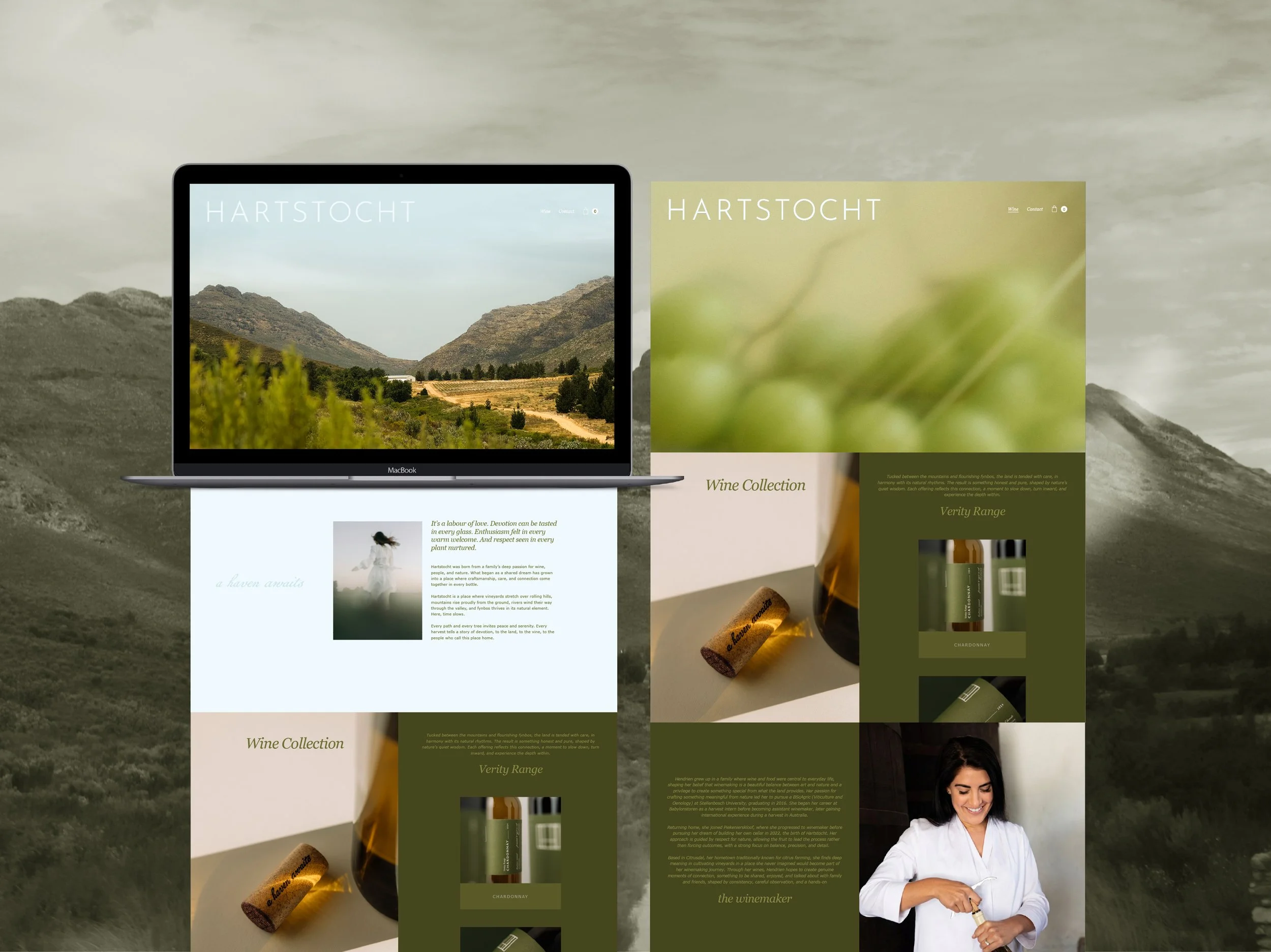
Brand Identity Design | Brand Manual | Label Design | Website Design | Project Management