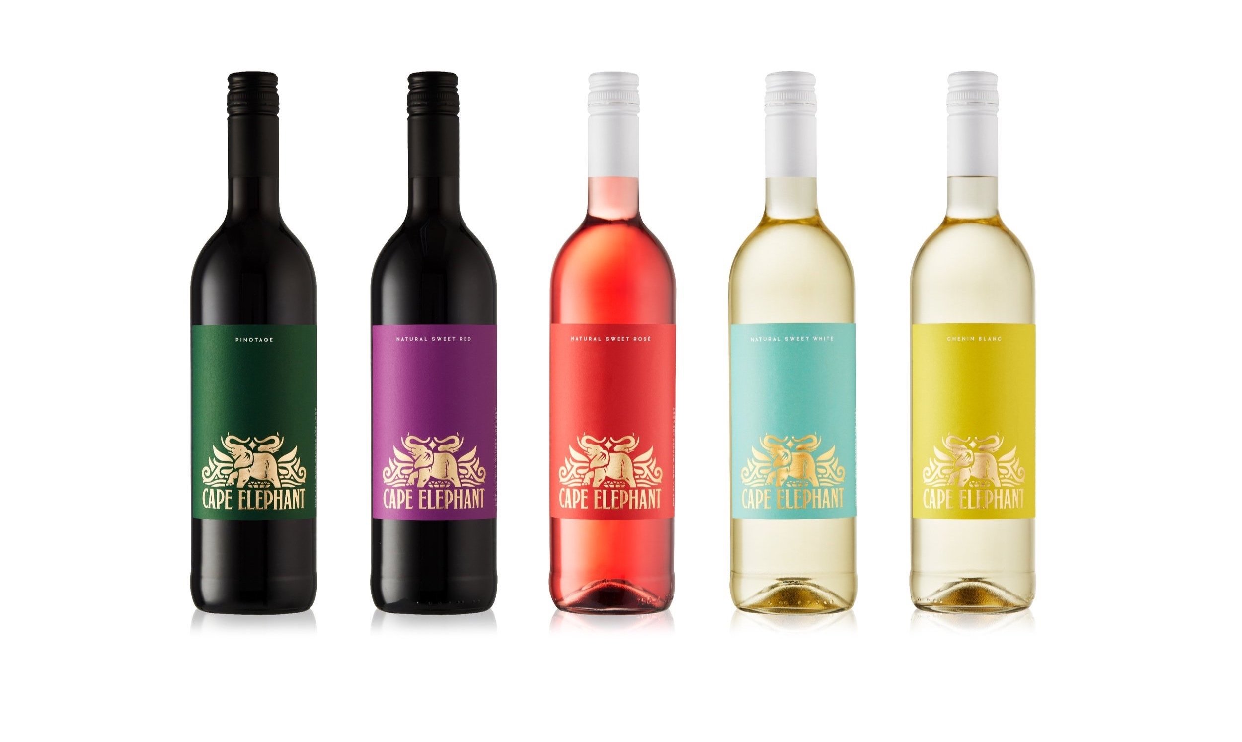

A wine range, consisting out of 12 single varietals under the Cape Diamond Wines brand.
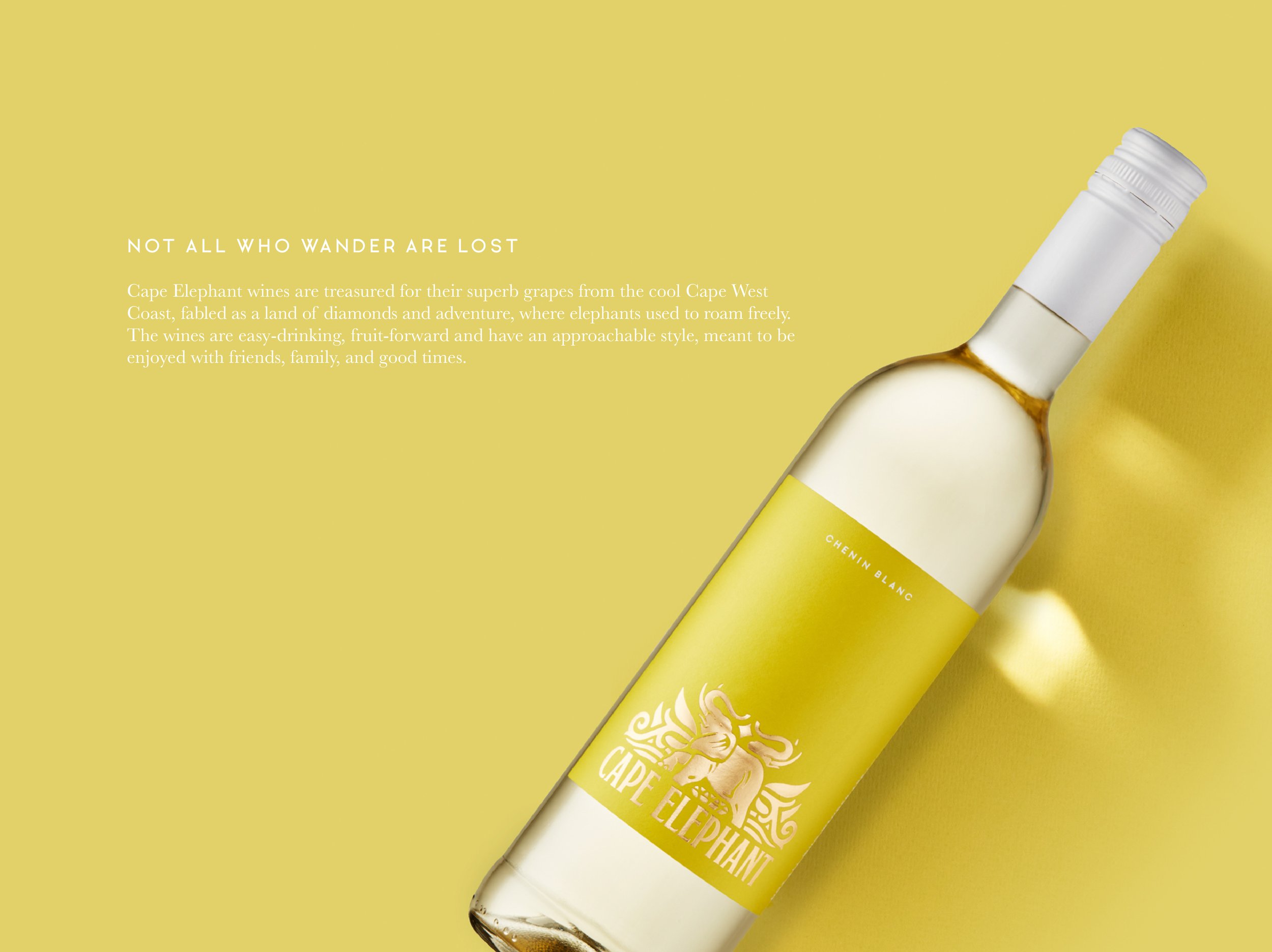
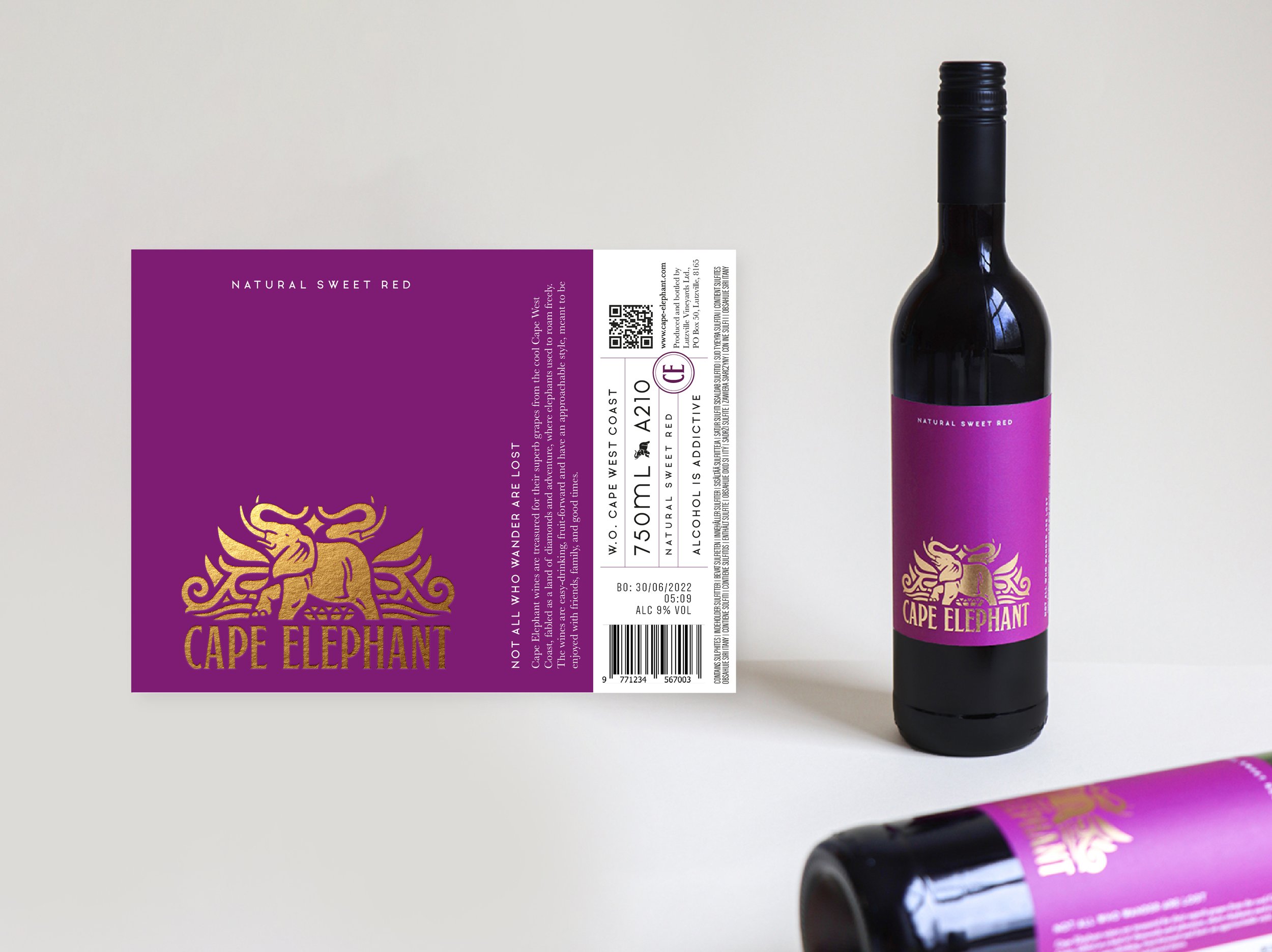
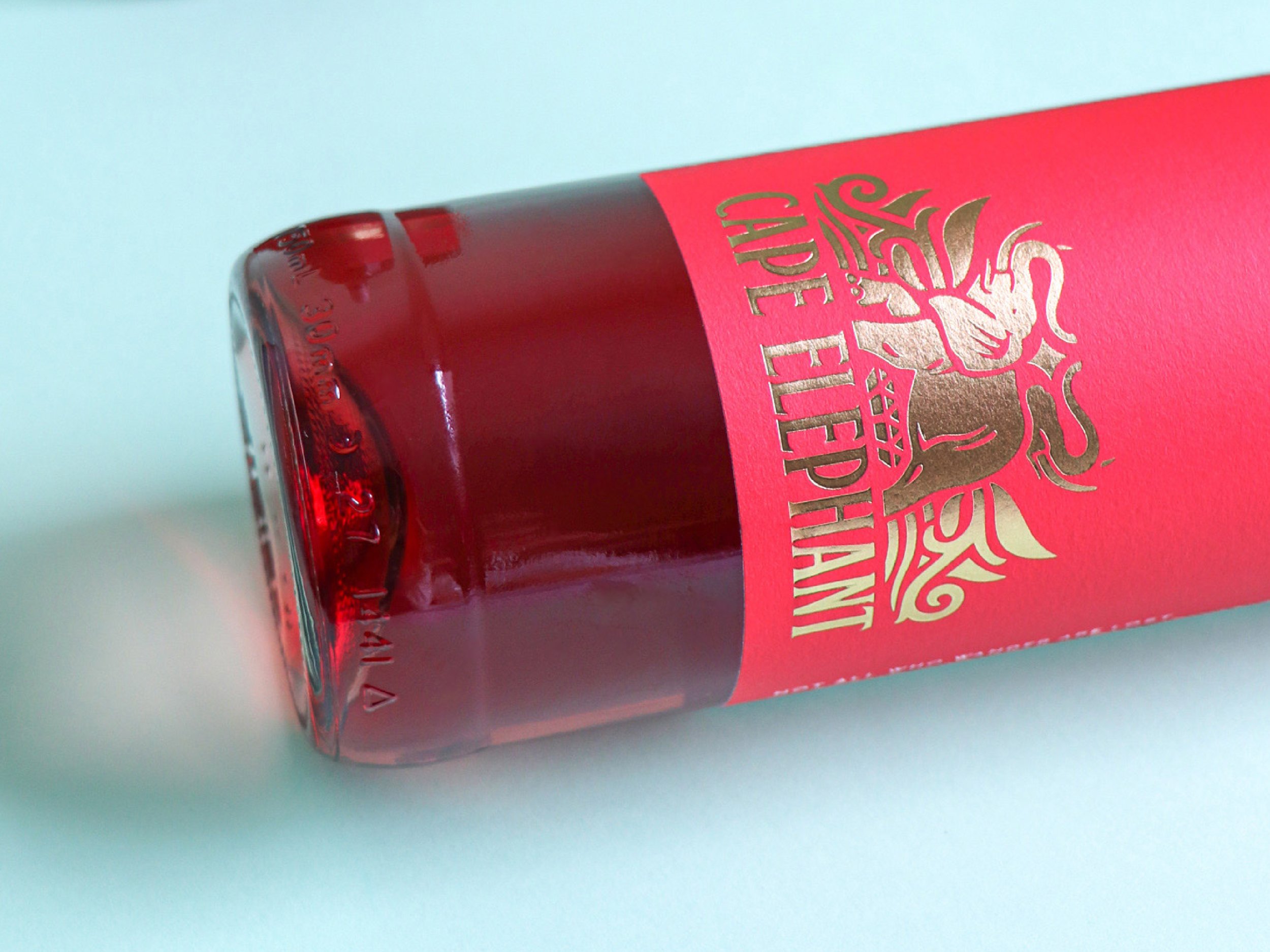
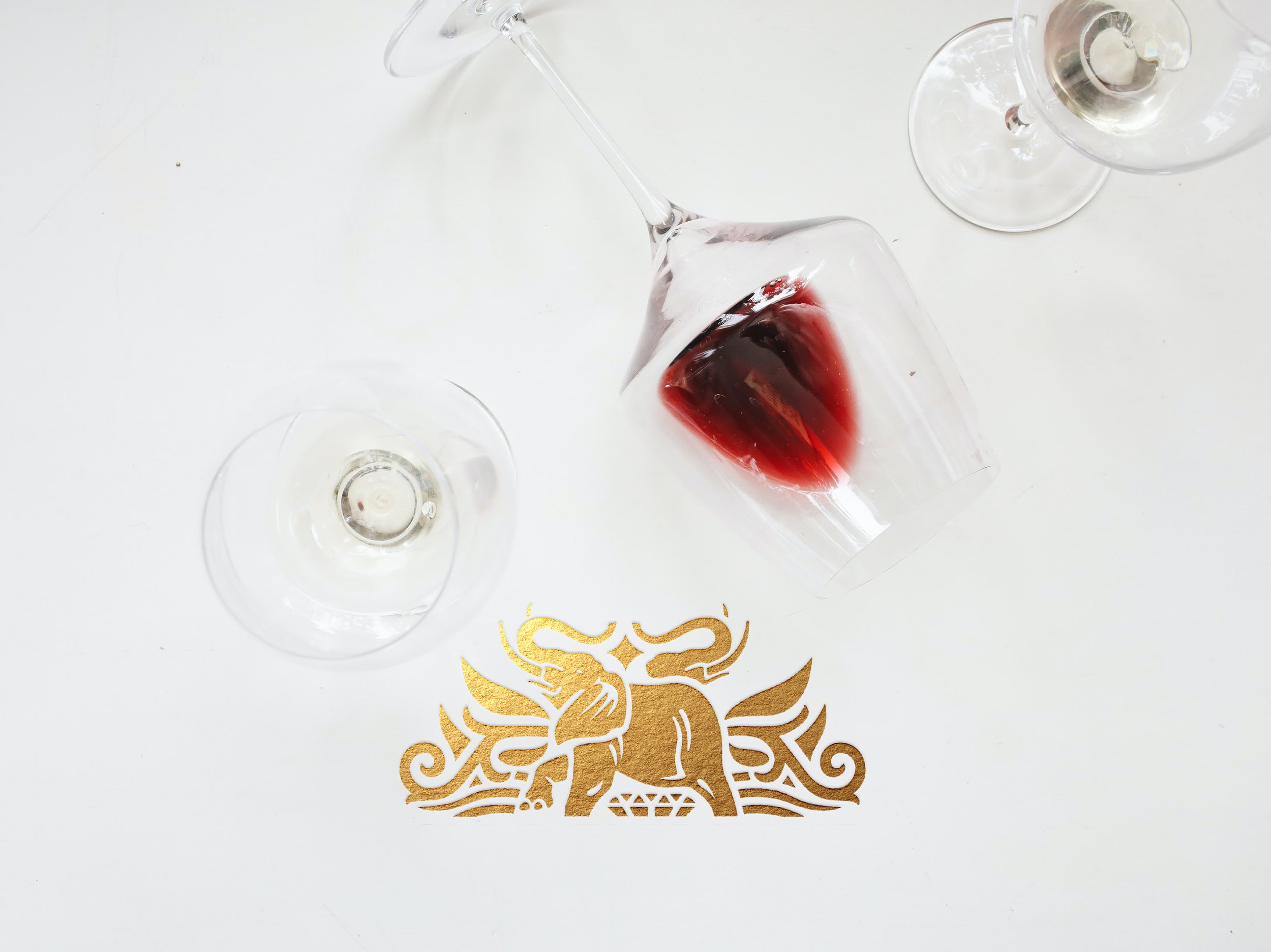
The name Cape Elephant derives from the vineyards being grown along the Olifants Riverbank where elephants used to roam the valley.
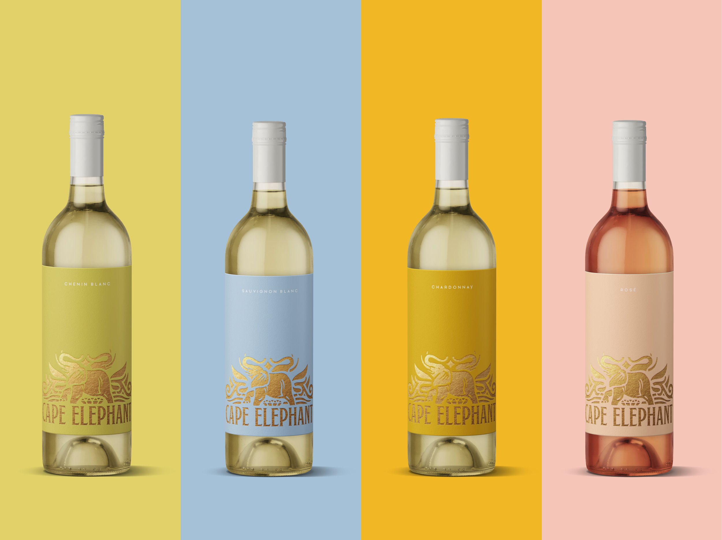
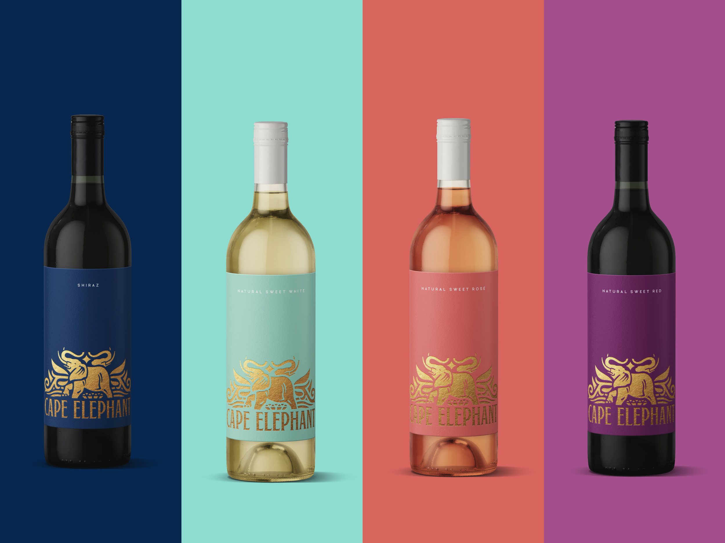
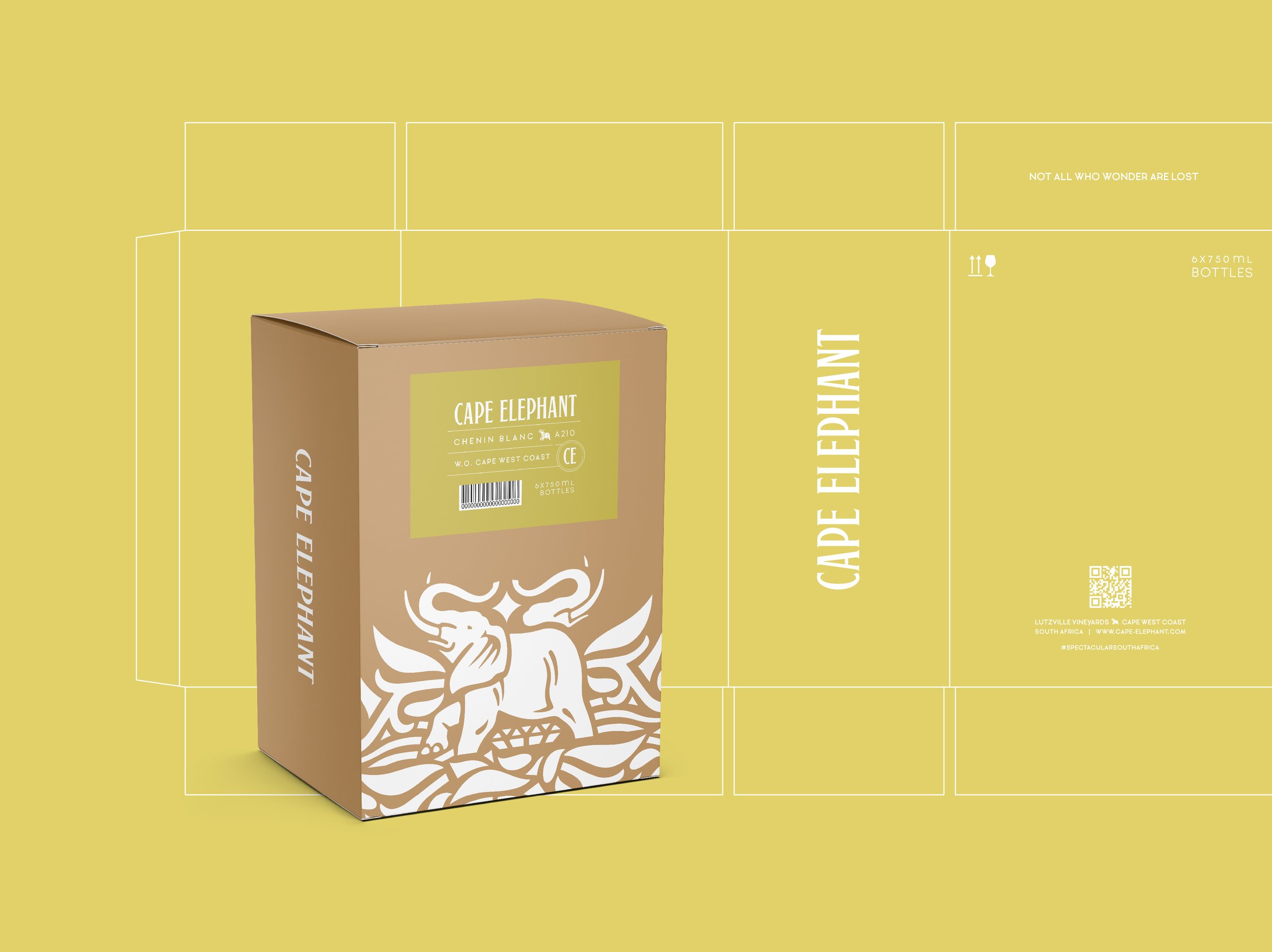
The range is distributed worldwide, and therefore needs to appeal to different ages, genders, and races. The execution therefore came down to two main elements - a pattern and a vibrant colour palette. The pattern was inspired by the existing elephant identity illustration style – with the addition of decorative elements that reflect the river and nature surrounding it. The pattern was also specifically created for the bottom of the label, framing the length and creating white space between the brand name and the varietal name.
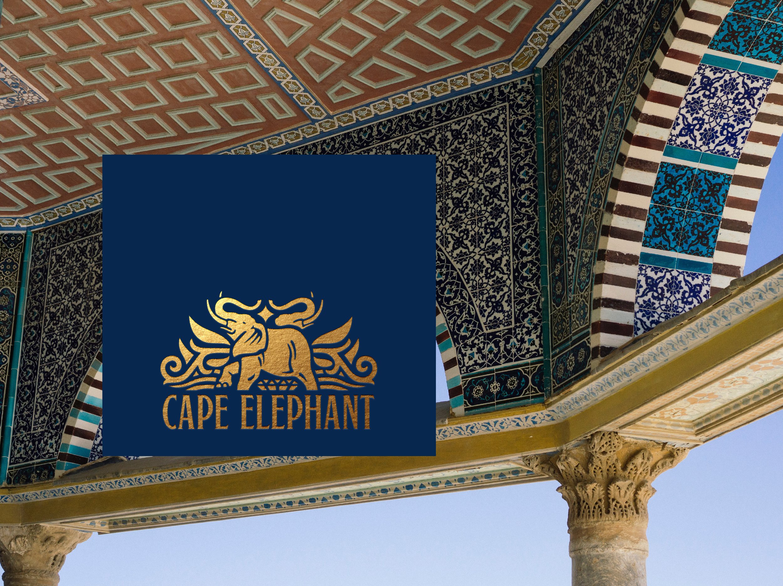
The design concept uses the elephant to become a symbol of an African gem, emphasized by the gold foiled pattern in contrast to the label colours. The label colour palette was inspired by gemstone shades, but was also carefully considered in accordance with the varietals.
The main aim of the design update was to elevate the brand, make it recognizable and stronger in terms of the overall visual impact of the range.
SERVICES:
Packaging Design | Illustration | Project Management | Photography