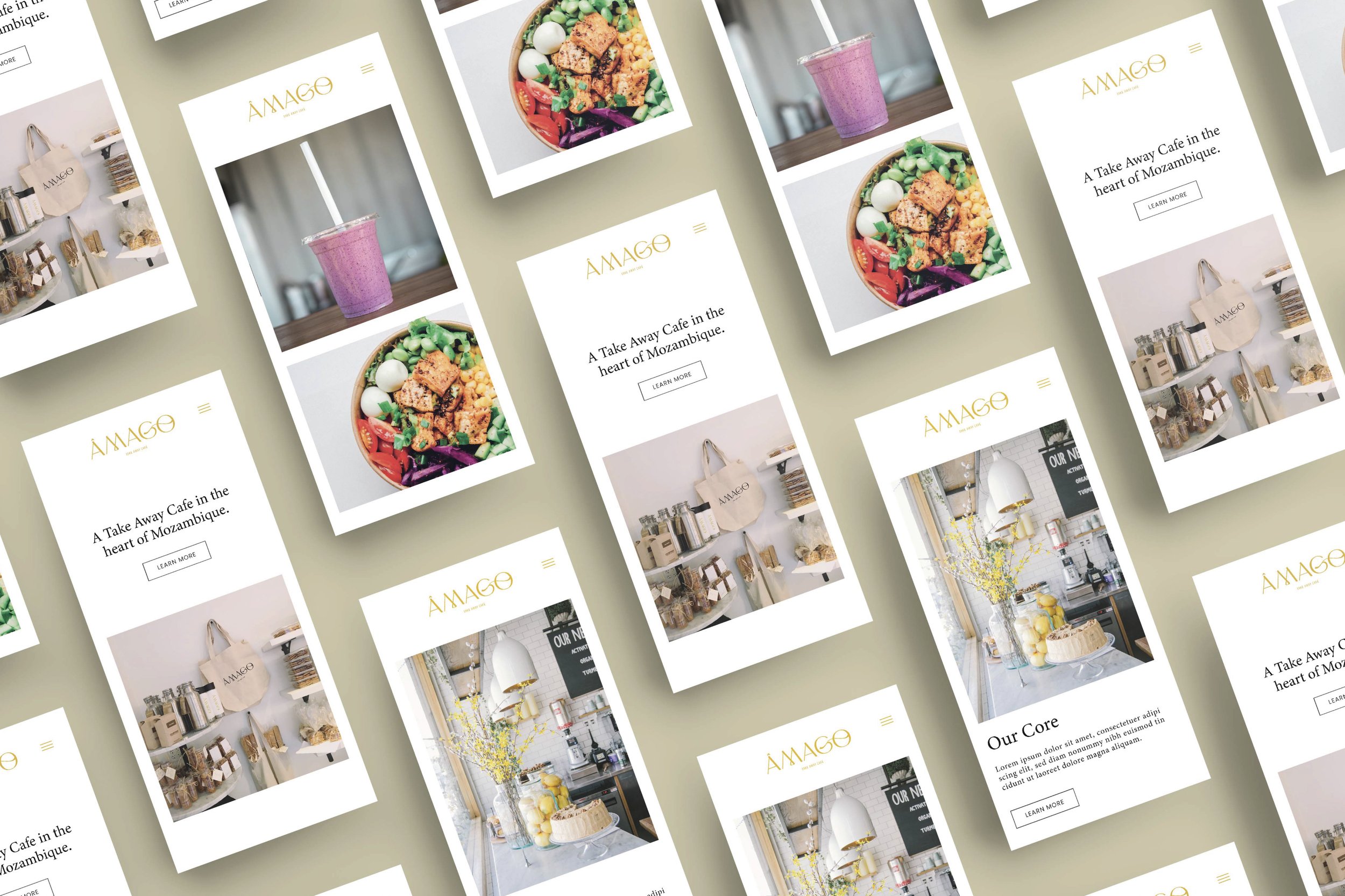

As a take-away Café in the heart of Mozambique, Âmago is the first of its kind.
In Portuguese the word Âmago means core, essence or heart. Not only does this reflect the owner’s hearts being drawn towards starting a take away Café, but it also plays on the fact that the Café will be a core/base from which customers can draw strength in the form of food and good coffee.
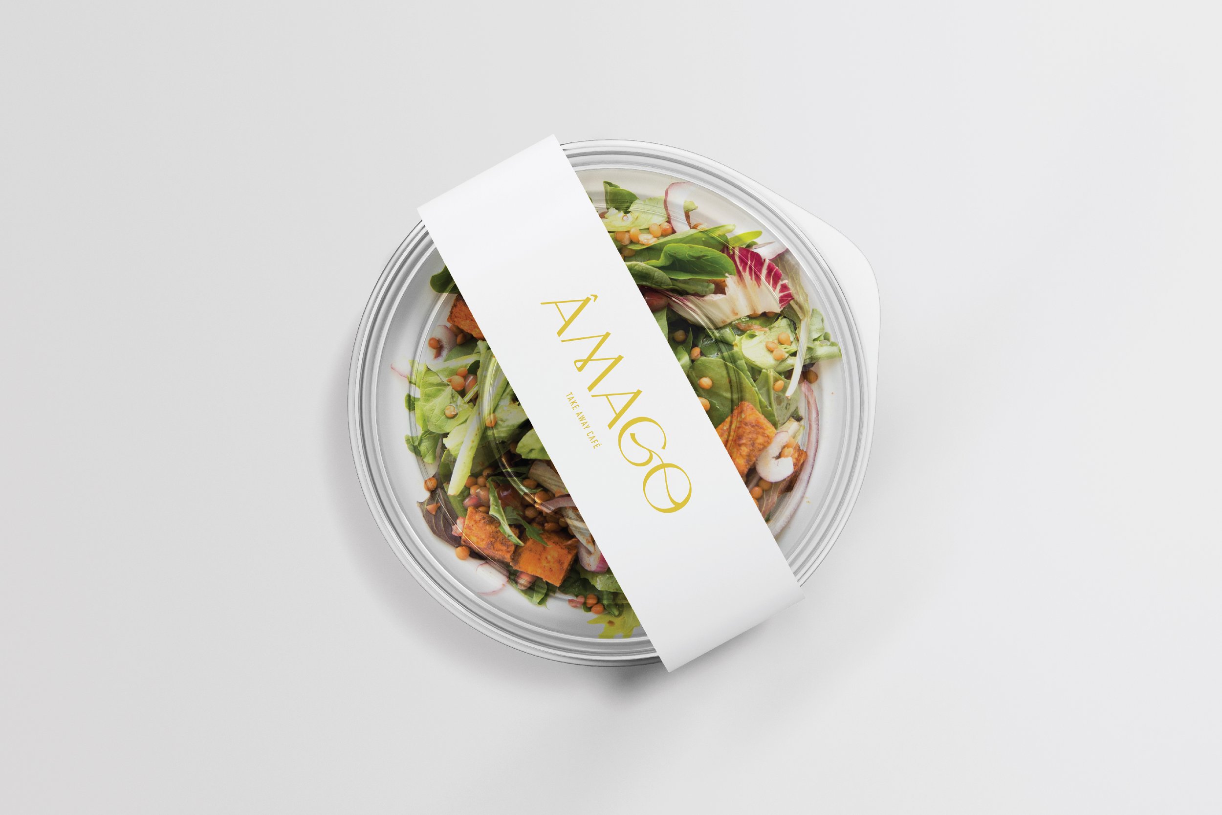
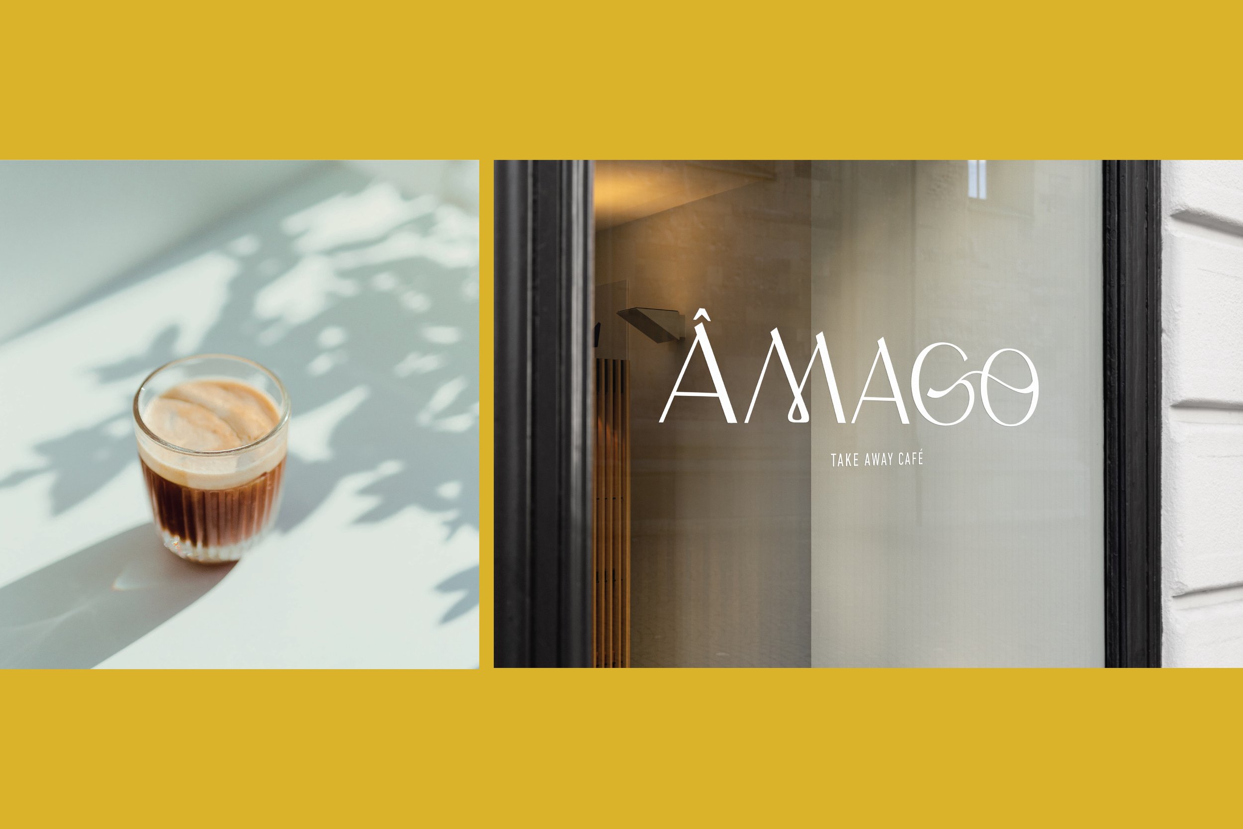
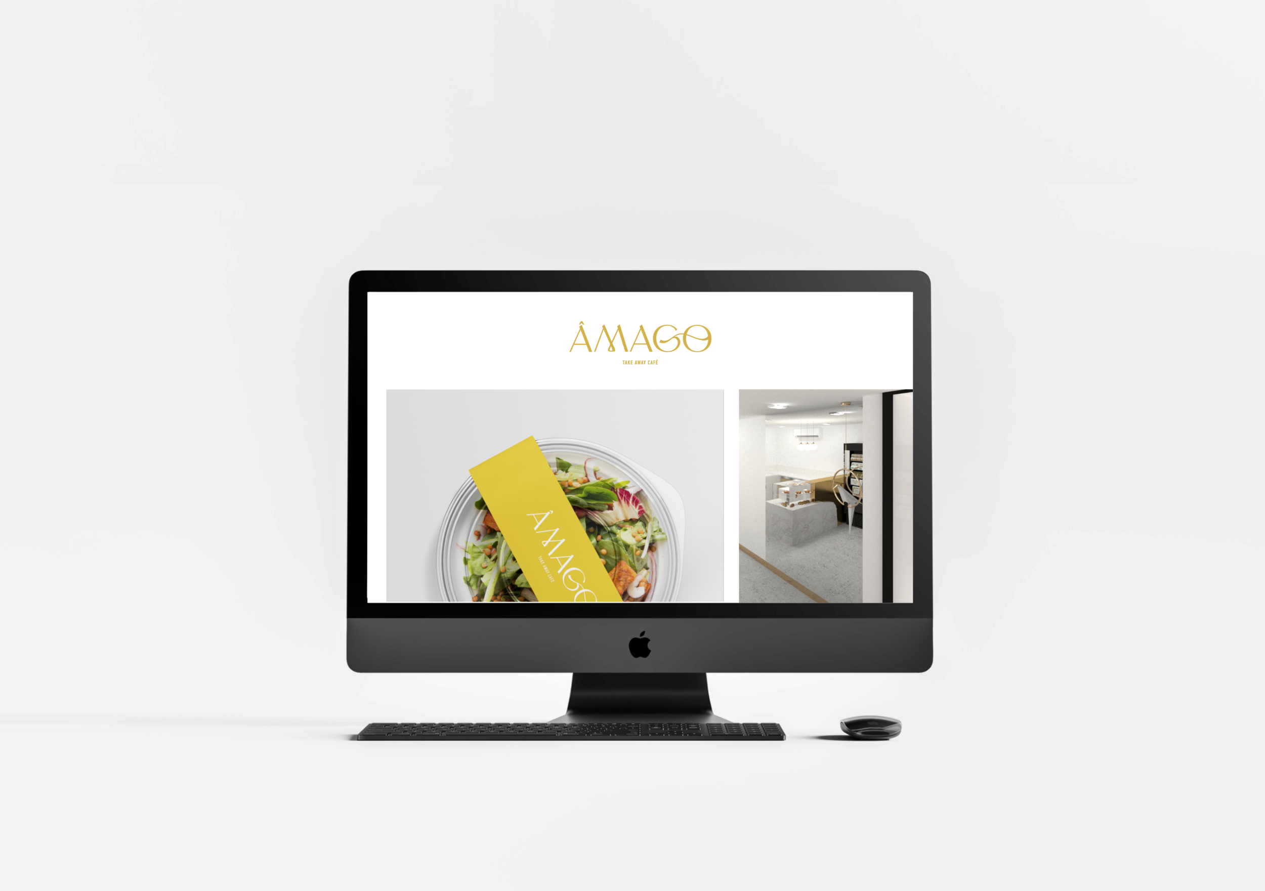
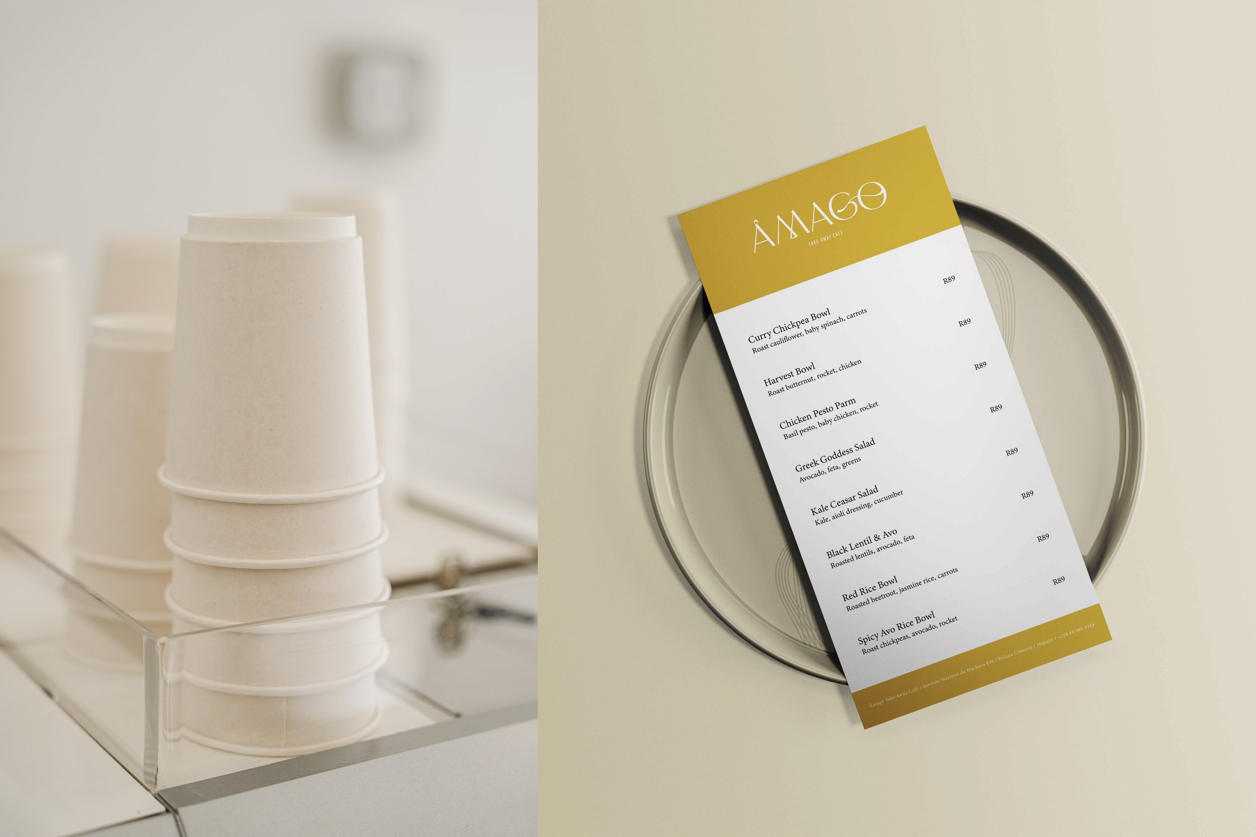
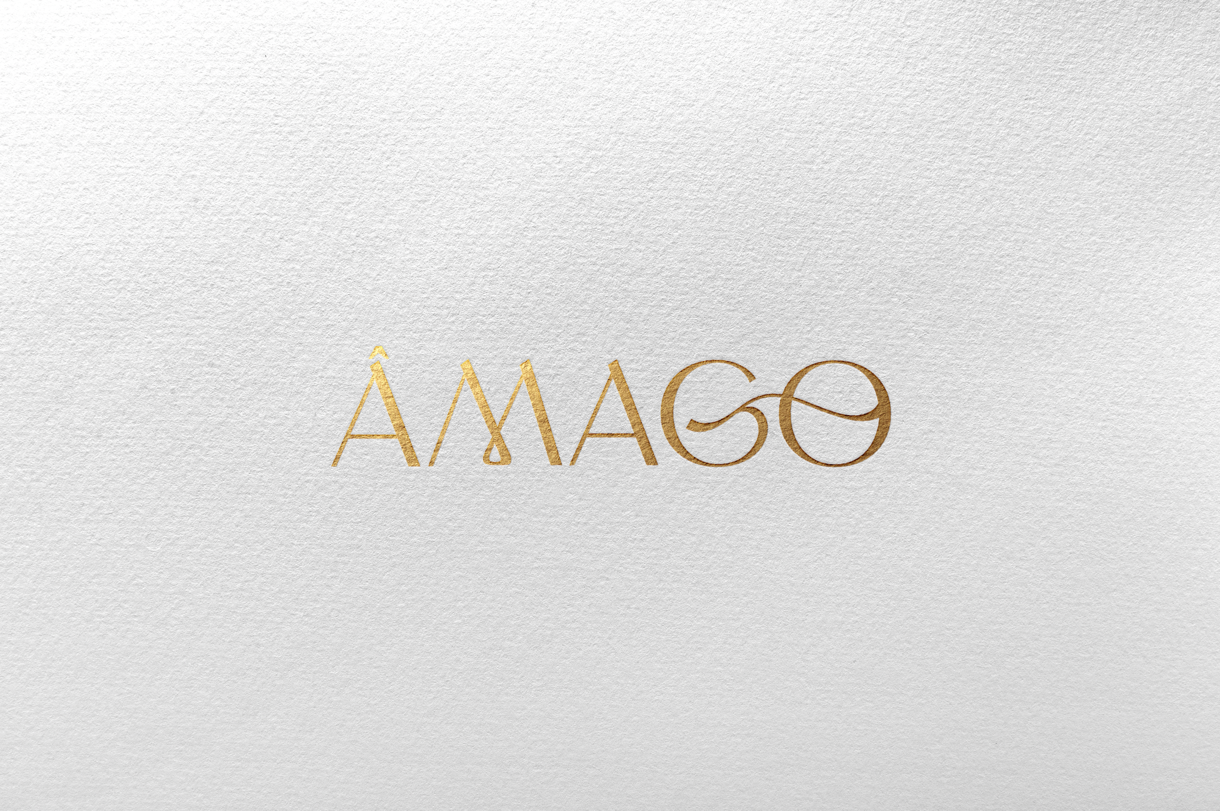
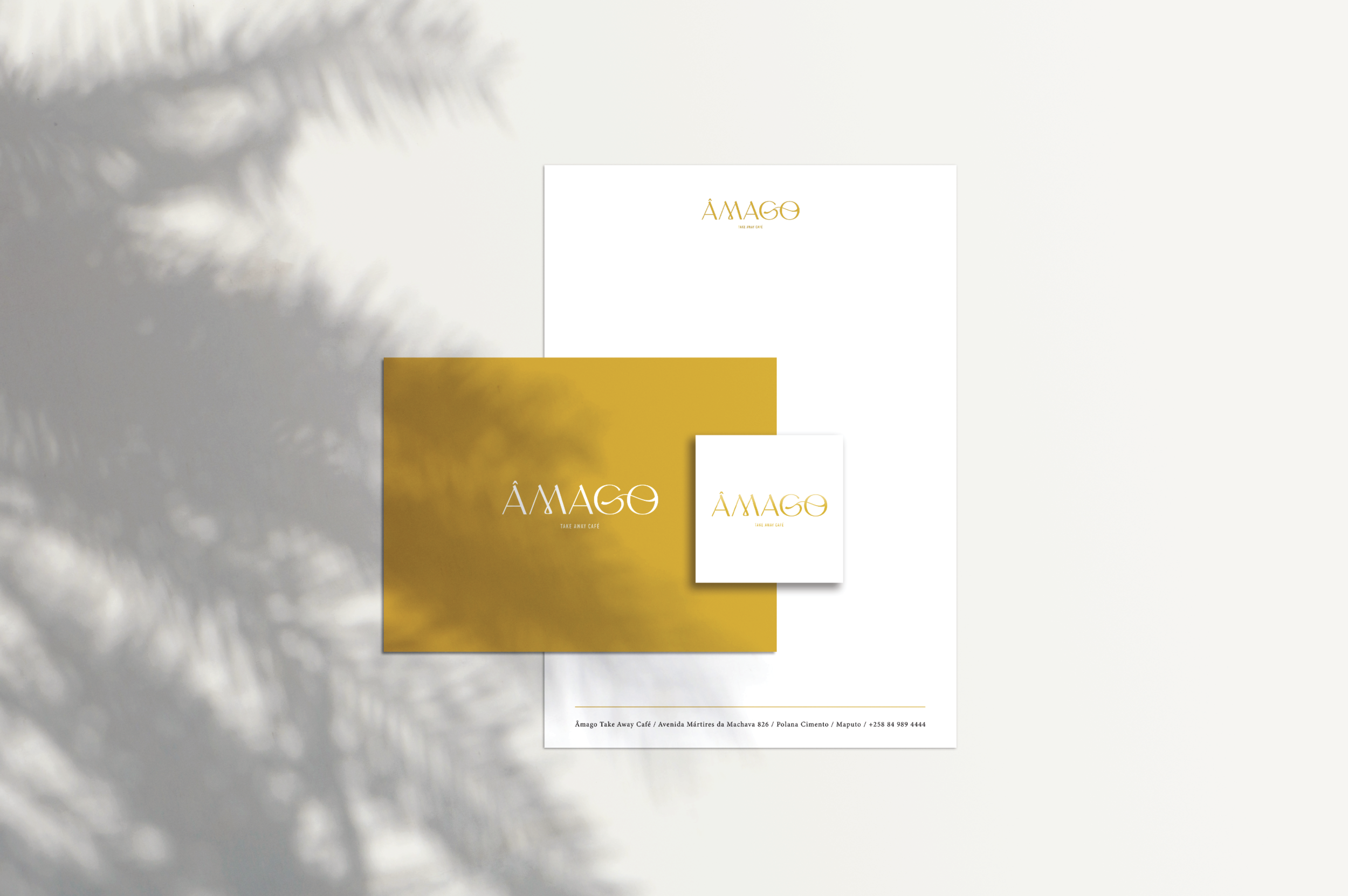
The brand identity uses the word “go” in the brand name, to emphasize the fact that the Café is purely for take-aways and not to sit down – coming and going. The design of the logo used a typeface that is both embellished, but also has an element of being trusted and premium because of the all caps typography.
The main colour palette of the brand was inspired by the sun, being the core of everything. Gold, a deep yellow and accent colours of black and white creates a palette that is sophisticated, but also evokes happiness and joy.
SERVICES:
Brand Identity Design | Stationery Design | Collateral Look & Feel Design | Project Management