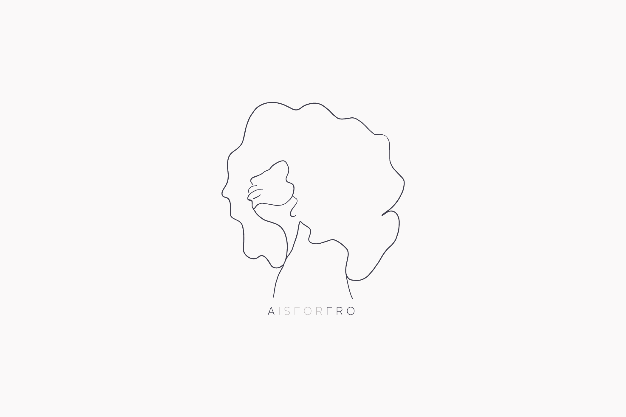
AISFORFRO
( A is for Afro)
Inspired by a child’s association with letters when learning to read, this brand seeks to change perceptions and celebrate afros by making it your first thought when you see the letter “A”.
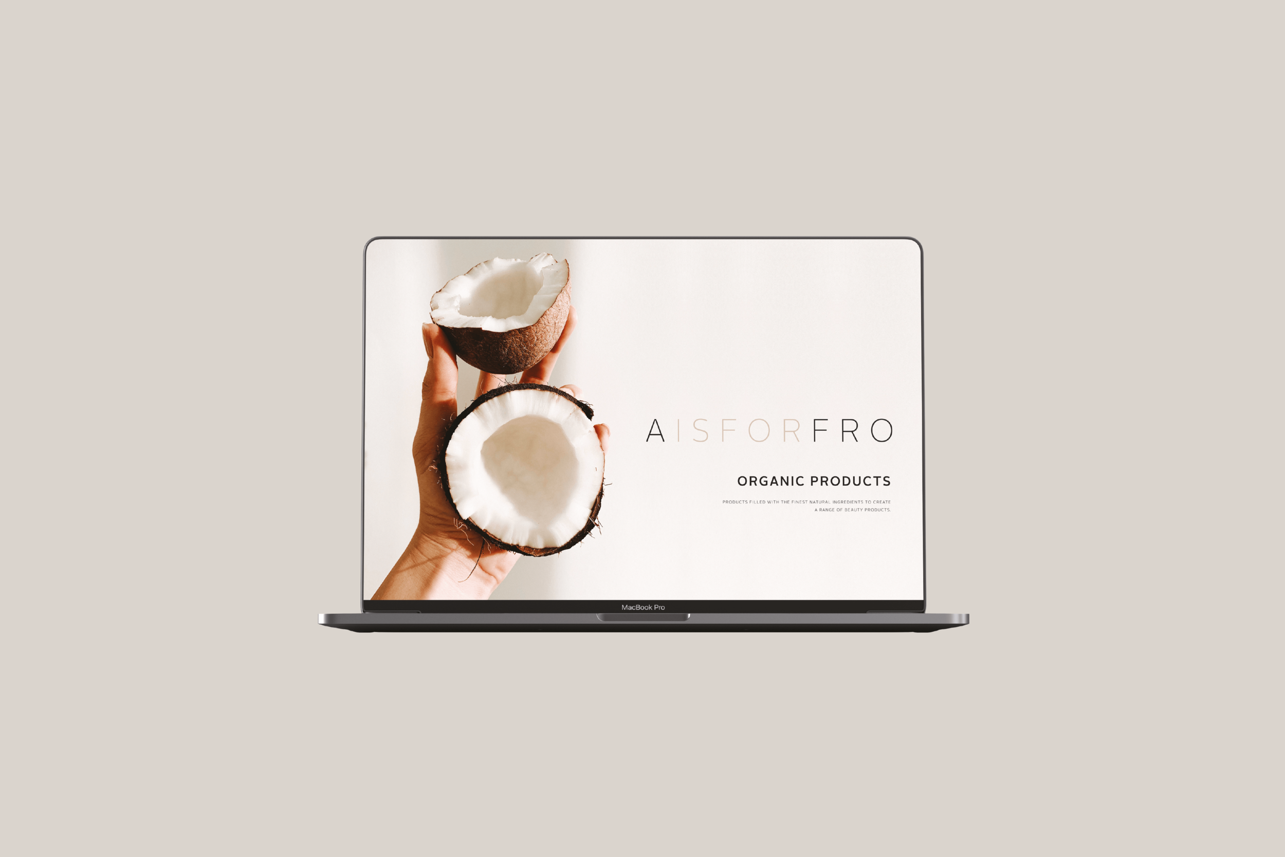
The brand uses only natural ingredients to offer a solution to the management of afros, whether for kids or adults. Therefore we used a neutral colour palette to differentiate between products, but also to be used on the t-shirt designs that the brand was launched with.
The logo design was kept clean whilst highlighting the importance of the letters and the words they form.
The typography we used was minimalist to mimic the bold typography children are introduced to when they first learn how to read.
The line drawing Illustrations on the t-shirt designs highlight enough parts of a face with an afro to make it clear without having to add too much detail. The aim of the t-shirts were to engage people in conversation in the care for afro hair and the lack of natural products that help people embrace this beautiful hairstyle.
SERVICES:
Logo Design | Project Management | T-Shirt Design