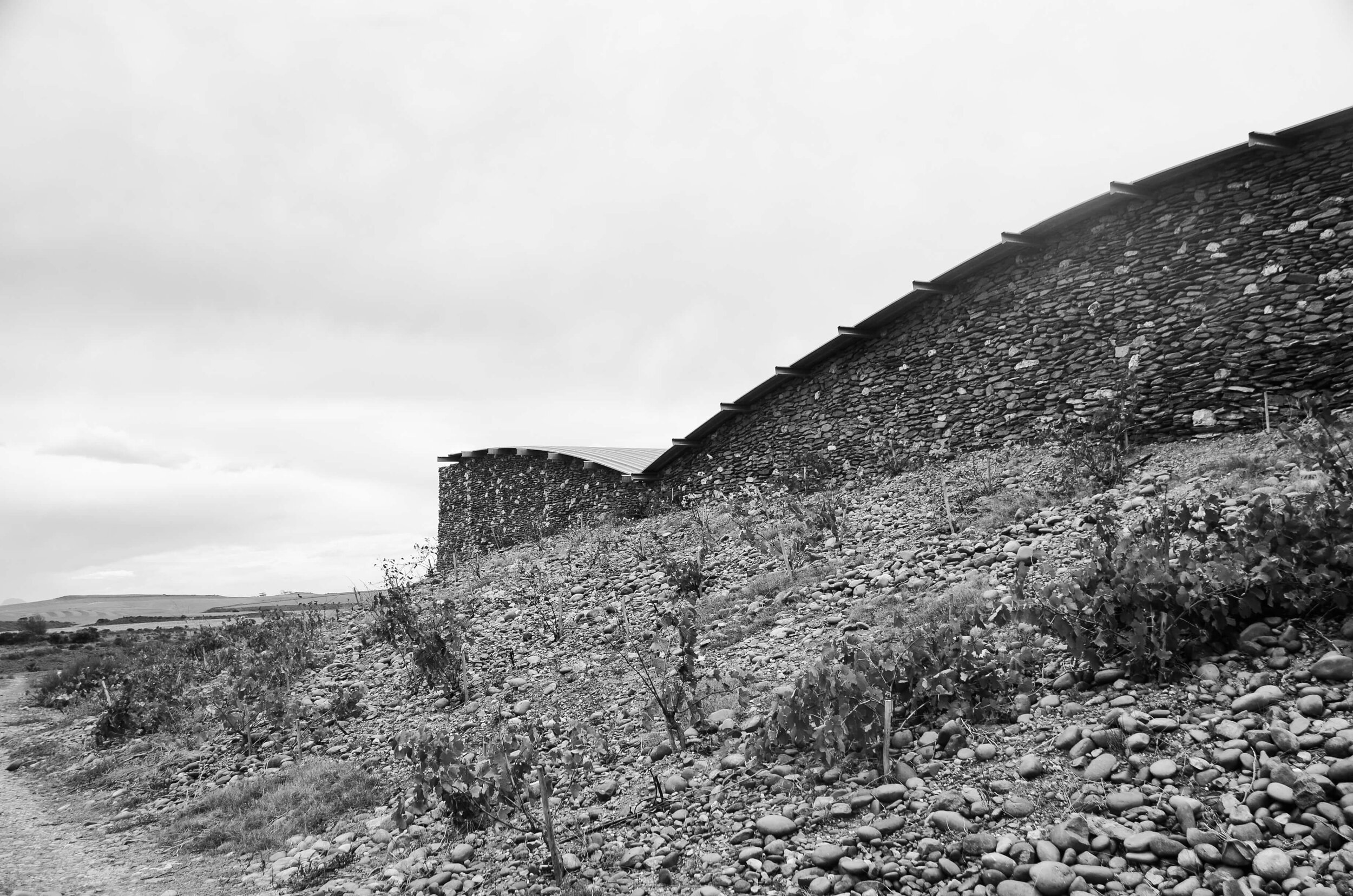
Briefed to redesign the Sijnn labels, we felt it was essential to gain a better understanding of the brand. After taking a drive out to Malgas and being in awe of the unexpected beauty we were greeted with, it became clear that these labels needed to celebrate the unique location of the estate, as we considered this to be one of their strongest unique selling propositions. In conjunction with the location, this concept celebrates the journey to the Sijnn Wine Estate as a destination.
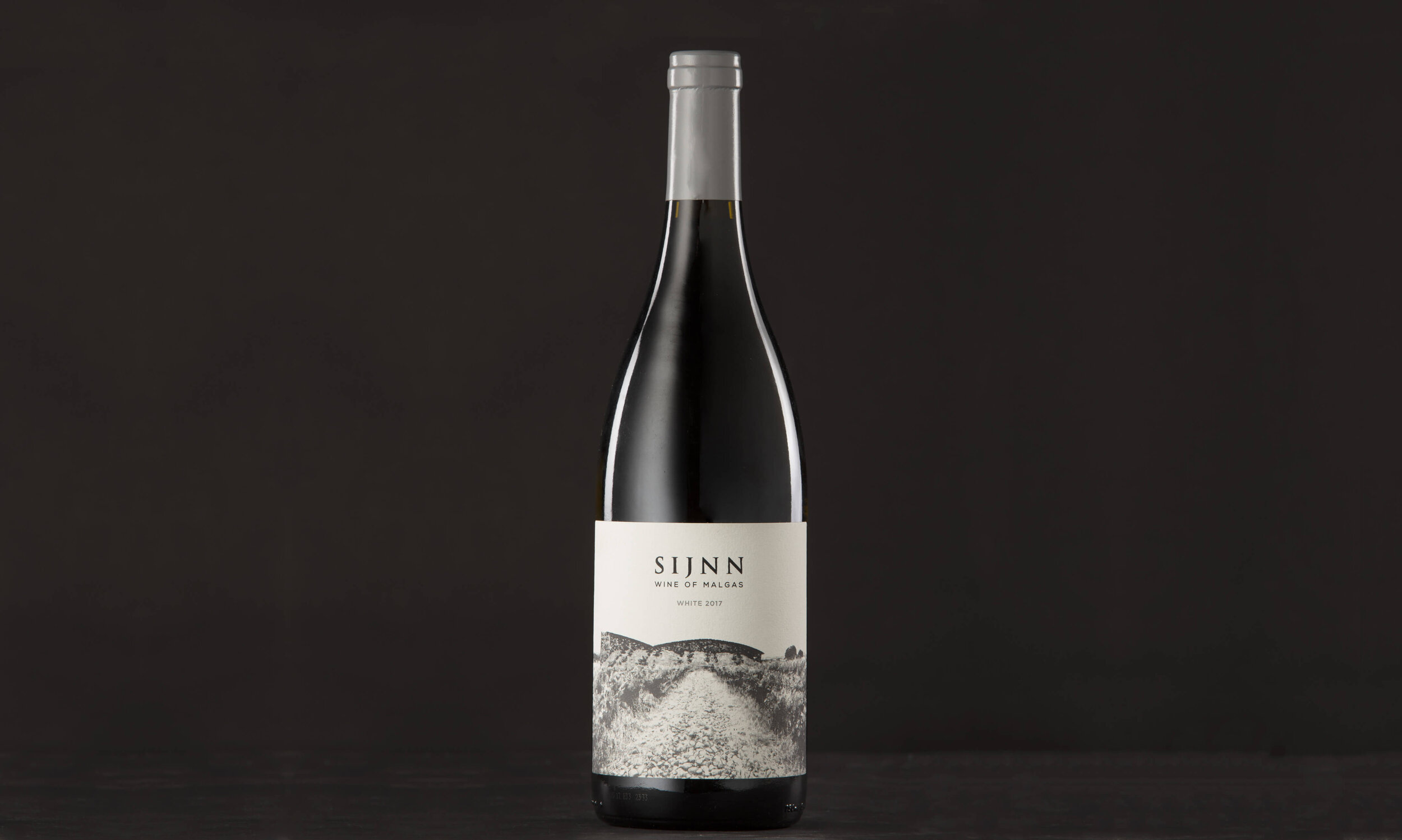
We began the branding process by making slight changes to the logo for legibility and changing the descriptor to ‘Wine of Malgas’.
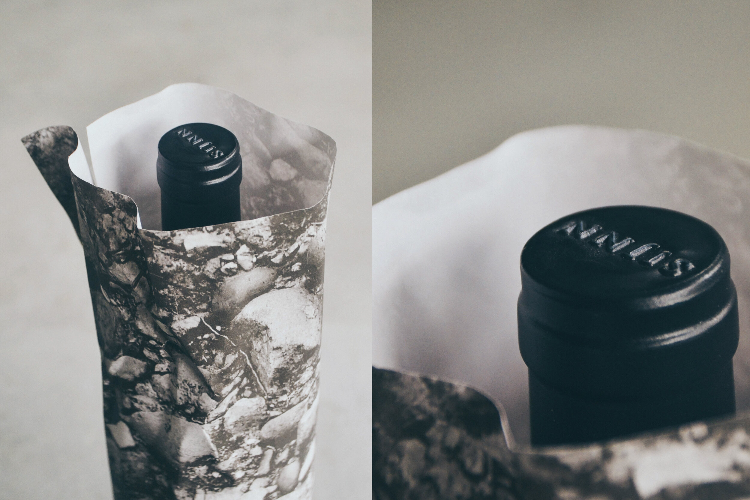
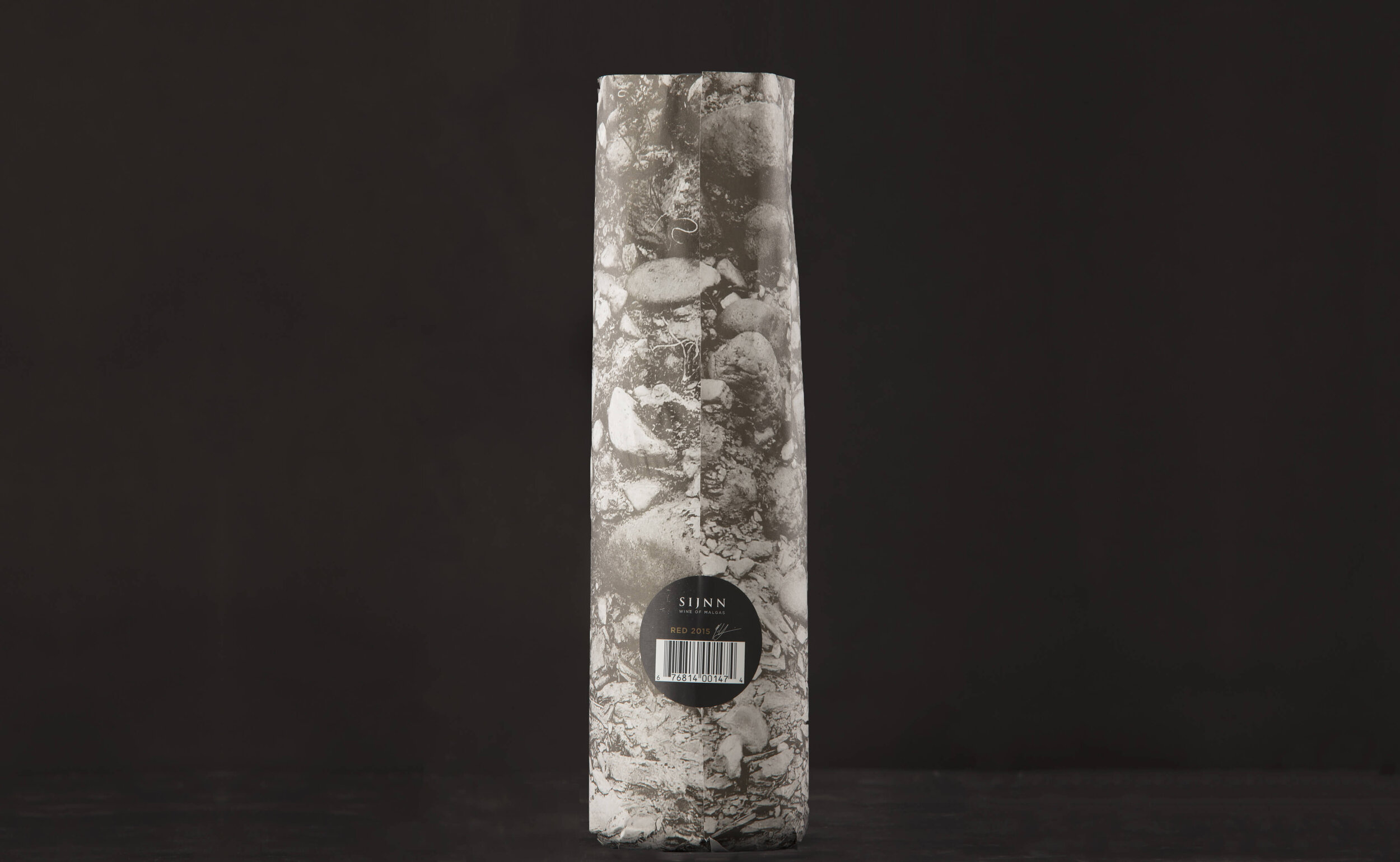
The idea behind the packaging was for each element to mimic, enhance and take you on the journey to the estate. The label design highlights the descriptor, the architectural features of the cellar and tasting room as well as the bush vines. The wrapping design focuses on the terrior and uses enlarged imagery of the unique soil profile as a striking visual pattern. In order to continue with the location elements, the client was advised to keep the map on the carton box.
HISTORIC WORK : SEAN HARRISON PORTFOLIO AND WILMA DE NYSSCHEN PORTFOLIO More recently we were approached to design a brochure, including an illustrated map for the estate, keeping in line with a similar illustration style used on the label design. This again celebrates the concept of location by giving first time and prospective visitors a glimpse of the surrounds and its uniqueness.
Map Illustrator : Dayna-Gay Tate
SERVICES:
Brochure Design | Copywriting | Project Management